Creating an effective B2B website is a tricky feat to master. A unique, engaging, and user-friendly online platform is only half the battle. You also need to satisfy key stakeholders in your organisation with accurate content for your web pages.
More so, a quick Google search for your 'unique' business offering will likely render thousands of results. The web is saturated with your competitor's sites, so capturing the attention of prospects is harder than ever. So what can you do? You make sure your website is operating as well as possible.

To begin, let's think about what an effective B2B website is not.
Your website isn't an online brochure that prospects passively sift through. Studies show that your web content only has 15 seconds to capture visitor attention. Every design and content choice needs to engage your prospects.
It's great to have a variety of informative web pages on your site, but are your prospects getting lost along the way? A logical website structure is key to helping users find exactly what they're looking for. And, getting this right gives your business more conversion opportunities (stay tuned, we'll explore this later).
Good web design is more than just making the page look nice. It's about making sure your website is user-friendly, functional, and most importantly, a powerful platform for your business.
– Clare Chan, Senior Digital Designer
Conveniently, this brings us to Numero Uno in our list of effective web design principles...
Think about your customer's journey and consider what they'll be looking for on your website.This will help identify more opportunities to engage and build trust, creating a lead generation pipeline for your website. This process is also a great basis for building an effective B2B sitemap.
What order do you think your prospects will view your web pages in? It's logical that they'll view, say, a product page first. But consider how they will find it and the pages they'll explore afterwards. It seems simple, but ensure the pages you think visitors want to visit are clearly labelled and easy to find.
And to make it even better, provide more than one opportunity to find pages in appropriate places of your site.
By identifying the ideal customer journey, you'll create a web design structure that puts the right information in front of visitors, at the right time.
Blend tip: The buyer journey principle can be applied to other key elements of your website, such as creating targeted content. This helps you build a strong lead generation-focused catalogue of web content.
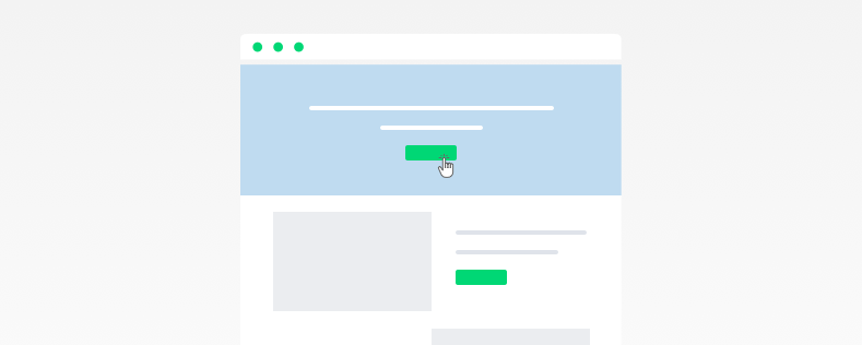
It's all well and good organising your website so things are easy to find. However, the content layout on your web pages need to be equally logical.
When creating a page design framework, it doesn't make sense to include a button to your company Twitter page within a section that contains details about your product. It's more rational to include a call-to-action that's relevant to your product and will inform or convert the visitor.
Throughout your website and your web pages, you should provide logical jumping-off points that encourage people to delve deeper into your website and the content on offer. Only send users to relevant places – they'll download your content or request a demo if you've done the groundwork and sparked engagement using the inbound methodology.
Most importantly, place conversion opportunities at relevant places in your website. This doesn't mean putting an intrusive pop-up in the middle of the screen asking to download your e-book (unless it genuinely helps your visitor).
If you engage the user with great content, you'll proactively build greater customer trust – so they're more willing to click a call-to-action. Whether that's simply reading a free guide, downloading content, or subscribing to your blog. As the saying goes: "If they come back they're yours, if they don't they never were."
Blend tip: Make it as easy as possible for users to connect with your business, even if it's not a sale. At Blend, we've found that contact forms at the footer of each website page often perform better than dedicated contact pages. This is because they're always available at the opportune moment, making users more likely to act.
A website that's 'as accessible as possible' lets anyone, regardless of abilities, platform, or context, explore your website with ease.
Ultimately, figuratively 'checking-off' this vital aspect of web design not only creates a better experience for everyone, but also attracts more visitors and allows them to become absorbed in what's really important (your business).
Your web design should aim to reach the generally accepted standards for website accessibility. The most detailed version of which can be seen on W3's Web Content Accessibility Guidelines.
However, what design elements are all-too-common perpetrators of poor accessibility, and how can you easily get it right?
According to Forrester research, websites designed for user experience (UX) can yield significantly higher conversion rates, rising up to 400% in some cases – it's vital your design elements compliment UX, not worsen it.
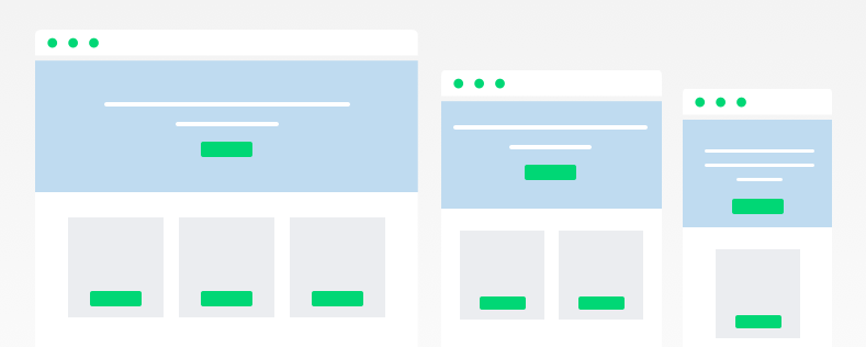 We've all opened a website on our phone before and struggled with its size or dimensions before closing the window and never going back again. In fact, studies show that people form 75% of their judgement of a website's credibility based purely on aesthetics, so it's essential your website can automatically scale without effecting the integrity of your design.
The more responsive your website, the better. 'Responsive web design' refers to a website that responds to user environment and behaviour based on platform, orientation, and screen size.
A website visitor should be able to view your website from their laptop, a phone, or a tablet. Latest statistics show that mobile internet users account for 52% of total internet users. Ignoring this proportion of mobile traffic would cause drastic user experience issues and potentially limit over half of your potential prospects.
Blend tip: Don't forget, your website should scale to on-screen browser window size too. A desktop user might open multiple browser windows, or scale them to half the screen. Your website design should be user-friendly at any scale or size.
No unsuspecting visitor will click a button if it looks like ordinary text (psst... the first word of this paragraph is a link). Clickable links or interactions, such as the navigation bar, call-to-actions, or page links, should visually respond to user actions. Commonly, this is achieved through hover-states.
The hover state is activated when a user rolls their mouse over a element, such as a button. The most common example of this is when you hover your desktop cursor over an element, such as a link, and the condition or appearance of the link changes. This signifies to you, the user, that the design element is interactive.
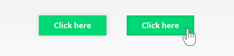
The hover state can be applied to interaction elements of web design. For example your call-to-action button, whether it's 'Speak to Sales' or 'Download The Case Study', should visibly change when the user places their cursor on it. This signifies that the button is clickable, and so customers are more likely to click.
Without this, your prospects can easily miss a call-to-action, and your business might miss a crucial lead. It can be as simple as changing colour, size, style, or format.
It's worth noting that the hover state doesn't work for mobile web design. Of course, there's no cursor on the screen at all times. Visitors use their finger, or even a phone stylus or keypad buttons to click. Therefore, make sure links and buttons are visually differentiated so they know where to go.
The phrase 'visual hierarchy' is used in web design to describe design elements and choices that make it easier to understand a website.
Humans organise information into meaningful patterns, and studies show that visual perception is even faster than thinking. A hierarchical approach to web design can improve usability by sub-consciously showing visitors what's most important or of lesser importance. But what does this mean?
It's easy for human beings to understand that visually bigger objects are more prominent, and therefore important, while smaller design objects are lesser so.
Your website design elements, such as typography, should follow this pattern. Key headings, illustrations, buttons, and call-to-actions should be appropriately sized so that prospects will notice them. Meanwhile, sub-headings and the rest of your web copy will be smaller, or normal sized.
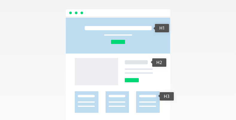
Apply the hierarchy principle to every design element of your website to help users better visually understand the page. For example, headings should be equally hierarchical as they are numerical:
H1 > H2 > H3
This will show users what you think is most important (a H1 will stand out more than a H3, for example).
Blend tip: Importantly, heading tags are a vital component of
search engine optimisation (SEO). Search engines such as Google understand your website, it's relevance, and its importance by reading heading tags. When heading tags are hierarchical and organised throughout your website, it will positively affect your search engine rankings – increasing the likelihood prospective customers will find your website.
The most effective B2B websites are presentable and powerful.
Presentable websites showcase the business in a professional and pleasing way. They're suitable for the target audience, and weave unique company branding into design to create a stand-out platform.
Powerful websites act as an organic lead generation tool. They're built to capture the attention of buyers, and offer simple conversion opportunities. No matter the stage of customer journey, they'll inform, delight, and convert visitors.
Balance the perfect combination of these two elements, and you’ll spark curiosity about your business, encourage more users to explore beyond the homepage, and boost traffic and conversions
Your website is not just a representation of your business, but also a powerful extension of it. It's the most important piece of marketing collateral you have.
Master this, and you'll unlock the benefits of an online platform that encourages organic growth, while simultaneously making it easier to inform and impress potential customers.