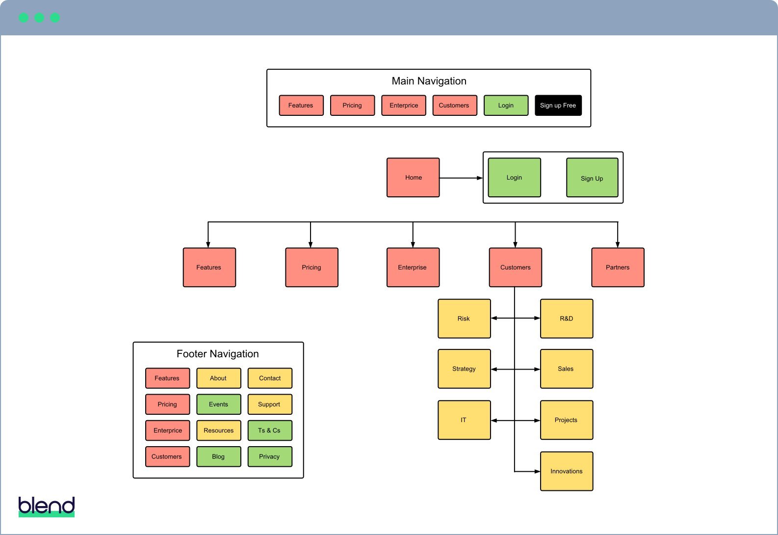
Wireframes and copy
Before you begin designing, you should fully wireframe and write the pages that make up the first phase of your agile website plan.
Working with wireframes and real (though not necessarily final) copy helps you plan a holistic customer journey.
Wireframes help you create the most effective website possible without becoming locked into a sub-optimal design. Remember, it’s cheaper and easier to update copy and make layout changes to a wireframe than a full design.
Wireframes can range from low to high definition. But it's usually wise to start with a simple wireframe and only add more detail once you have some confidence in the content.
Creating wireframes in Sketch, PhotoShop, or Illustrator can save time in the design phase. If the person creating them isn't familiar with those applications, however, LucidChart is a great alternative.
Homepage design
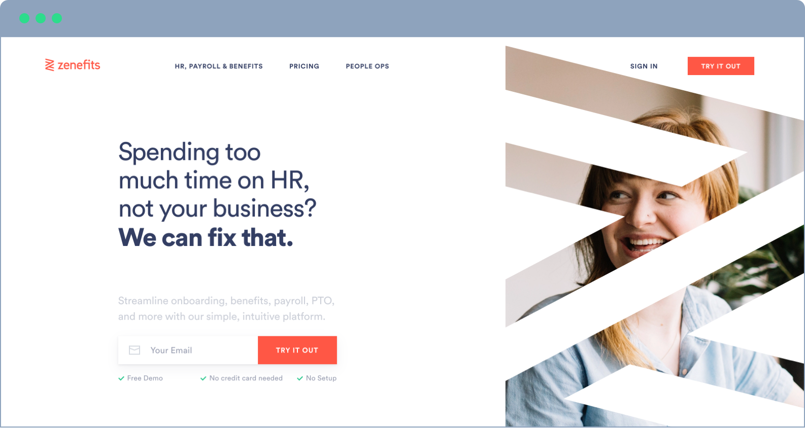
The homepage is the most crucial component of any B2B website design and is likely to pop up frequently during initial discussions and throughout the design process.
Homepage design is challenging because:
- It's the first page many visitors see
- Visitors could be at any stage of the buying process
- Visitors decide whether to stay or bounce in a matter of seconds – the classic ‘blink test’
The first thing you must get right on your homepage is the header section, as this is the only thing new visitors will read before deciding to stay or go. To ensure the right visitors decide to stay, you need to tell them exactly what you do and whom you do it for – your value proposition.
Businesses often forget about the first-time visitor when designing their homepage headers and fail to communicate their value proposition clearly – if at all. It may be because it feels unimaginative to say, “We do X for Y”. But nothing is more effective at getting you past the blink test.
Homepage value propositions don't get much simpler, or better, than Vivian's:

Sliders (aka carousels) can damage homepage effectiveness. Research into the subject has proved that sliders are bad for SEO and the user experience. They’re also lethal to positioning and communicating your value proposition.
Including a slider in your website design, forces you to come up with multiple top-line messages.
Websites that use sliders often fill them with alternate versions of their supposed value proposition, company news, or product launches. These don’t tackle the real objective of getting a first-time visitor to say “Hey, I'm in the right place”. That’s what the other pages of your site are for.
So, do yourself a big favour – ditch the slider and come up with a truthful, concise, and compelling value proposition for your homepage.
Your homepage should also include:
- Points of differentiation – Once a visitor is past the blink test, tell them why you’re the best choice for them.
- Social proof – Evidence goes a long way toward building trust and preference. Share customer logos, testimonials, or case studies to demonstrate your credentials.
- Calls to action – A good CTA guides the onward journey of visitors at all stages of the buying process.