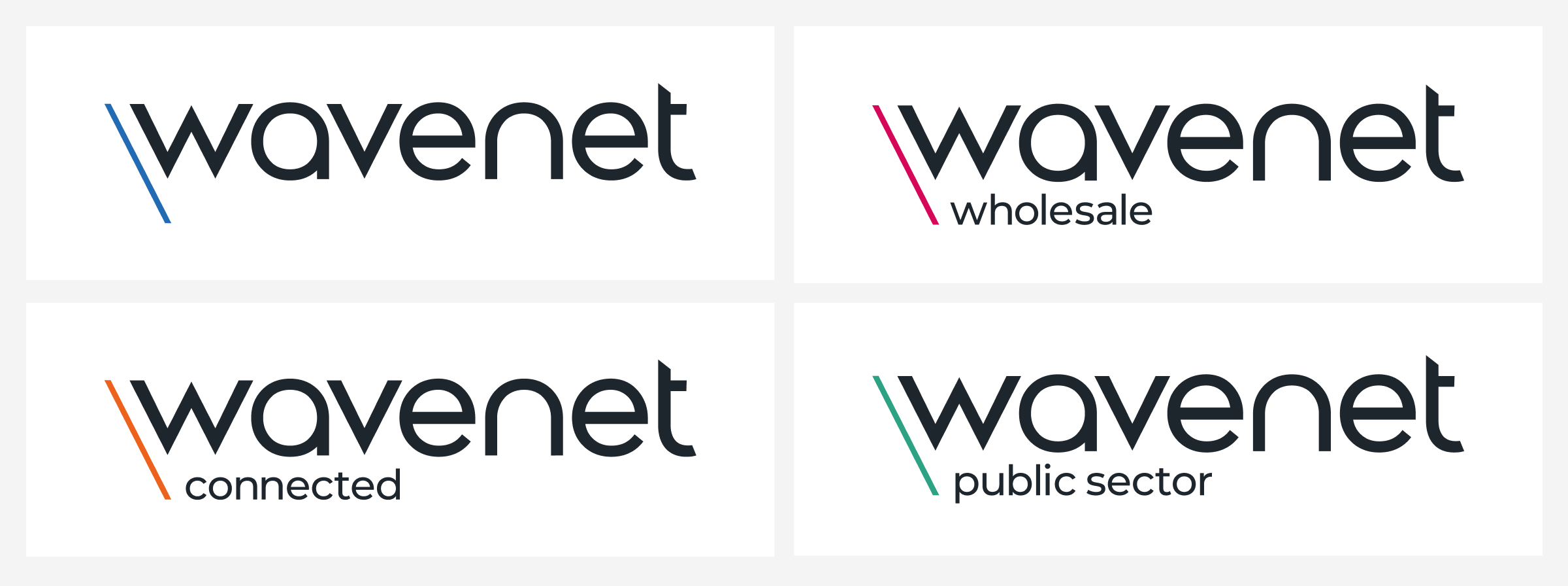
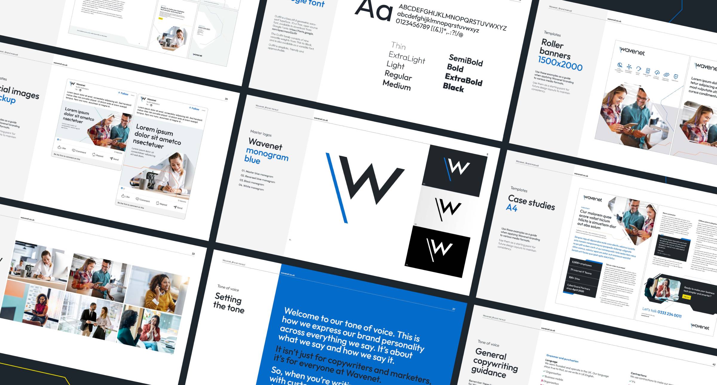
Wavenet
HubSpot powered brand transformation
Project type
Brand
Website
Industry
Telecommunication
Location
United Kingdom
Services provided
Brand
Copy
Design
Development
Strategy
Wavenet, a leader in cybersecurity, communications, and technology-managed services, approached us to modernise their brand. Their goal was to unify their divisions with a new fresh, clean visual identity.
So, we combined our creativity with the power and scalability of HubSpot CMS to create a new brand that represents their innovative business.
Tech and innovation sit at the heart of Wavenet. This heavily influenced our development of a fresh, distinctive visual language. The rebrand was also an opportunity to establish visual consistency throughout the Wavenet Group, using colour to introduce a clear, distinct brand structure.
Wayne Harris
Art Director at Blend
Wavenet's logo stands out with its distinct design, reflecting a futuristic perspective on telecoms. The sharp, dynamic features in the bespoke letterforms convey precision and directness, qualities that define Wavenet's solutions. Bold colours clearly define each sub-brand, establishing a consistent, structured hierarchy to Wavenet's visual identity.
Following several recent acquisitions, Wavenet needed to integrate several identities into their brand. It was crucial to maintain the familiarity of the original brands while seamlessly incorporating them into Wavenet. To acheive this, we deployed Wavenet's distinctive logo typeface distinctive logo typeface into their solutions, ensuring a consistent visual identity.
Wavenet wanted to use icons to represent their solutions while striving for a consistent look and feel. To achieve this, we developed a custom set of icons, carefully aligning them with the logo's line weight, angles, and cuts.
We took steps to enhance Wavenet's visual identity, building on the established colours of their brand and specialist divisions. We implemented a clear structure to create a unified and cohesive brand colour palette.
We supplied Wavenet with a digital accessibility matrix, offering clarity on colour combinations with AA-level contrast, to ensure optimal accessibility for all users. This matrix clearly sets out:
As part of the rebrand, we introduced a new imagery style. This features informal lifestyle images set in a contemporary, dynamic workplace environment that captures instances of effective and natural communication. We overlaid a visual mask on the images to symbolise Wavenet's innovative use of technology. Together, the imagery, text, and generous white space combine to cultivate a refreshing and clean brand image.
To apply the brand consistently across all channels and touchpoints, we developed a comprehensive brand guidelines document for Wavenet. This invaluable resource helps Wavenet use their brand in different ways whilst maintaining consistency.
Wavenet's new website, developed on HubSpot CMS, seamlessly reflects their brand. Image masks transform standard stock photos into a distinctive style, while ample white space improves readability, scannability, and provides a fresh appearance. Strategic use of colour and icons effectively separates market solutions, creating a user-friendly experience that aligns with the website's primary objective: high-intent website conversions.