Brand transformation brought to life on HubSpot
CybExer
Security
Europe (not UK)
About the project
CybExer, a NATO-awarded cybersecurity company, were looking to expand their offering in the private sector.
They recognised that their brand and website needed to evolve to elevate their market perception and to support their demand generation strategy.
So, we combined our creativity with the power and scalability of HubSpot CMS to create a new brand that reflects their business values and a website that's built for demand generation.
Logo development
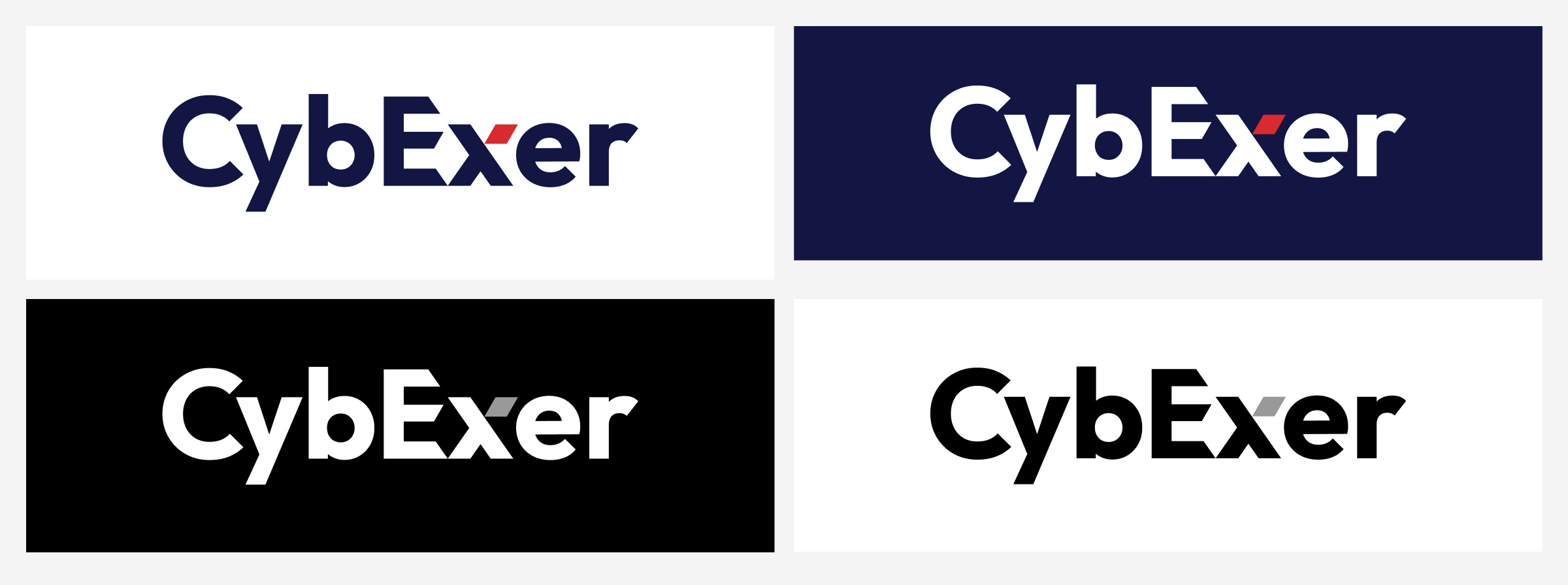
The evolution of CybExer's logo centred around their existing rhomboid shape, which carried strong brand recognition amongst their customers.
So, rather than abandoning this, we integrated it more purposefully into the wordmark, specifically within the 'X'. By reducing the size of the shape, it gained more impact, particularly with the red accent colour.
We also addressed pronunciation challenges by introducing an angled capital 'E', helping to clearly differentiate the 'cyber' and 'exercise' elements that form the name.
Cohesive brand colour palette
The colour palette focused on establishing a sophisticated balance between a deep blue and their existing red.
While the original brand heavily relied on red, we deliberately paired it back, transforming it into a powerful accent colour. This repositioning actually made the red more distinctive and purposeful, particularly as a call-to-action element.
The darker blue, which carries subtle military undertones reflecting the company's heritage, provided a strong foundation that allows the red to truly stand out.
Custom icon set
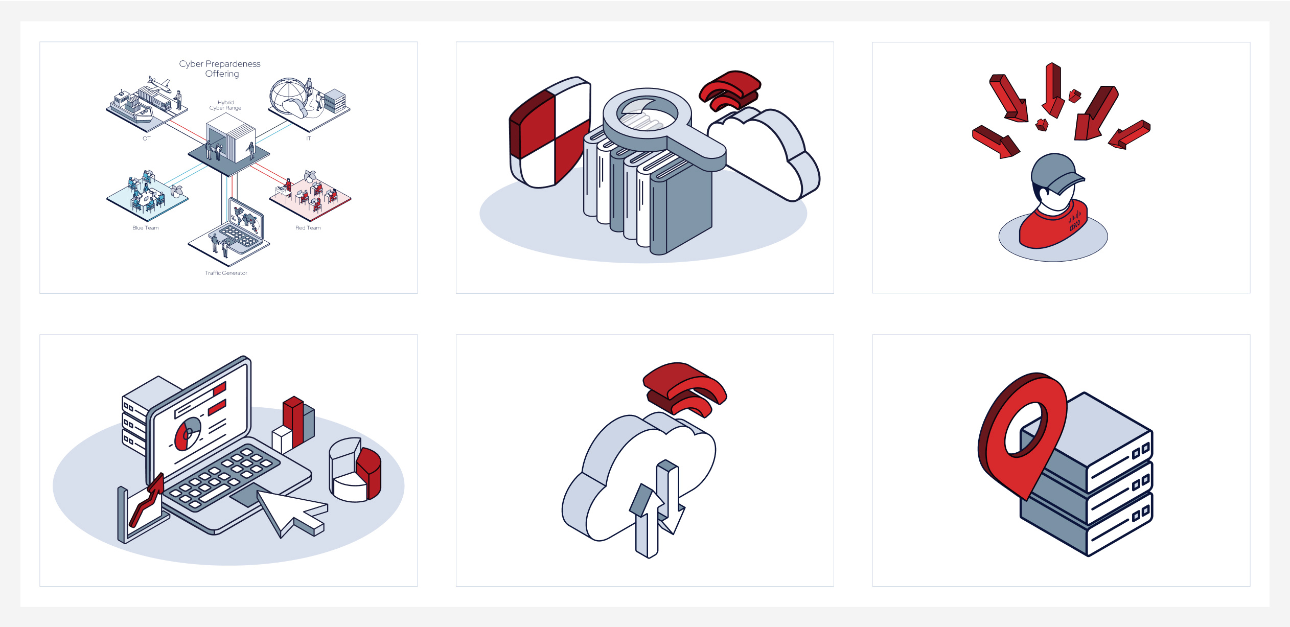
Working from CybExer's existing visual assets, we developed a bespoke icon set that used an isometric pictogram style.
Rather than starting from scratch, we built upon their established visual language, refining and expanding it to create a family of icons that could effectively communicate complex cybersecurity concepts and scenarios.
Web accessibility matrix
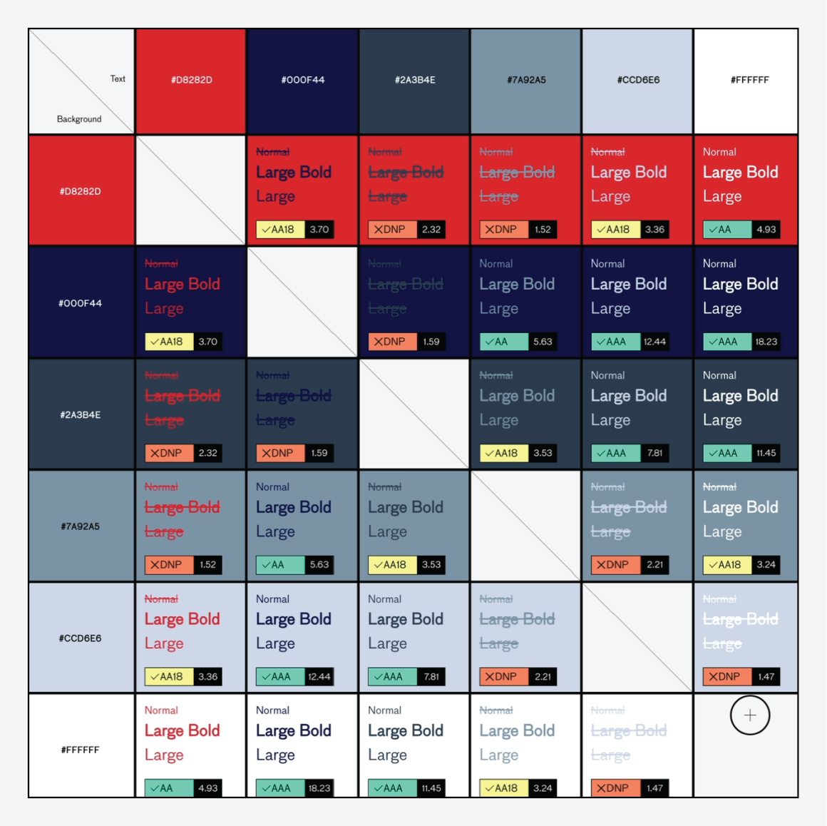
We supplied CybExer with a digital accessibility matrix, offering clarity on colour combinations with at least AA-level contrast, to ensure optimal accessibility for all users. This matrix clearly sets out:
- Colour pairings that maintain at least AA-level contrast when used together.
- Colour combinations suitable for graphics or large headlines, meeting accessibility requirements.
- Colour combinations that aren't accessible when used together, helping to avoid potential readability issues.
Grid system
The grid system we created is a fundamental design principle that influences every aspect of CybExer's visual communications.
Built around the angle of their logo device, this system offered flexibility in how content is presented.
The grid is used to create depth through overlapping shapes, define distinct content areas, or be stripped back for simpler applications.
Comprehensive brand guidelines
To apply the brand consistently across all channels and material, we developed a comprehensive brand guidelines document for CybExer. This resource helps them use their brand in different ways whilst maintaining consistency.
Website transformation
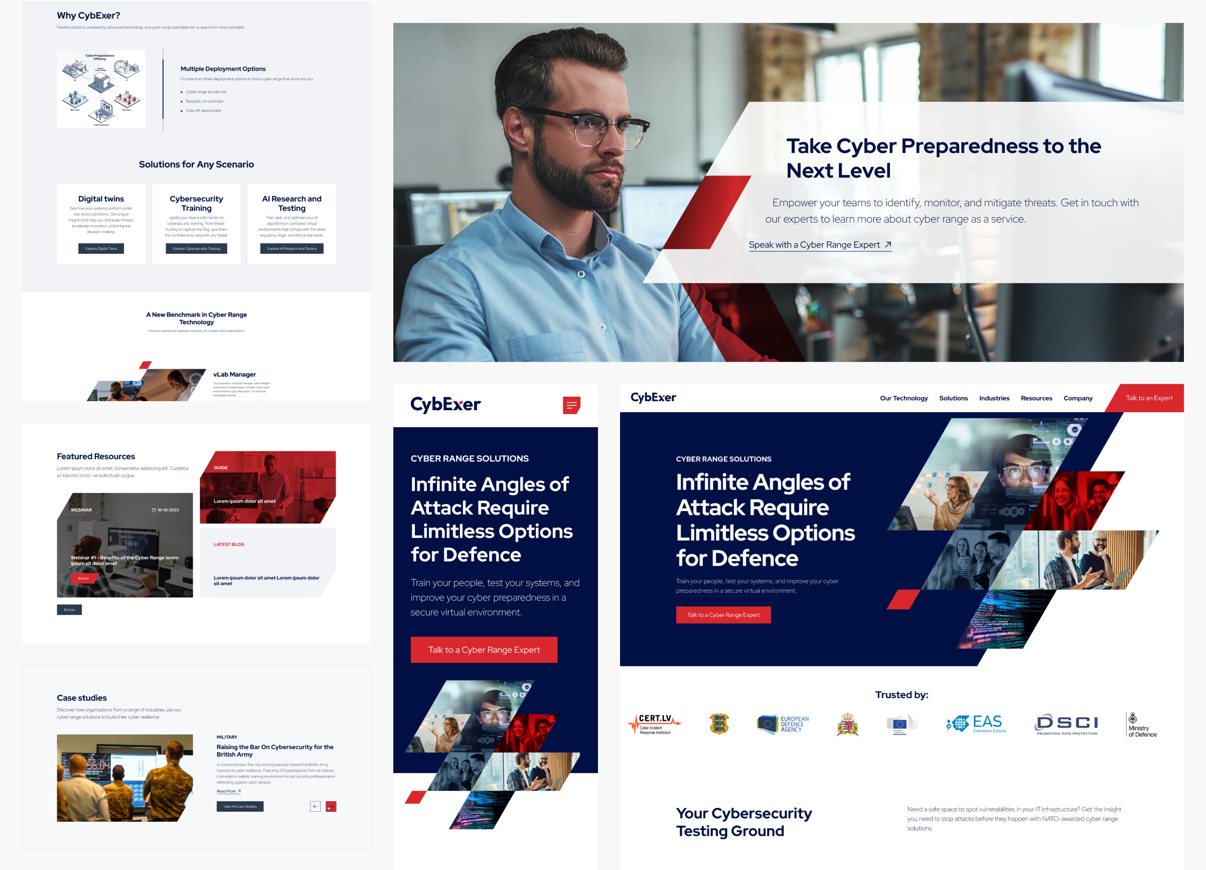
The website. developed on HubSpot CMS, brings the CybExer brand to life in a practical but impactful way. The grid system helps structure complex content across the site while keeping everything clear and easy to navigate. This means even detailed cybersecurity services and concepts are presented in a way that makes sense to visitors.
The colour strategy comes into its own on the website. The deep blue creates an accessible base, while the red is used strategically to highlight important elements and guide users through the site and to key conversion points.