

Episode summary
Considering a dark-themed design for your website? We think that might be a bad idea for B2B.
Whilst dark websites might look attractive on the surface and check the box of being creative, but they might lack substance when it comes to the essential components of a B2B website.
In this episode of Websites Decoded, Phil breaks down the potential issues with dark-themed websites and what’s led to this discovery.
Episode transcript
I strongly suspect that in B2B website design, dark mode is a bit of a mistake, and maybe a big one.
And hand in hand with that, the investment in creating toggles that the user can use to switch between light and dark mode is potentially wasted investment that could be much better applied elsewhere.
I'll come straight out and say I don't have the volume of data to support this that I would like to have, and I haven't found studies on the subject.
But I do know that the few dark mode first websites that we've been convinced to build over the years have not performed as well in terms of SEO, traffic acquisition, and high intent lead conversion as I would have expected them to, given all the other best practise principles that were built into them.
So it left me quite worried about the potential negative impact of building a B2B website in a dark-first way for that reason.
Why are B2B dark-themed websites bad?
As I said, I don't have data to support it yet, but if we think about why that might be happening and why that is the case...
Dark mode was made for dark environments
The resurgence of dark mode comes from mobile device use at night, where a dark mode is more restful to see, and it's generally better for a user that's in a dark environment on a small mobile screen.
Now, the vast majority of important visits to a B2B website, and even more importantly, conversions are not happening at night on a mobile device. They are by and large happening during daylight hours and on desktop devices.
So immediately I start to think that optimising your entire website experience for those users who are on a mobile device at night starts to sound less sensible.
Dark websites make it harder to read body text
And my own impression of dark mode first websites is that during those daylight hour visits, they're not easier to read and they're not easier to engage with.
White text on a black background produces some particularly challenging accessibility issues that are even worse for those with accessibility challenges.
But I think most people will realise or recognise when I say that small white text on a black background tends to appear quite fuzzy, quite furry, and it doesn't help me to read it, it doesn't facilitate reading.
And of course, reading that text, reading that copy is crucial to forming an opinion that leads to a purchase, and so that presentation, which is suboptimal from an accessibility point of view, I think affects us all.
Considering more than just text colours
In addition, there's more to creating a dark mode website if that's what you're going to do than just inverting the colour of the background and then the colour of the text.
And there's a lot more considerations that need to be taken, text size, the font weight, the colouration of images, icons, headlines, etc.
And it's for that reason, I think, that rarely do you see enough effort put into the alternate version of a website.
Using a dark/light mode toggle
If there is a toggle that lets the user switch from light mode to dark mode at their discretion, it's rare, although we have done it, that enough effort goes into that alternate version to make it as good, as effective as the default for consumption.
And therefore, I think that for now, the majority of interaction that those toggles do get is probably out of curiosity more than a desire to actually switch the website into that other mode. Because it doesn't typically lead to an improved accessibility and engagement during that core period when most business decisions are taking place.
And I think furthermore, if your business is operating on the hope that by optimising for mobile users at night you are going to grow, you've probably got some fundamental issues to consider, because that is not where the majority of your high-intent conversions are going to happen or take place.
Real challenges with creating a website experience that's optimised for that user.
How Apple use dark mode effectively
And even Apple, who I think a lot of people would hold up as a champion of dark mode and as a pioneer and as somebody to observe and see how they do it, they do a few things that I think hint at why this is an issue for B2B.
So one, when you land on a product page on Apple and it's dark, it's very much about the images, the product images, and it's very much about headline copy, which is very big. And the copy never drops below a certain size, never drops below a font size, which is bigger than most paragraph copy on B2B websites, because the length isn't as long.
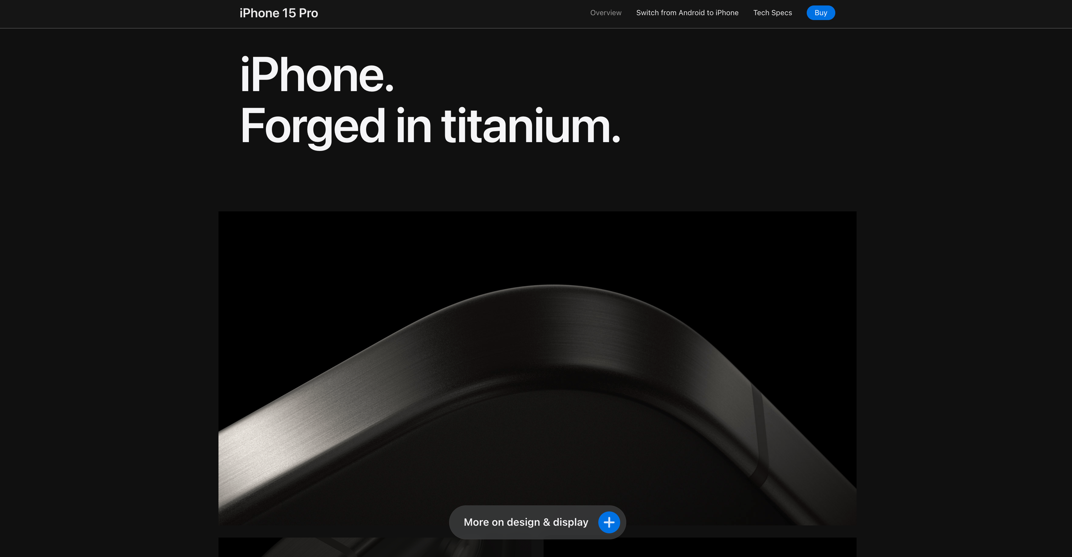
So if you're going to go for dark mode, you've got to think really carefully about the typography and the copy itself to be able to retain the size that dark mode needs to be legible to all.
And the second you click buy on an Apple website, you go to a light page with black text.
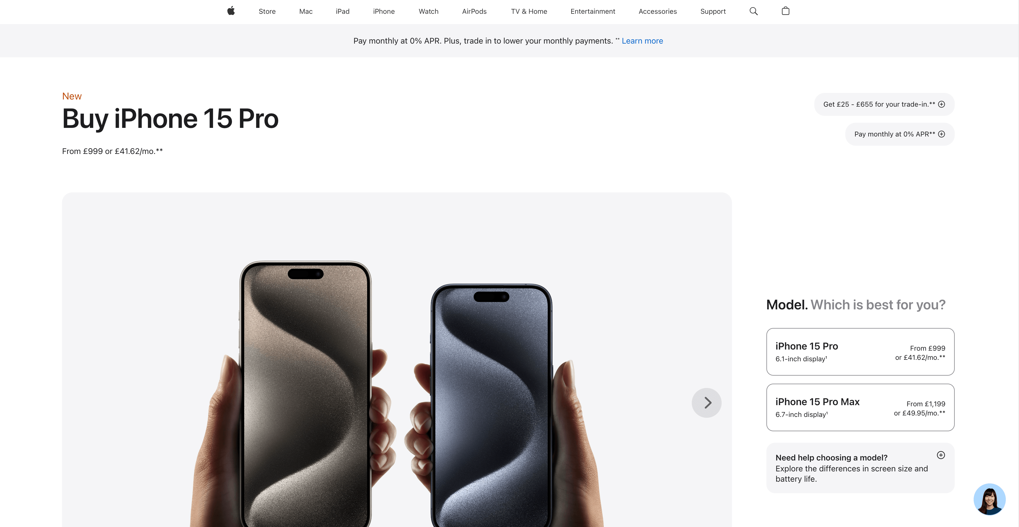
And I reckon there's a good reason for that because you're about to convert.
I think that we're seeing Apple say that black text, white background converts better I'd wager that they have got enough data on that to know for sure.
So I think even though Apple is a fantastic example of website design. It isn't necessarily an example to follow.
Using dark elements within a light website
When it comes to B2B website design, dark elements can be used.
You'll see websites in our portfolio that have dark hero sections where the headline copy is large enough to be easily read in that format, and it lends itself to the brand and to the impression we want to create.
But we'll typically switch or alternate to white sections below that, because that's what instinctively and to a certain degree empirically is what is going to lead to the best experience for the visitor and the highest likelihood, we think of them converting and converting at the bottom of the funnel. All importantly.
Dark-themed websites could be a big mistake
So yeah, I think dark mode is a mistake in the first place, and it's rarely done extensively enough, well enough, considerately enough, to make it a success when it is done.
And I think in a B2B setting, if you want visitors to educate themselves about what you have to offer and go on to express their intent via your website, you want to be thinking about light mode first and foremost, and probably not spend your budget, which is usually limited, on creating an alternate mode at significant cost.
That isn't actually going to improve the user experience for most of your visitors.