Your contact page is a critical component of your website. It serves multiple purposes, from providing support for existing customers to connecting with potential buyers. So designing a contact page with a seamless user experience is crucial for website success.
Contact page design best practices
Fortunately for marketers, there are proven best practices to design a high-performing contact page. The best practices we've compiled draw from over a decade of experience in website design and numerous studies on effective contact pages. By following these guidelines, you can create a contact page that drives engagement and conversions.
1. Make it specific
Firstly, it's important to question the purpose of your contact form. 'Contact us' is a very generic, catch-all, place that all kinds of people go to to contact your business, such as:
- Existing customer support
- Job seekers
- Sales pitches/spam
- Enquiries from potential customers
This generic nature means that the generic contact page isn't optimised for any of these things. It's a catch-all place that has to serve multiple purposes. So, we advise that businesses optimise the contact experience for the key audiences you (actually) want to hear from.
Removing a generic contact page and replacing it with dedicated pages that support specific actions can improve the quantity and quality of submissions you receive, pages like:
- Customer support
- Book a demo/talk to sales
- Career opportunities
Using specific pages like this means you can use tailored language and intentional design on these pages to help those specific groups of people complete a desired action. As opposed to a generic contact form where they have to provide all of the context about their submission, they can complete the action quicker and within the context of their problem/enquiry.
2. Conventional design is good
Unique design and creativity are great for websites, helping you stand out from competitors and showcasing your brand identity. However, when it comes to user experience, familiarity is key.
Your contact page plays a critical role in generating leads and inquiries. The last thing you want is for a potential buyer to invest a significant amount of time in researching solutions, and evaluating your offering, only to feel confused about how to contact you.
So when it comes to contact page design, it's wise to stick to conventional design principles. This ensures visitors can intuitively navigate and use the page without any confusion hindering the conversion process.
A typical two-column design with text on the left and the form on the right is a good convention to follow for contact pages.
3. Outline the next steps
Uncertainty can often hinder action, but when you know the outcome of something, you're more likely to follow through. This principle applies to your contact page too.
By clearly outlining the next steps upfront – whether it's the expected response time, actions required after submitting the form, or the process to receive a proposal – you make it more likely for buyers to complete your contact form. Providing this transparency removes uncertainty, as potential customers know exactly what to expect after they reach out.
4. Intuitive form
Forms remain an effective mechanism for visitors to contact your business. They've become so ingrained in website design that users expect them when trying to reach out to a company. When it comes to form design, length, and format, keeping it intuitive and simple is crucial:
- Ensure input fields and help text are clearly visible.
- Streamline the form as much as possible while maintaining a suitable structure.
- Make the submission button prominent and easily clickable.
- Pre-fill information wherever logical.
While shorter forms may seem appealing due to the low barrier for submission, they can sometimes result in more low-quality leads. Maintaining an appropriate form length often means you'll attract more serious buyers who are willing to invest a little extra effort to contact you.
5. Include social proof
Social proof is a powerful way to boost conversions and encourage more buyers to enquire through your contact form. It builds trust with prospects and reinforces the claims made on your site.
There's no more critical moment to reassure buyers than when they're about to take the leap and reach out to your business. At that pivotal point, you need to instil maximum confidence that your company is the right choice to solve their problem. Social proof is a fantastic tool to inspire that confidence and nudge prospects closer to conversion.
6. Consider removing navigation
To maximise conversions, it's advisable to remove any distractions from the page that might lead visitors astray, preventing them from completing your form.
But what about the navigation?
A HubSpot study showed that, on certain types of landing pages, removing the navigation can lead to a 28% increase in conversion rate. The rationale is that by eliminating the navigation, visitors are more likely to take the only other action presented to them: submitting the form.
Removing potential distractions and funnelling visitors toward the desired action can have a significant impact on conversion rates. However, it's essential to strike a balance and ensure the user experience remains intuitive and seamless.
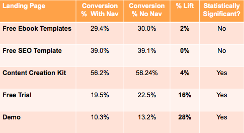
Results from HubSpot's A/B test: navigation vs no navigation
7. Use calendar booking strategically
More businesses are investing in calendar booking solutions that enable website visitors to schedule meetings directly with their team. This approach streamlines the booking process, potentially shortening sales cycles, but caution should be taken with this method.
Adding a calendar booking widget to a website means anyone can book time with a busy and potentially expensive resource – your sales team. This could lead to people who have no intention of buying, or those simply trying to pitch their own services, occupying valuable time slots.
We've observed higher quality submissions when using a traditional form that adds structure to the submission process, and then directing qualified leads instantly to a calendar booking widget. This approach ensures you attract more qualified buyers through a structured form while benefiting from the speed of calendar booking solutions.
8. Mobile-friendly design
With mobile now accounting for 58.21% of global internet traffic, ensuring your contact form is responsive and optimised for mobile devices is crucial. To deliver an optimal contact page experience on mobile, consider the following:
- Ensure the page fits within the mobile device's viewport, eliminating the need for pinching or scrolling to read the content.
- Stack form fields vertically and ensure clickable elements like inputs and buttons have a sufficient tappable area.
- Hyperlink email addresses and phone numbers, allowing mobile users to take action by simply clicking instead of having to copy and paste.
9. Avoid top-of-funnel content and resources
When someone lands on your contact page – whether it's a generic page or one specifically for requesting a demo, speaking with sales, or booking a consultation – they're often at the end of their research and evaluation process. They're ready to take an action. Therefore, all your efforts on this page should be geared towards driving them to take that desired action.
Adding additional content such as blogs, guides, and resources at this stage may be detrimental to your conversion rates. Visitors at this point have already educated themselves enough to know that your solution can help them, so they don't need to consume more resources.
To maximise conversions, avoid including anything on this page that doesn't directly support the main goal of moving the visitor forward in their journey towards conversion.
10. Try moving your generic contact form to the footer
When looking at the footer section of your website, it's crucial to assess if you're using that valuable space effectively. It's not uncommon to find a 'subscribe to blog' form or other elements with poor engagement rates occupying that area.
If you're required to have a generic, catch-all contact form on your website, we recommend including it in the footer on every page, rather than dedicating a separate page for it.
In our experience, when placed in the footer, these contact forms receive a higher quantity and quality of submissions compared to having them on a dedicated page. By combining highly structured, bottom-of-the-funnel conversion pages (like 'book a demo') with a footer contact form, you can cater to a wide range of buyer needs and behaviours.

10 of the best contact page examples
Here are 10 contact page designs with varying target audiences and objectives to help inspire your page.
1. Allica Bank
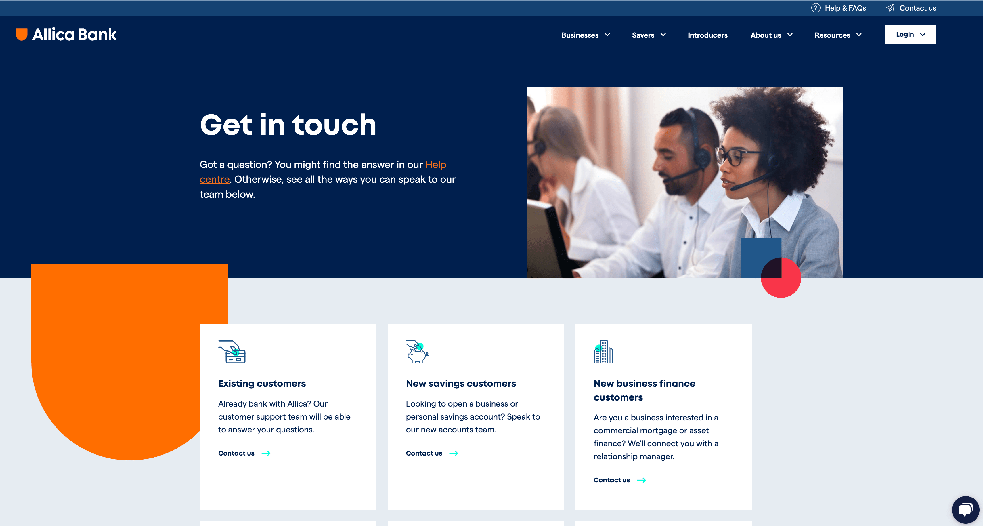
Allica Bank is an innovative business bank known for making banking easier and more enjoyable for its customers. As a bank serving both personal and business accounts, Allica Bank recognises that customers may have various reasons for reaching out. To cater to these needs, their contact page serves multiple purposes, presenting clear options to contact them for different enquiries. These options are distinguished through concise copy and iconography.
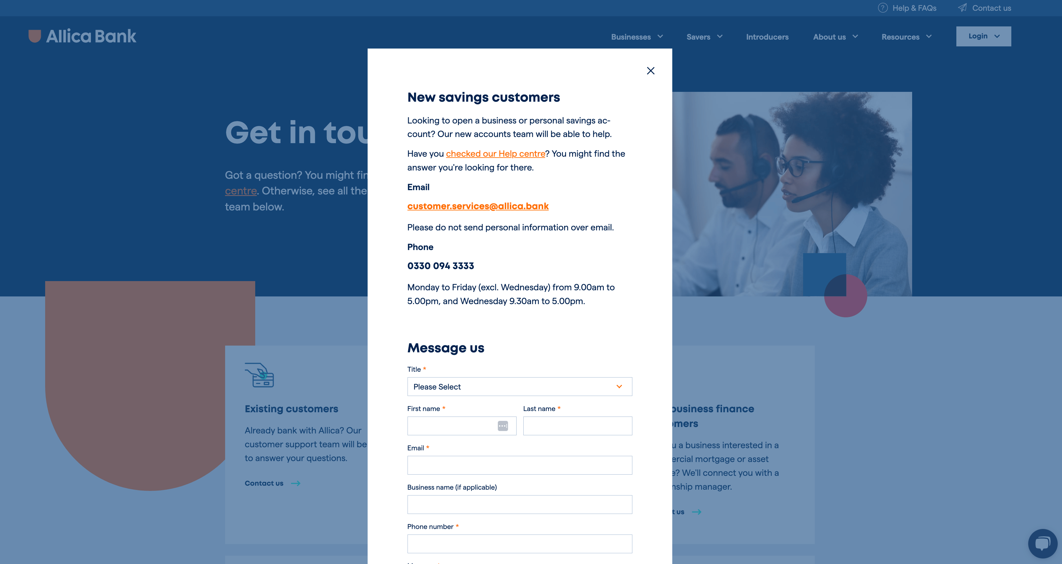
When you select an option, Allica Bank has forms that pop out in light boxes, making the contact experience even faster. Within the light boxes, they show different contact options and helpful information so that the user can choose their preferred method of contact.
2. Cognism
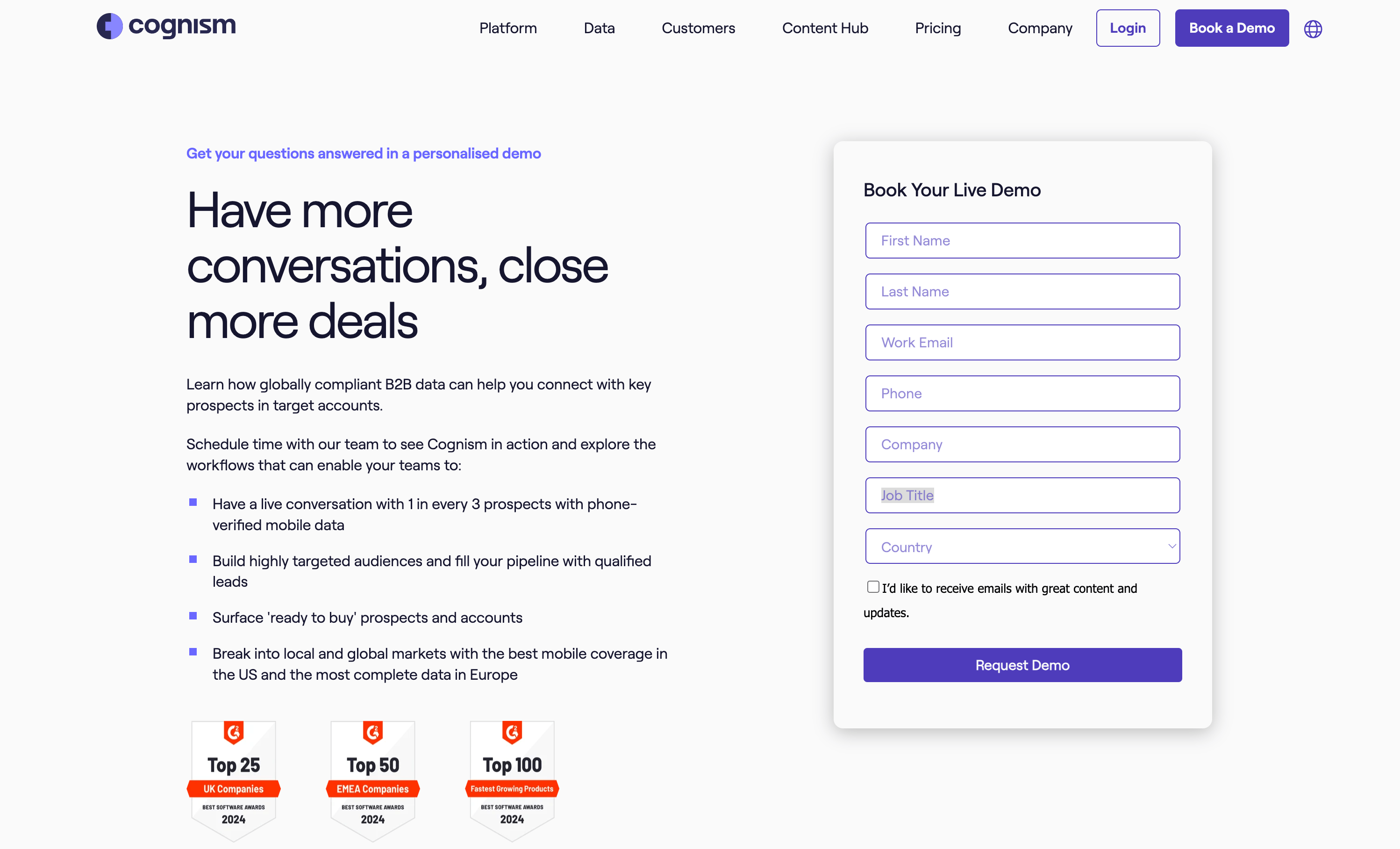
Cognism is a global sales intelligence provider, offering a comprehensive SaaS product to sales teams. As a product business, Cognism's primary contact method is a 'book a demo' page.
They use a conventional layout that's intuitive and instantly recognisable. The copy above the fold clearly states that the form is for booking a live, personalised demo. The bullet points outlining the benefits of their platform and social proof further encourage buyers to request a demo.
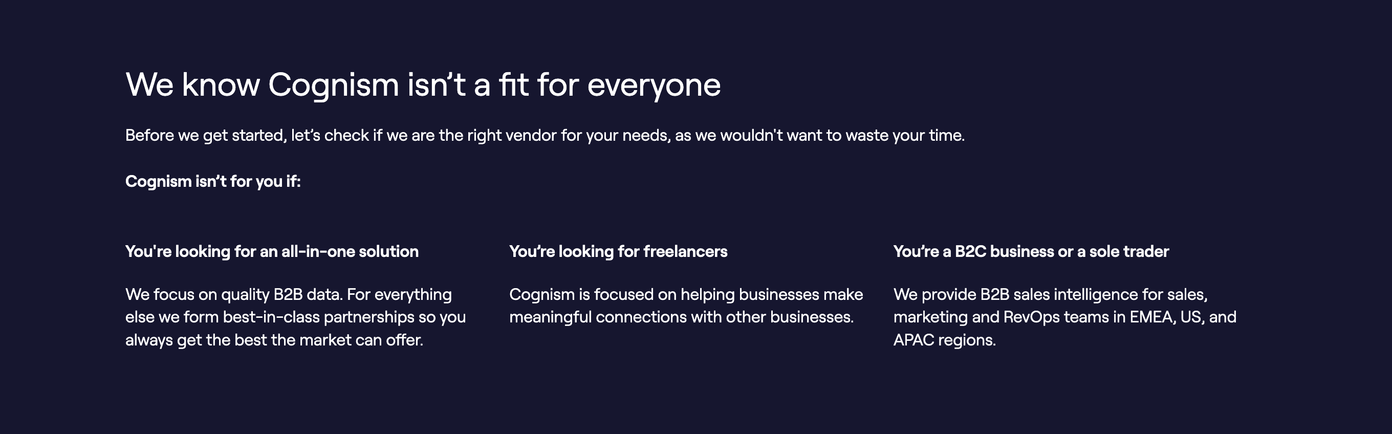
Just below the form, Cognism also includes a section to qualify leads by describing scenarios where Cognism might not be the best fit. This self-qualification approach helps filter out unqualified leads, resulting in higher-quality demo requests.
3. HubSpot
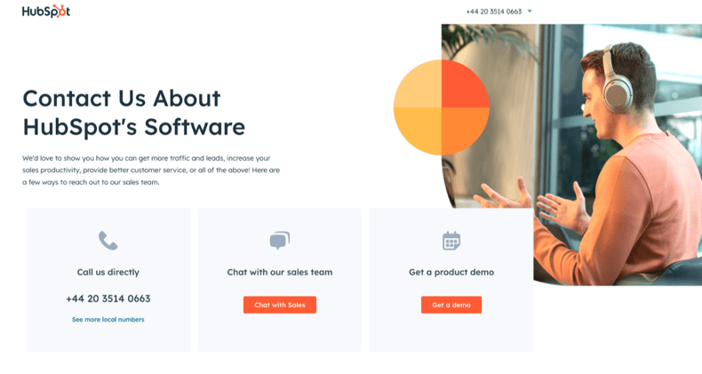
HubSpot is an all-in-one CRM solution offering sales, marketing, service, and operations products in a unified platform. They provide multiple contact methods, which their 'contact sales' page presents in a clear manner.
HubSpot appeals to different user preferences by offering various contact options, clearly showcased using recognisable iconography and distinct buttons. The phone number lightbox pop-out is particularly useful, displaying all possible contact numbers to reach HubSpot's sales team.
The well-organised presentation of multiple contact channels allows visitors to choose their preferred method of engagement, catering to preferences.
4. Datel
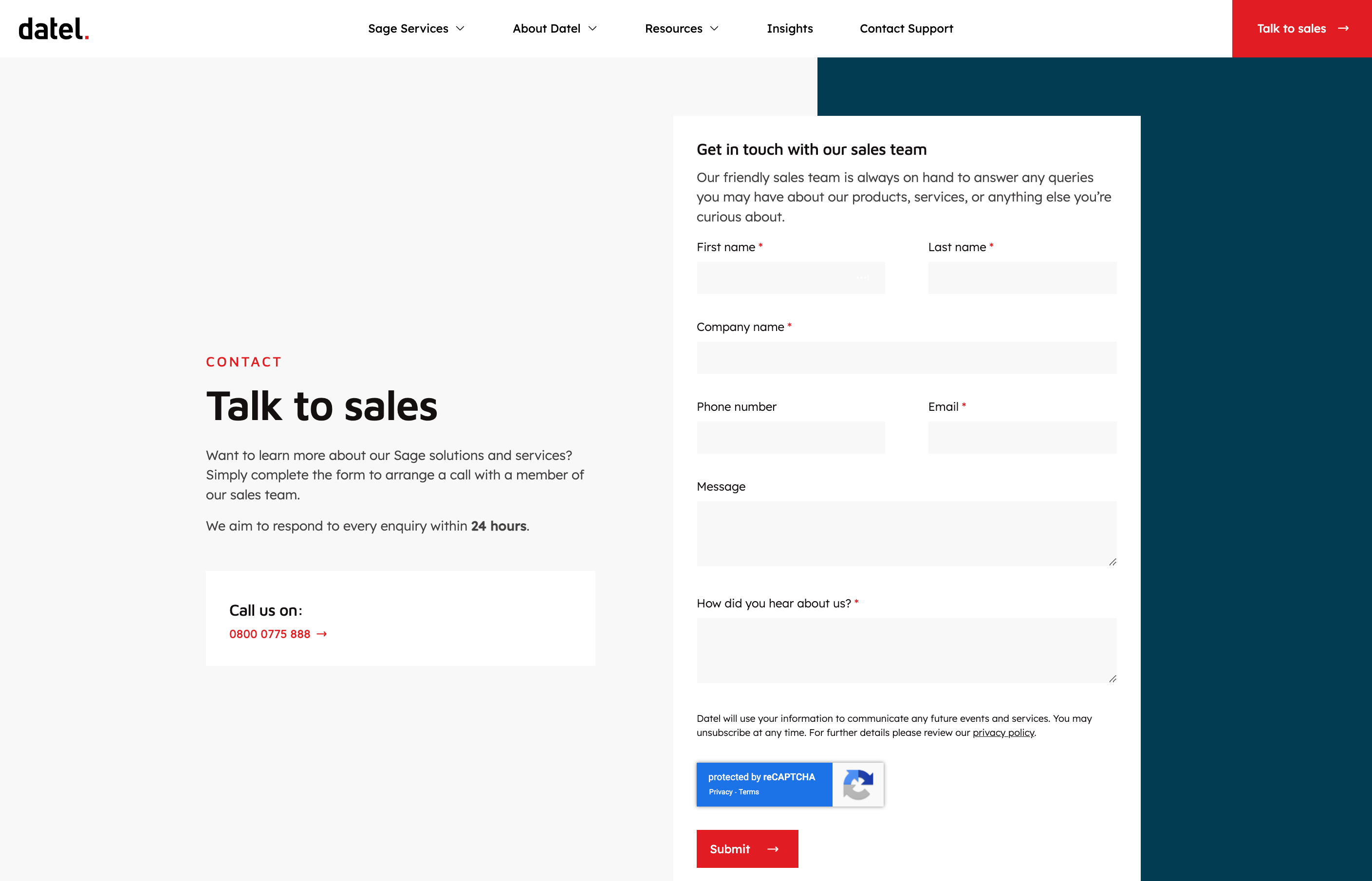
Datel, a Sage Business Partner, specialises in creating innovative software solutions. As a service-led business, Datel's website prominently features a 'talk to sales' call-to-action, leaving no ambiguity about the primary contact objective.
The page copy continues with the same clarity, explicitly stating that by submitting the form, visitors will be connected with Datel's sales team. This transparency sets immediate expectations for buyers about who will respond to their enquiry. Additionally, the copy mentions a standard 24-hour response time, ensuring buyers know when to expect a follow-up.
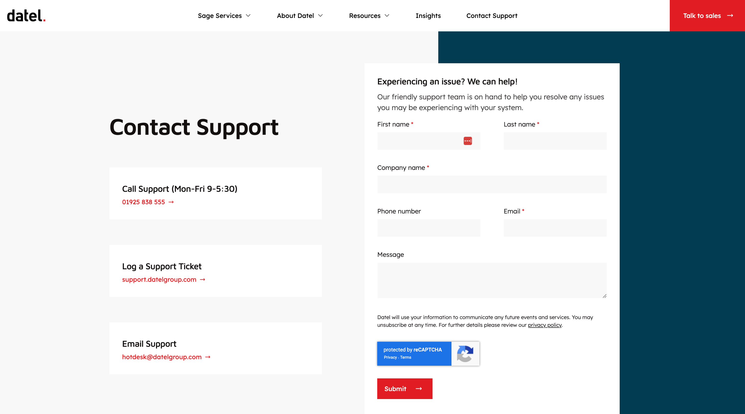
Recognising the distinct needs of new and existing customers, Datel has a separate page dedicated to customer support. This approach ensures an optimal experience for both audiences by catering to their unique journeys and requirements.
5. Slack
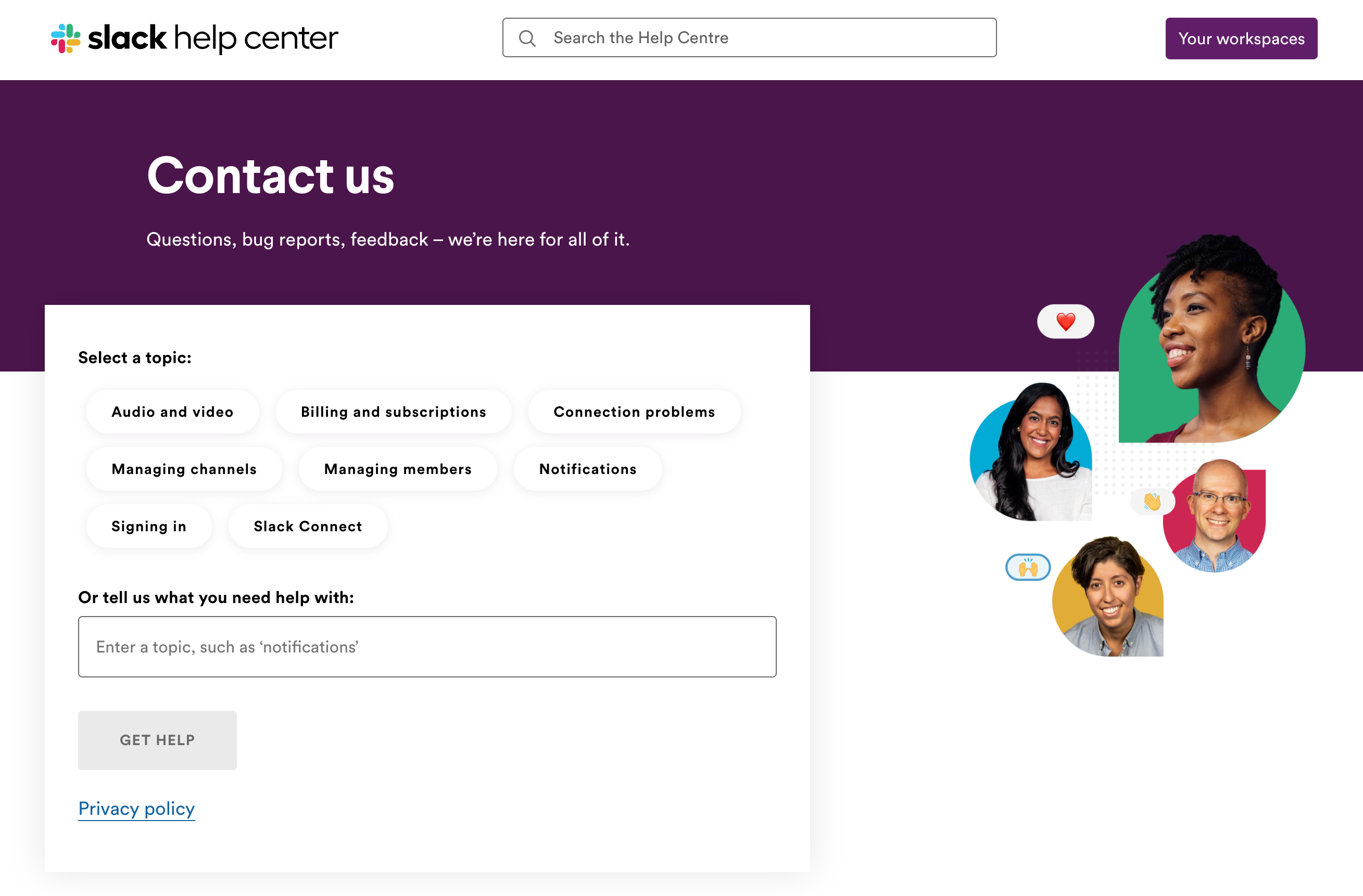
Slack, a leading business communication tool, has an intuitive contact page for existing customers. Their contact form helps users pinpoint the category of their inquiry before begining the process. Slack has compiled a list of the most popular contact topics, making it easy for users to choose the relevant subject matter. Additionally, they provide an open text field for inquiries that fall outside the pre-selected categories.
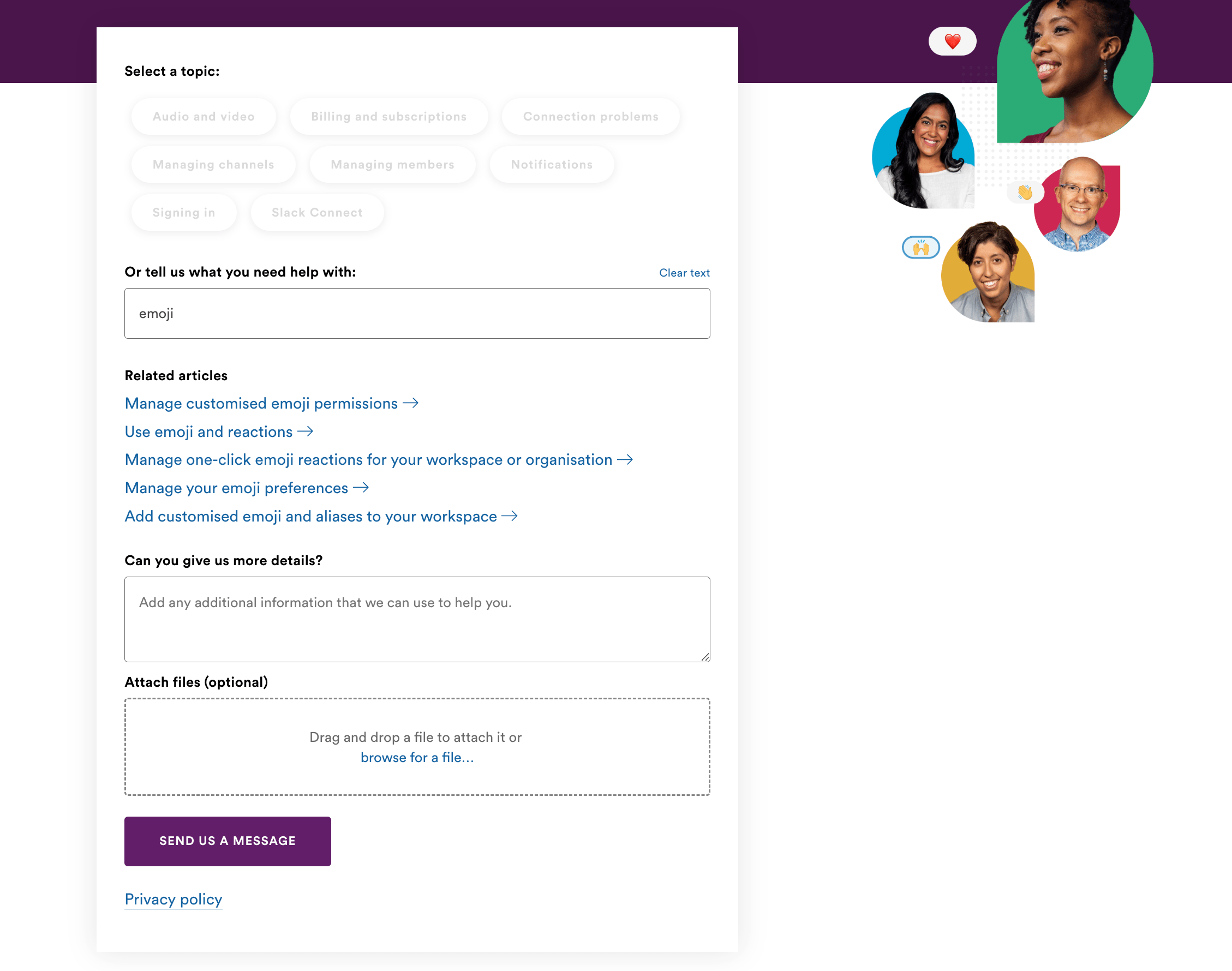
Unlike some platforms that try to push users towards their knowledge base, making it challenging to find contact details, Slack presents both options. When a user selects or types a topic, related knowledge base articles are surfaced to assist with that specific issue. But Slack also includes a simple contact form below, ensuring users can easily reach their support team if the knowledge base does not resolve their problem. This approach strikes a suitable balance between technology, structure, and user-friendliness without overcomplicated processes.
6. Blend
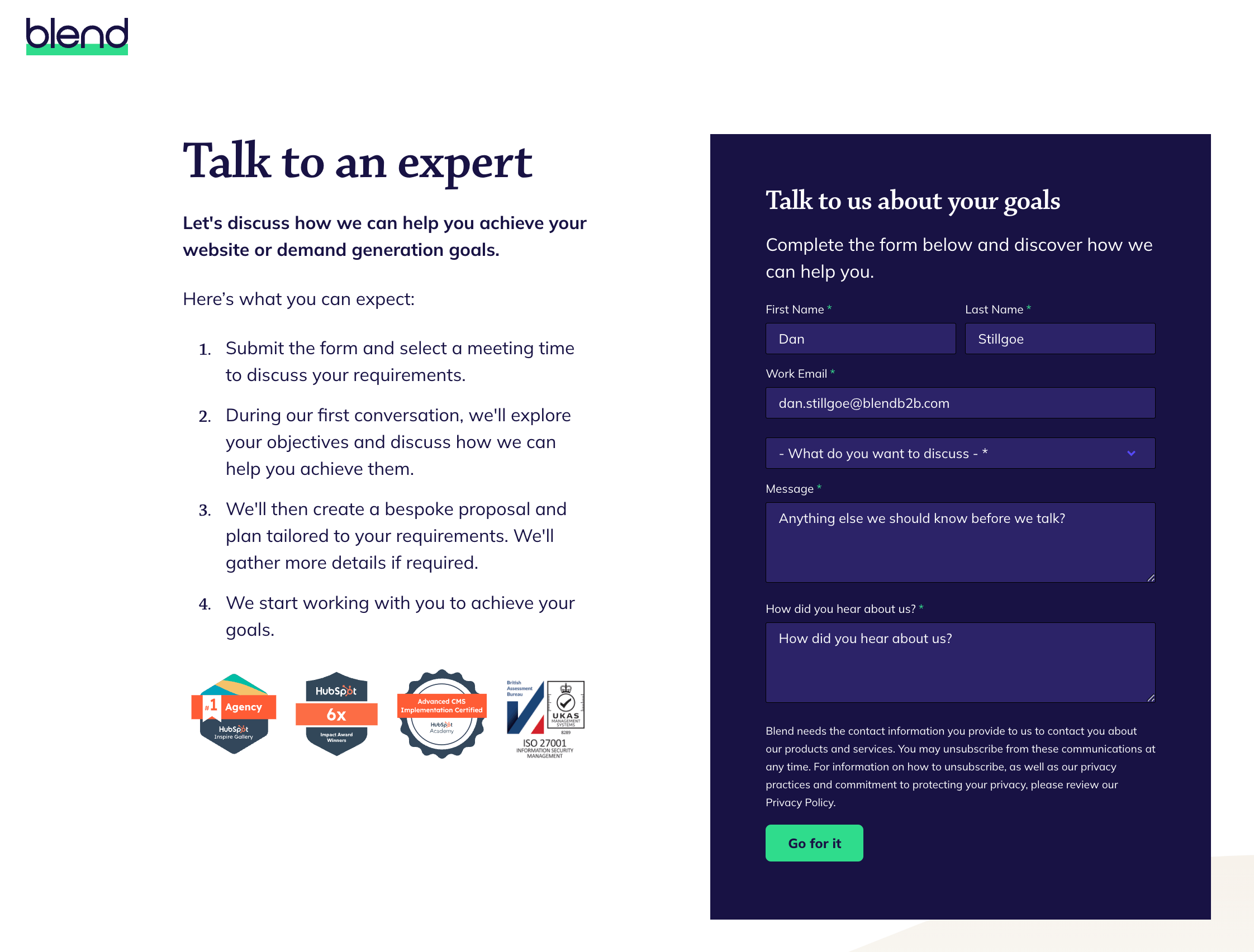
Blend (us) are a HubSpot website design agency, the primary goal of our website is to connect prospects with our team to discuss their requirements. We take a consultative approach to enquiries, which is reflected in the language we use "talk to an expert".
We clearly outline the process someone can expect to go through when working with us, setting expectations upfront by detailing the next steps after submitting the form. The social proof section below, displaying accreditations and recognition, positions us as a trusted partner and subject matter experts in our field, instilling confidence in prospects.
7. C.H.I Overhead Doors
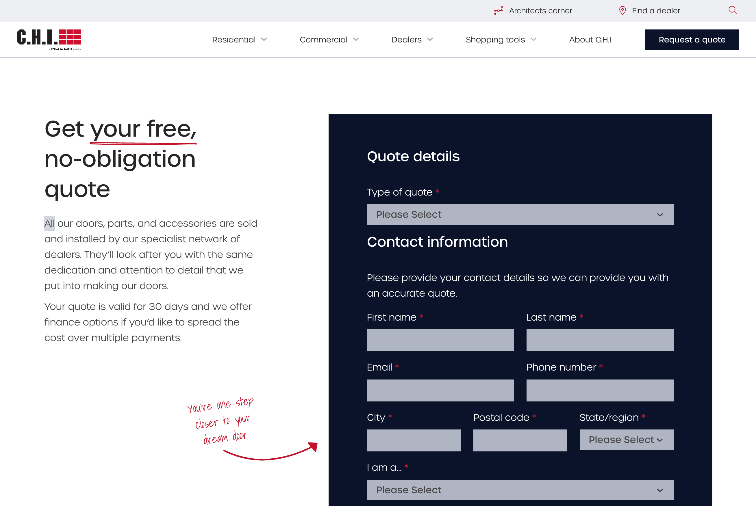
C.H.I Overhead Doors is a high-end garage door manufacturer. Their website's primary contact action is to request a quote, a natural next step for a business like theirs. C.H.I does not directly handle sales or installation of their products. Instead, they leverage their network of dealers for those services, a fact they clearly communicate upfront on their page.
The page design is simple and easy to digest, incorporating playful brand elements. Although the form is considerably lengthy, it uses different column widths strategically, minimising the overall perceived length.
8. Rainforest
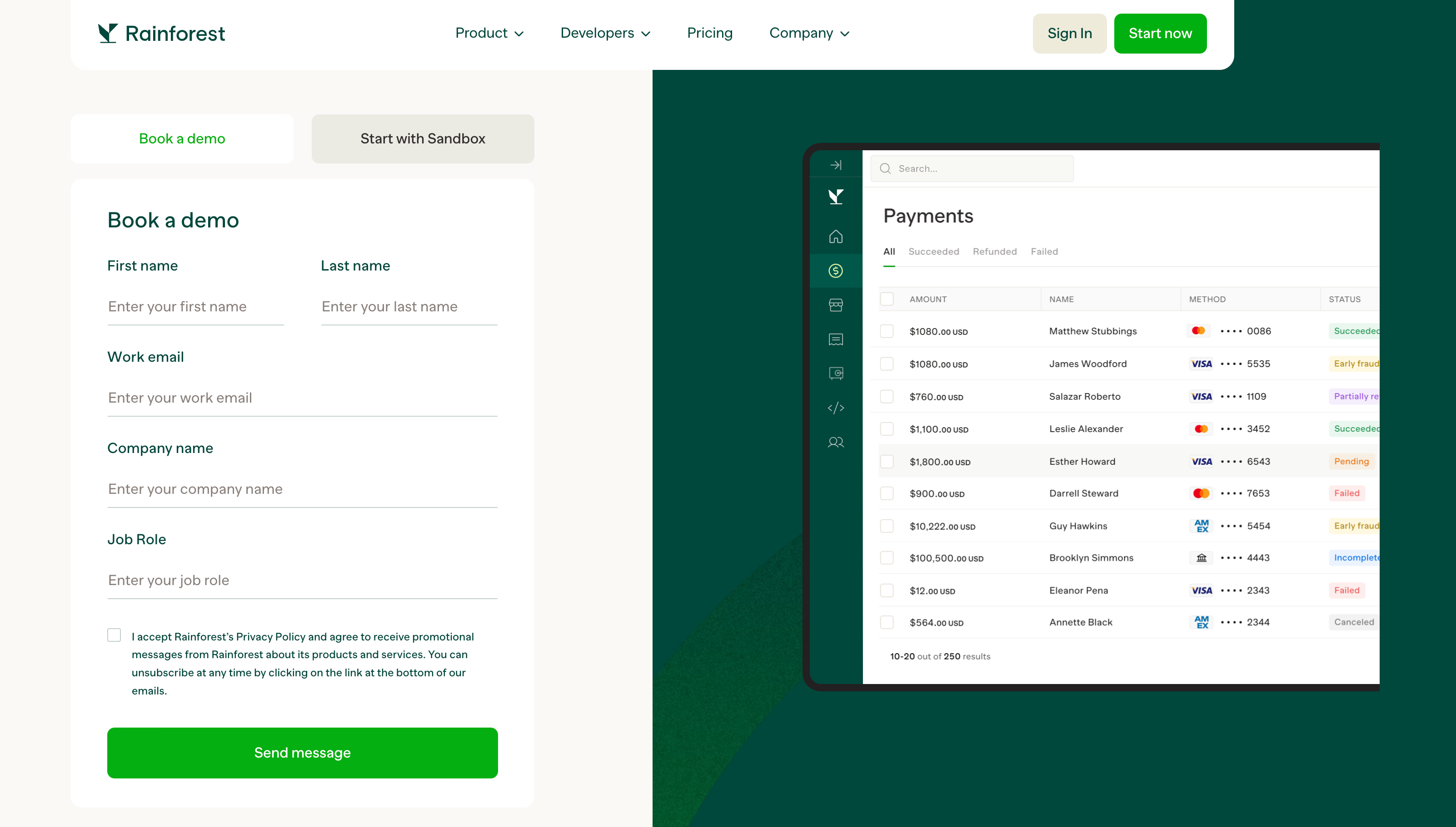
Rainforest Pay is a payment processing solution, and their contact page design offers great visuals and functionality. The animation clearly showcases the product, further reinforcing what users can expect from the platform.
Their website provides two methods to get started with their platform: 'Book a demo' or 'Start with Sandbox.' These options are cleverly presented through a tab interface, allowing buyers to choose their preferred approach seamlessly.
The combination of visually appealing animations and the user-friendly tab functionality creates an engaging and intuitive experience for visitors. By offering multiple entry points tailored to different preferences, Rainforest empowers potential customers to explore their solution in a manner that suits their needs and interests best.
9. Acre Security
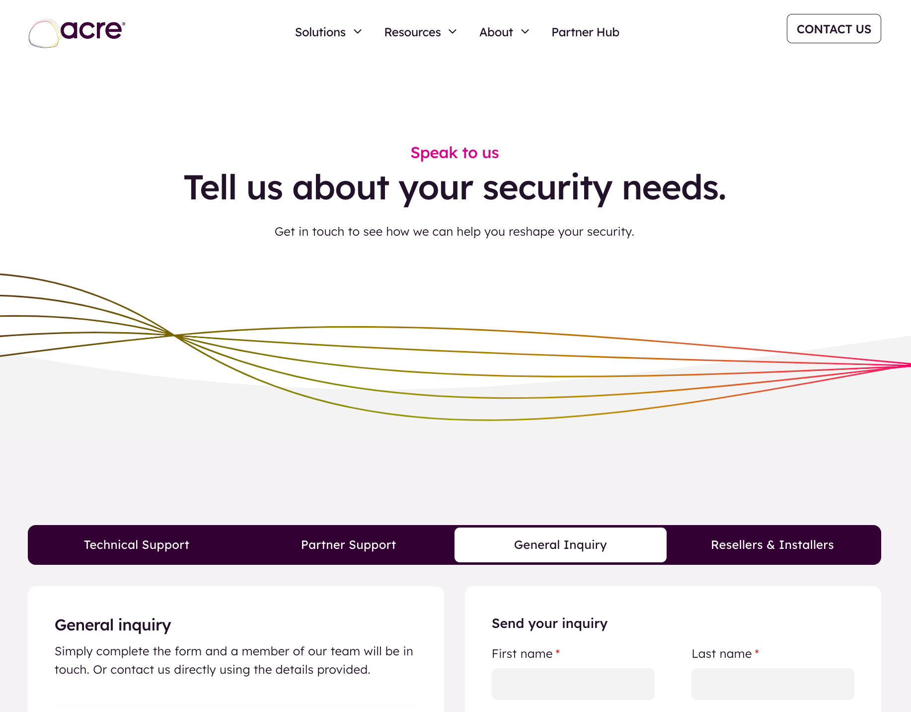
Acre Security provide leading security solutions to enterprise businesses. Their contact page serves multiple purposes, using tab functionality to display different information and forms based on the user's specific requirements. While tabbing functionality can sometimes go unnoticed, Acre Security presents it prominently above all other information, ensuring users clearly understand its intended use.
The multi-purpose nature of the contact page, combined with the intuitive tab interface, allows visitors to easily navigate and access the relevant information or form tailored to their needs.
10. Loxo
.png?width=2288&height=1490&name=loxo%20contact%20page%20design-min%20(1).png)
Loxo is a talent intelligence platform designed for recruiters. As a product-led growth SaaS business, their primary website call-to-action is to 'start free.' However, Loxo recognise the importance of providing an option for buyers to engage with their sales team too.
Loxo's 'Talk to Sales' page is particularly interesting as it includes a platform demo video alongside the contact form. Since Loxo follows a product-led approach, they don't mind if users choose to watch the demo and start a free account independently or watch the demo and then realise they have additional questions for the sales team. This setup is a clever way to guide users toward the path that best suits their needs.
Start generating more leads through your website
In today's landscape, an effective B2B website is crucial for generating qualified leads. While your contact page plays a small but vital role, consistently attracting quality leads requires your entire website to work harmoniously in creating an exceptional user experience for your buyers.
By ensuring that every touchpoint aligns with your buyers' needs and preferences, you can foster trust, credibility, and ultimately, conversions.