

Looking for tech website inspiration that's actually achievable? We've rounded up 15 outstanding tech websites from companies more like yours. From transport tech to AI tools, these sites nail the balance between striking design and practical UX. Discover what makes them effective and how you can apply these principles to your own website.
The best technology websites
It's tempting to check out the Apples and Microsofts of the world, and whilst they're certainly aspirational, they're hardly practical examples for most businesses.
So, we've curated a list of 15 remarkable tech websites from companies that might be more similar to yours. These sites balance striking design with practical functionality, demonstrating that you don't need Silicon Valley budgets to create an impressive online presence.
Each website offers unique lessons in effective web design, from AI tools to blockchain platforms, transport tech to clinical software. Several of these examples, were designed and developed by our team here at Blend, showcasing our expertise as a B2B website agency in creating high-performing websites for technology companies.
1. Transpoco

Transpoco's transport tech website is a masterclass in modern, vibrant design that brings their brand to life in creative yet functional ways.
The site cleverly extends their logo into light trails that not only add visual interest but actually reinforce their message about tracking and movement. This design element creates a unique visual identity while serving a narrative purpose—precisely what good design should do.
White space is used strategically throughout the site, giving content room to breathe and allowing key messages to stand out clearly. Their colour palette strikes that elusive balance between established professionalism and contemporary energy, blending solid colours with free-form gradients for a dynamic feel.
What's particularly impressive about Transpoco's site is how it marries creativity with usability. Despite its distinctive visual approach, the site remains intuitive to navigate, with information thoughtfully organised and easily accessible. It's a perfect example of how creative design can enhance rather than hinder the user experience.
2. Anthropic

Would a technology website list be complete without featuring some AI tools? Probably not in 2025.
Anthropic's website demonstrates the perfect balance between providing direct access to their AI tools and delivering a comprehensive website experience that clearly explains all available options. Their clean, minimal approach makes information incredibly easy to digest, crucial for a complex technology product.
As you explore deeper into the site, you'll find expertly presented visuals, primarily in the form of simple, effective animations. These elements do the heavy lifting of demonstrating how the tools work and highlighting key features that potential buyers are interested in. The balance struck here is impressive, visual elements enhance understanding without becoming distractions.
What could easily have become a cluttered showcase of technical capabilities is instead a masterfully edited experience. Anthropic shows remarkable restraint in their design choices, focusing only on what matters and presenting it with exceptional clarity. In the often overwhelming world of AI products, this clarity is refreshing and effective.
3. Robin Radar

Robin Radar Systems employs a dark-themed website that perfectly aligns with their high-tech offering while strengthening their brand identity.
From the moment visitors land on the homepage, they're greeted with a clear, concise value proposition that immediately helps first-time visitors understand if Robin Radar can address their specific needs. Adjacent to this statement is a custom image that visually represents their ability to detect various small objects, reinforcing their core capabilities without unnecessary words.
The solution pages deserve special mention for their thoughtful design. Each page utilises distinct imagery and clear headings to immediately identify the type of detection solution being presented, making it easy for visitors to find exactly what they're looking for.
Throughout the site, Robin Radar effectively uses a combination of large images, generous spacing, and bold typography to deliver key messages with impact. Brand elements are consistently applied across backgrounds and other areas, creating a cohesive look and feel that reinforces their identity at every turn.
4. Zapier

Zapier's website is a masterclass in simplifying complex information and guiding buyers on their journey. With a tool as extensive and versatile as Zapier, it would be easy for users to feel overwhelmed or lost.
Their clever website hierarchy, however, expertly guides users to information and use cases specifically relevant to their needs. The site manages to make an enormous product feel accessible and tailored to each individual visitor.
The visuals throughout the website are thoughtfully designed to incorporate product UI screenshots and other elements that demonstrate the platform in action. This approach helps visitors understand not just what Zapier does, but how it works in practice.
Perhaps most impressive is the navigation system. Despite the substantial product offering and numerous options, the mega navigation remains surprisingly intuitive thanks to clear iconography and a well-structured layout. It's a testament to how thoughtful design can make even the most complex products accessible.
5. Algorand

Algorand's website brilliantly reflects the cutting-edge nature of blockchain technology through striking, purposeful design choices. The homepage immediately captures attention with an impactful hero video that sets the tone for the entire experience.
Their digital grid design system creates visual continuity throughout the site, reinforcing the technological sophistication of their platform while providing a consistent framework for content. This systematic approach to design reflects the structured nature of blockchain itself.
A particularly thoughtful touch is the inclusion of light/dark mode toggles, showing clear consideration for their developer audience's preferences. Impressively, both modes maintain beautiful design standards rather than treating one as an afterthought. This technical sophistication combined with aesthetic excellence demonstrates how modern design can simultaneously serve both form and function without compromising either.
6. Jamie

Jamie's website thrives on bold messaging supported by immersive visuals. The scroll animation draws visitors into the experience while still adhering to fundamental UX principles, a balance that many sites struggle to achieve.
The colour theme is deployed strategically throughout the site, with purple serving as a salient point to draw the eye to key words and messages. This purposeful use of colour creates a visual hierarchy that guides visitors through the content in a natural, intuitive way.
Despite the technical complexity of Jamie's AI tool, the website presents use cases with remarkable simplicity and clarity. Product UI shots feature subtle animations that demonstrate functionality, while background elements include gentle movement that adds visual interest without becoming distracting.
Their pricing page exemplifies industry best practices, with clearly presented plans positioned above a feature comparison table. All information is logically structured and easily digestible, making the decision process straightforward for potential customers.
7. Second Nature

Second Nature's website demonstrates how to create a bold, energetic design that still delivers on functionality. Their use of vibrant colours in gradient waves to separate content sections provides a modern approach to page structure while naturally guiding users through information.
Product benefits are presented in uniquely contextual ways that enhance understanding. One standout example is the display of features on a door graphic that relates directly to their offering, a creative visualisation that makes technical concepts more accessible and memorable.
Their podcast section deserves particular mention, featuring custom illustrations and clear, user-friendly content presentation. This section proves that modern, distinctive design can actually enhance rather than hinder content consumption when executed thoughtfully.
Overall, Second Nature shows that vibrancy and functionality aren't mutually exclusive, when thoughtfully implemented, bold design choices can create a more engaging and effective user experience.
8. Viedoc

Viedoc's website demonstrates modern minimalism in the clinical technology sector. Their design employs subtle gradients and generous white space to create a fresh, contemporary feel that sets them apart in an industry often dominated by cluttered, overly technical presentations.
This minimalist approach perfectly complements their clinical software offering, using modern typography and carefully curated product imagery to showcase their technology without overwhelming the visitor. Rather than bombarding users with complex feature lists, the website maintains a clean brand presentation that effectively communicates their message with clarity and purpose.
The addition of a dark mode option demonstrates awareness of modern user preferences, particularly important for software products where users often prefer lower-light environments. This thoughtful feature shows attention to detail and consideration for how their audience actually uses technology, a fitting quality for a tech company's website.
9. Framework

Framework's website exudes a trendy, cool aesthetic that perfectly aligns with their product positioning. Their approach feels distinctly different from typical tech websites, creating an immediate brand differentiation that appeals to their target audience.
Muted background colours create a clean, sophisticated feel while complementing their products beautifully. Large, high-quality imagery showcases their offerings in a premium way that elevates the perception of their brand.
What truly sets Framework apart is their presentation of technology with distinctly non-technical visual elements. Hand-drawn arrows and paint splodges used to highlight colour options create a hipster, artisanal feel that contrasts sharply with the sterile approach many tech companies take. This deliberate design choice positions them as approachable and creative, qualities that resonate with their specific market segment.
10. Equiem
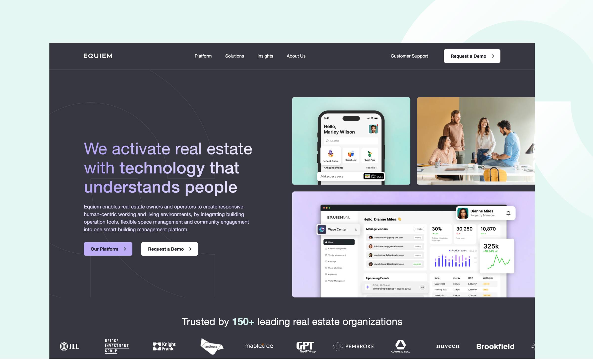
Equiem's website sets a new standard for tech website design. Their brand identity shines through elegant typography featuring a purple-to-white gradient that adds depth without overwhelming the content—a delicate balance many sites fail to achieve.
The site excels in presenting product features, using contemporary device frames to showcase their user interface with exceptional clarity and professionalism. This approach gives visitors a genuine understanding of the product experience without requiring them to sign up or book a demo first.
What makes this design particularly effective is its thoughtful balance of product and lifestyle imagery. Key features are highlighted in modern, clean layouts, while carefully selected photography maintains a human connection that reminds visitors of the real-world impact of their technology.
Interactive elements like tab modules help condense complex information into digestible formats, while branded background elements create a cohesive, unique experience that reinforces their identity throughout the user journey.
11. FT Technologies

FT Technologies uses a high-end video background on their homepage that showcases their innovative products while maintaining a clean, modern aesthetic. This dynamic element immediately communicates sophistication without sacrificing usability.
The website masterfully balances engaging content with ample white space, creating a fresh and sophisticated user experience that allows technical information to be presented without overwhelming the visitor. This breathing room is particularly important for complex technological products.
Their product presentations exemplify modern design principles, using clean layouts and thoughtful spacing to highlight key features effectively. This approach ensures that complex technical information remains accessible and engaging, demonstrating how modern design can enhance rather than hinder product understanding.
What's particularly impressive is how the site maintains visual interest while adhering to minimalist principles—proof that restraint and engagement aren't mutually exclusive in web design.
12. N-Zyte
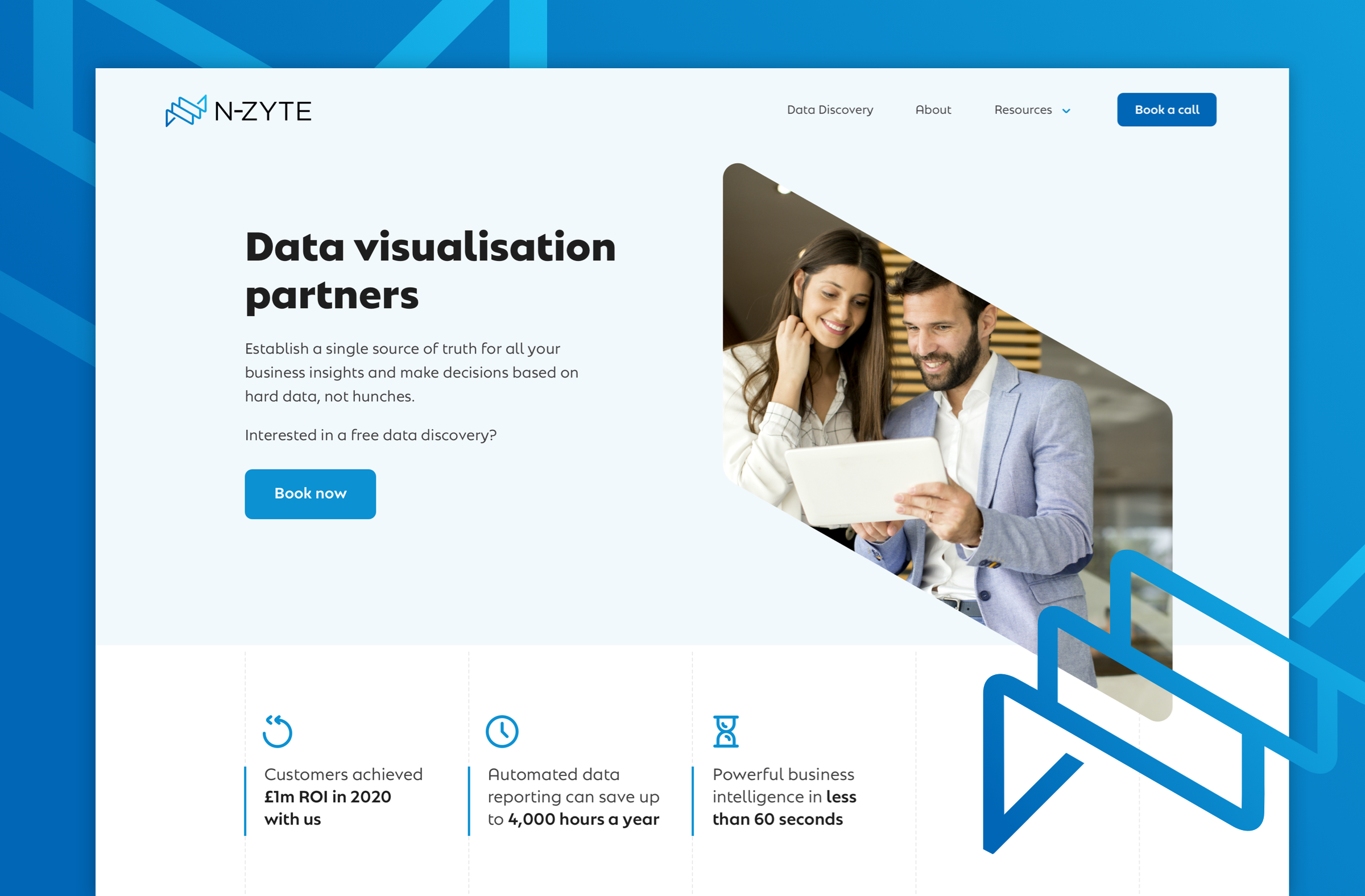
N-Zyte's website embodies the principle that simplicity, when executed with intention, can be remarkably effective. Their straightforward approach focuses on essential elements without extraneous features or content that could distract from their core message.
Despite employing a simple colour scheme, the site creates visual interest through clever image masks that incorporate their logo shape. The logo itself appears behind different elements throughout the site, creating depth and dimension without complexity.
This startup website ticks all the essential boxes without adding unnecessary complications. It presents exactly what visitors need to know in a clear, clean, and modern way, an important reminder that effectiveness doesn't always require elaborate design or extensive features.
For growing tech companies with limited resources, N-Zyte demonstrates that thoughtful simplicity can create a professional, compelling online presence without requiring enormous design budgets.
13. CoLab

CoLab's website immediately impresses with its crystal-clear value proposition displayed alongside high-quality UI shots that demonstrate their product in action. Their strategic use of salient colours in CTAs creates effective contrast against the dark theme, guiding visitors' attention exactly where it needs to go.
The site features numerous UI showcases that vividly demonstrate the product, but importantly, these aren't standard screenshots. Instead, they're carefully designed, high-end visual representations that elevate the perception of the product while maintaining clarity.
A particularly effective design choice is the thoughtful alternation between dark and light backgrounds depending on the information being presented. Light backgrounds are typically employed for deeper, more detailed information where readability is paramount, a subtle but important consideration that shows genuine understanding of user experience principles.
14. Partful

Partful's website features a truly distinctive homepage hero design, with angled boxes that echo the cut of their logo. The animation alongside their clear value proposition is immersive and cleverly showcases the "exploding" nature of their product, a visual representation that explains the concept more effectively than words alone could.
A particularly effective element is their before/after slider that tangibly demonstrates the value of their product compared to traditional approaches. This interactive feature transforms an abstract benefit into a concrete, visual comparison that immediately communicates their unique selling proposition.
Image masks throughout the website create a unique visual identity, moving beyond classic full-hero layouts to use angles derived from their logo to frame images. Their signature orange colour is deployed strategically for CTAs and key words, creating visual focal points that guide the user journey.
The interactive demo tour is especially noteworthy, giving potential buyers a comprehensive sense of the product before they're ready to engage with sales. This self-directed exploration option acknowledges the modern buyer's preference for independent research before human interaction.
15. Clay

Clay's website stands out for its ability to embrace their distinctive "fairy garden" branding while maintaining a thoroughly professional presentation. This balancing act creates a memorable experience that differentiates them from competitors without sacrificing credibility.
The site feels clean and fresh without skimping on information, a common pitfall when aiming for a minimalist aesthetic. Their distinctive brand embellishments, like decorative flowers, create a unique feel while still allowing product imagery and information to take centre stage when needed.
What makes Clay particularly noteworthy is how confidently they deviate from typical industry conventions. In a sector where websites often look interchangeable, their distinctive approach creates immediate brand recognition and memorability without compromising functionality.
What makes an effective technology website?
Looking across these 15 outstanding examples, several common elements emerge that contribute to effective technology website design.
Clear, concise value proposition
Every successful tech website features a straightforward value proposition that immediately communicates what the company does and why it matters. This clarity helps visitors quickly determine if the solution is relevant to their needs, reducing bounce rates and improving engagement.
Thoughtfully presented features and benefits
Rather than overwhelming visitors with exhaustive feature lists, the best tech websites present capabilities in contextual, easily digestible ways. They focus on benefits rather than specifications and use visual elements to enhance understanding.
Strategic use of product imagery
Effective tech websites incorporate product screenshots and interfaces thoughtfully, helping visitors visualise the actual user experience. These visual elements are typically enhanced rather than raw, presented in device frames, with subtle animations, or with highlighting to guide focus.
Unique brand expression with intuitive UX
The most memorable sites successfully balance distinctive brand elements with intuitive navigation and information architecture. They create visual differentiation without sacrificing usability, ensuring the site remains functional while still expressing brand personality.
Creating your own standout tech website
While these examples showcase different approaches to tech website design, they all demonstrate that effective digital presence doesn't require enormous budgets or massive teams. The key is thoughtful execution that prioritises user needs while expressing your unique brand identity.
As you consider your own tech website, focus on clarity first, ensure visitors can immediately understand what you offer and why it matters. Then, look for opportunities to incorporate distinctive design elements that reflect your brand personality without compromising usability.
Remember that the most effective websites aren't just visually impressive, they're strategic tools that guide visitors toward meaningful actions. By balancing aesthetic considerations with functional requirements, you can create a tech website that not only looks good but actively supports your business goals.


