

Visitors to your website expect their user journey to be just as easy on their phone as it is on their desktop. Completing a purchase, downloading content, or getting in touch with you should be straightforward, regardless of device.
With nearly 55% of global website traffic generated via mobile devices, marketers need to remember mobile visitors when designing their website.
“Embracing the mobile mindset means ensuring that the entire customer journey is responsive, relevant, actionable, and frictionless” HubSpot
What is mobile optimisation?
Mobile optimisation is when you investigate your site structure, page speed, and site design through the lens of your mobile users. It allows you to create a smooth user experience for every visitor, regardless of device.
4 tips for optimising your website for mobile
1. Choose a responsive design
2. Optimise your images
3. Use lazy loading
4. Test your website

1. Choose a responsive design
It may sound simple, but a well-designed, responsive website always considers the mobile experience.
A responsive website design adjusts to different screen sizes and stays consistent regardless of the device you're using.
At Blend, there are a few considerations we always make:
-
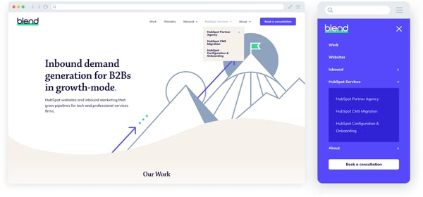
Navigation
Mobile screens are much smaller than desktops or laptops. This makes it trickier for the user to move from page to page. That's why it's best to make your mobile menu as short and as accessible as possible.
Now, you probably already know what a hamburger menu is, even if the term is unfamiliar. A crucial addition to every responsive website, hamburger menus collapse depending on the size of the screen it’s being viewed on.
Hamburger menus vary very little in design which means they're instantly recognisable, creating a smoother user journey.
- Collapse content into one column
Have you ever read a blog on your mobile and scrolled over two columns? Too much scrolling can quickly put your visitors off your website. It should make life easier for its visitors, not harder. Design your website to be responsive, so that content collapses into one column when it’s viewed on a mobile.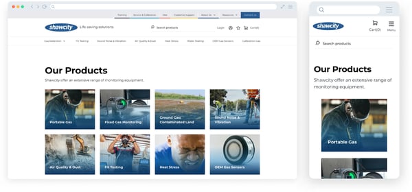
- Are your CTAs big enough?
Your calls-to-action (CTAs) are a crucial element of your website. They direct your visitors around your website and act as instructions for what you want them to do next. Strong CTAs keep your visitors on your website longer and help convert them to leads.
And although it might sound obvious, CTAs need to be easy to click on a small screen. Otherwise, navigating around your website will be difficult and you risk losing potential leads. Or as Moz eloquently puts it “design for the fat finger”.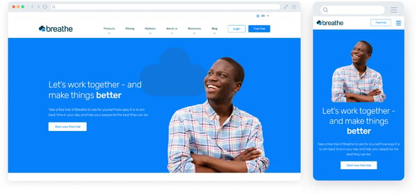
- Consider your forms
Keep your mobile visitors in mind when designing your forms. Forms can be tricky to fill out on mobile devices compared to on a computer, so make them as easy as possible to use.
Carefully consider every field you include - do they all really need to be there? Keep only what's truly necessary so you don't lose any potential conversions. You can always opt for tick boxes or dropdowns to make the process even easier. - Say no to pop-ups
Pop-ups are annoying. And they are never more annoying than on a mobile device, when they block the entire page you're trying to view, forcing you to scroll desperately to find the X to close it. By which time, you've forgotten why you were on the page in the first place.
Pop-ups on mobile devices only serve to disrupt and annoy your visitors, and Google will penalise you for it. Avoid them altogether if you can, and opt for CTAs that lead to landing pages instead.
2. Optimise your images
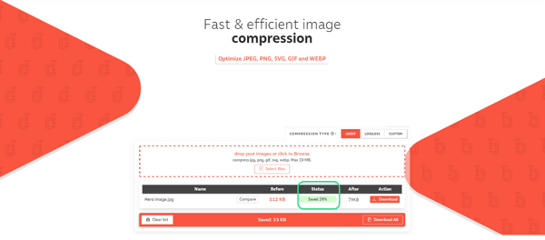
Images are essential for a vibrant, engaging website. But the reality is, your images don't need to be of print quality - that level of detail doesn't render online. However, if you have lots of images, they can soon take up a lot of space on your server, and slow down your website.
To combat this, make sure your images are correctly sized for mobile. Compress all your images before uploading them to reduce file size and maintain your website’s speed. There are lots of free tools online you can use to do this - we like Compressor, but Compress JPG and Tiny PNG are good alternatives too.
3. Use lazy loading
Time is of the essence when it comes to grabbing a web visitor’s attention. Nothing turns people away faster than a slow site.
If your web pages have a lot of content with images and videos, it can dramatically slow down the website’s load time.
Lazy loading is an excellent solution to avoid this problem whilst not losing any of your content. With lazy loading, only required content appears. So, as the visitor scrolls down a page, the content appears, showing only a fraction of the content at a time. This helps decrease page load times.
Accelerated Mobile Pages (AMP) are stripped-down HTML versions of your webpages. But, as Google no longer prioritises websites with AMPs, we wouldn’t recommend using them.
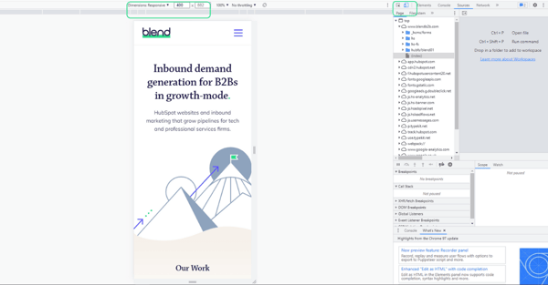
4. Test your website
Test your website to understand how it looks on different mobile devices. Our developers use Chrome Devtools.
Devtools allows you to identify problems in the HTML and adjust styling easily before altering the actual code. You can alter the dimensions of the window so you know when to change it to responsive. And, you can resize the browser window manually to see different breakpoints, or choose specific preloaded breakpoints i.e. iPhone XR, iPad Air, etc.
A breakpoint is a set point in pixels where the content will respond differently i.e., at 992px we’d recommend dropping from a normal desktop-nav to a mobile-nav with a hamburger menu.
Google Analytics will also provide you with specific data related to your visitor’s mobile behaviour.
Embrace the mobile experience of your visitors
Mobile web traffic has accounted for nearly half of all global web traffic since the beginning of 2017. This trend shows no signs of slowing down - 64% of SEO marketers think mobile optimisation is an effective investment.
By creating a smooth user experience on every device, traffic, time spent on your website, and lead generation will all increase. So if you’re not yet thinking about mobile optimisation, now is the time.


