

Ready to create a healthcare website that builds trust and converts?
Speak with our team to discover how we can help you build a website that demonstrates your medical expertise and turns visitors into qualified prospects.
Creating effective healthcare websites requires balancing clinical credibility and regulatory compliance with warm, human experiences that build trust with anxious patients and demanding healthcare professionals alike.
The best healthcare websites achieve this by combining clear, jargon-free communication with sophisticated design that reflects their expertise without intimidating their audience. They understand that whether you're a pharmaceutical company, medical device manufacturer, or healthcare software provider, your website needs to inspire confidence whilst remaining genuinely helpful.
We've curated 6 exceptional healthcare websites that demonstrate what works in this demanding sector. From patient engagement platforms to clinical trial software, these sites prove that healthcare companies can create distinctive, effective online presences without sacrificing the trust and authority essential to the sector.
Let's be transparent upfront: four of these websites were designed by our team at Blend. We're including them because we have genuine insights into what works in healthcare web design and the strategic thinking behind effective solutions. The Blend projects are clearly marked, but every example here has been chosen because it demonstrates exceptional healthcare web design.
.jpg?width=2400&height=1535&name=DrDoctor-Homepage-1%20(1).jpg)
DrDoctor's website brilliantly balances clinical credibility with approachable design. The fresh green primary colour creates a calming, healthcare-appropriate feel whilst purple accents add depth and sophistication, distinguishing them from the sea of blue-dominated medical websites.
What makes this site particularly effective is how their distinctive brush stroke brand elements are woven throughout the experience. These organic shapes appear as textured backgrounds, visual dividers between sections, and subtle interactive details that create movement without distraction. The beauty lies in the variation; each page deploys these elements differently, maintaining brand cohesion whilst avoiding repetitive design patterns.
Layered backgrounds and strategic gradients do more than look attractive; they serve a functional purpose by helping visitors distinguish between patient-focused content and technical product information. Healthcare professionals researching the platform can quickly identify the sections most relevant to their needs.

Viedoc's website demonstrates how clinical trial software can look sophisticated without being intimidating. The clean, modern design builds on Viedoc's established brand identity whilst presenting their platform through high-quality software imagery that helps potential buyers evaluate the solution effectively.
Information architecture was clearly a priority. Content is organised logically, making it straightforward for visitors to find exactly what they're looking for, whether that's specific features, pricing information, or technical documentation. This clarity is particularly important in clinical trial software, where buyers need to assess complex functionality quickly.
The comprehensive mega menu addresses a critical usability challenge. Rather than forcing visitors to hunt through multiple pages, it provides intuitive pathways to relevant content, recognising that different audiences have distinct information needs. The navigation structure helps each group reach their target content efficiently without wading through irrelevant sections.

Labguru's website brings vibrant energy to laboratory management software through bold design choices. The bright gradients flowing from yellow through to purple create a contemporary, dynamic feel that breaks away from the conservative palettes dominating the scientific software sector.
Eye-catching product visuals showcase the platform effectively, with animated demonstrations that bring the software to life. These animations highlight the platform's ease of use, showing visitors exactly how straightforward laboratory management can be rather than simply claiming it. This transparent approach builds trust, potential customers can see the software in action before booking a demo.
The site successfully balances visual appeal with the scientific credibility that laboratory professionals expect. The vibrant design doesn't compromise functionality or technical depth. Instead, it makes complex laboratory management concepts more approachable without oversimplifying them.
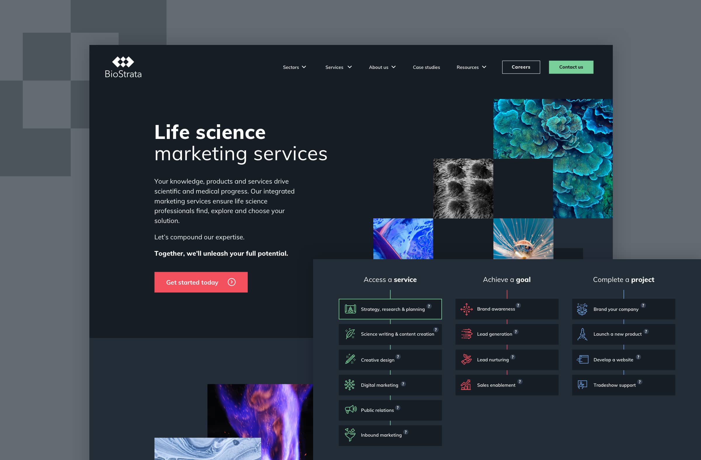
Biostrata's website positions them as premium life science marketing specialists through sophisticated design choices that balance scientific credibility with creative flair. The dark theming and grey colour palette create a contemporary, professional atmosphere whilst maintaining the authority their scientific clients expect.
The hero section immediately captures attention through interactive animation that responds to mouse movement, adding a layer of engagement without overwhelming visitors. This subtle interactivity reflects the innovation Biostrata brings to life science marketing.
Throughout the site, abstract imagery enhances the scientific aspect of their brand whilst establishing their unique identity. The tree diagram format cleverly visualises their comprehensive service offerings, making it easy to understand their full capabilities at a glance whilst reinforcing their systematic approach to marketing strategy.

Zocdoc's website takes a bold stance against healthcare's blue-dominated visual landscape by embracing a bright yellow as its primary colour. This confident choice immediately differentiates them whilst creating a warm, approachable feel that reduces anxiety around booking medical appointments.
The clean, search-centric design puts finding and booking healthcare providers front and centre. A prominent search bar dominates the homepage, recognising that most visitors arrive with a specific need, they're looking for a doctor, and they want to find one quickly. The interface removes unnecessary friction from this process. Simple, friendly illustrations throughout the site humanise the healthcare experience. Rather than relying on stock medical photography or sterile clinical imagery, these playful illustrations make the booking process feel less intimidating.

Athenahealth's website demonstrates how clean design can effectively communicate complex healthcare software capabilities. The hero video immediately establishes their human-centred approach by showing doctors genuinely helping patients. This sets the tone for the entire experience, reinforcing that despite being a technology company, Athenahealth ultimately exists to support better patient care.
Subtle scroll animations add polish and guide attention without becoming distracting. The animations feel purposeful rather than decorative, drawing the eye to key messages and creating a sense of progression as visitors move through content. This restraint is particularly important in healthcare, where overly animated interfaces can feel gimmicky rather than trustworthy.
Looking across these six exceptional examples, several common elements emerge that separate effective healthcare websites from the generic masses.
The best healthcare sites establish credibility without resorting to the tired corporate blue template that dominates the sector. They recognise that trust comes from clear communication, genuine expertise, and transparent approach rather than just looking "serious."
Effective sites use social proof strategically, customer logos, case studies with real data, certifications, and industry recognition. But they present this evidence naturally within the user journey rather than cramming it all onto the homepage in a desperate bid for credibility.
Colour choices matter enormously in healthcare. Whilst blues and greens remain popular for their associations with trust and wellness, the best sites choose specific shades that feel contemporary rather than corporate. Labguru's vibrant gradients, Zocdoc's bright yellow, and Viedoc's clean presentation all convey professionalism without the stuffiness of traditional healthcare palettes.
Healthcare is inherently technical, but the best websites make complex concepts accessible without oversimplifying. They use progressive disclosure, allowing technical buyers to dive deep whilst business stakeholders can grasp core value propositions quickly.
Visual elements, diagrams, product UI screenshots, data visualisations, work alongside clear copy to explain how healthcare solutions actually work. High-quality software imagery and animated demonstrations show platforms in action rather than hiding behind abstract marketing language.
Animation serves a purpose beyond aesthetics. Subtle movements draw attention to key features, demonstrate product functionality, or simply create a polished, premium feel. The key is restraint; healthcare websites that over-animate can feel gimmicky rather than trustworthy. Purposeful animation that guides without distracting exemplifies this balanced approach.
Standing out in healthcare requires confident brand choices. Distinctive visual identities, whether through sophisticated dark theming or bold, optimistic colour palettes, create immediate recognition and differentiation in a crowded sector.
But brand identity extends beyond colour and imagery. Typography, navigation structure, content tone, and even the types of photography used all contribute to creating memorable experiences that reflect company values and resonate with target audiences.
The best healthcare websites maintain visual consistency without becoming monotonous. Repeated brand elements create coherence whilst thoughtful variations prevent repetitiveness, ensuring the brand feels cohesive yet dynamic throughout the user journey.
The best healthcare sites recognise that different visitors have different needs. Effective navigation structures acknowledge this diversity, providing clear paths for different audience segments without creating confusing maze-like experiences. Whether through mega menus, audience-specific sections, or thoughtful page architecture, these sites make it easy to find relevant information quickly.
Comprehensive navigation that organises content by audience type solves this challenge elegantly without forcing visitors through irrelevant sections. The key is understanding user intent and creating pathways that match how different audiences actually think about their needs.
The best sites show rather than tell, using product UI screenshots, interactive demos, video walkthroughs, and specific use cases to demonstrate actual capabilities. This approach builds genuine confidence. When potential customers can see your platform in action and understand exactly how it works, trust develops naturally without requiring aggressive sales tactics.
Video content should demonstrate real functionality rather than serving as glorified advertisements. Hero videos showing healthcare professionals genuinely helping patients reinforce a human-centred mission whilst remaining authentic rather than overly produced.
Accessibility isn't optional in healthcare, it's essential. Sites serving medical audiences must work for users with visual impairments, motor difficulties, or cognitive differences. This means proper heading structures, sufficient colour contrast, keyboard navigation support, and screen reader compatibility.
Performance impacts more than user experience. Page speed affects SEO rankings, conversion rates, and overall perception of your brand. In healthcare, where trust is paramount, a slow or buggy website raises questions about your organisation's capabilities.
Your marketing budget shouldn't be consumed by managing server infrastructure, security patches, and technical maintenance. It's better invested in creating effective, trust-building experiences that generate qualified pipeline.
That's why HubSpot Content Hub is ideal for healthcare websites. HubSpot handles technical infrastructure, security, and performance, whilst providing powerful development and editing capabilities that let you create sophisticated, high-performing websites without IT headaches.
For healthcare companies, this is particularly valuable. Your website demonstrates your commitment to security and reliability through its very infrastructure. HubSpot's enterprise-grade security, compliance certifications, and robust hosting inspire confidence whilst freeing your team to focus on content and conversion optimisation.
The most effective healthcare websites balance credibility with distinction, technical depth with accessibility, and sophistication with usability. They recognise that healthcare buyers are researching thoroughly before engaging, so they provide genuine value through clear information and a transparent approach.
Whether you're redesigning an existing site or building from scratch, focus on demonstrating expertise through clear communication rather than trying to appear serious through generic corporate design. The examples here prove that healthcare websites can be both trustworthy and distinctive, professional and approachable, technically sophisticated and genuinely helpful.
Speak with our team to discover how we can help you build a website that demonstrates your medical expertise and turns visitors into qualified prospects.


15 June 2026

11 May 2026