

Ready to create a logistics website that builds trust and converts?
Speak with our team to discover how we can help you build a HubSpot website that demonstrates your logistics expertise and turns visitors into qualified pipeline.
Logistics and transportation buyers are unusually sceptical. They've been burned by websites that promise "seamless supply chain solutions" and deliver a stock photo of a container ship and a contact form. The businesses getting this right treat their website the way they treat their operations: as something that has to work under pressure, for people who don't have time to figure it out.
As a HubSpot website design agency that's built 200+ HubSpot websites, we've had a front-row seat to what separates a logistics website that generates pipeline from one that just exists. Here are 10 examples worth looking at for inspiration in 2026, including three we built ourselves.
Let's be transparent upfront: three of these ten websites were designed and built by our team at Blend. We're including them because they demonstrate how HubSpot Content Hub handles genuinely complex logistics requirements, live inventory sync, dealer management integrations, CRM builds layered onto decades-old legacy systems, whilst still producing a distinctive, effective site. The other seven are here on merit, not affiliation.
Designed and developed by Blend
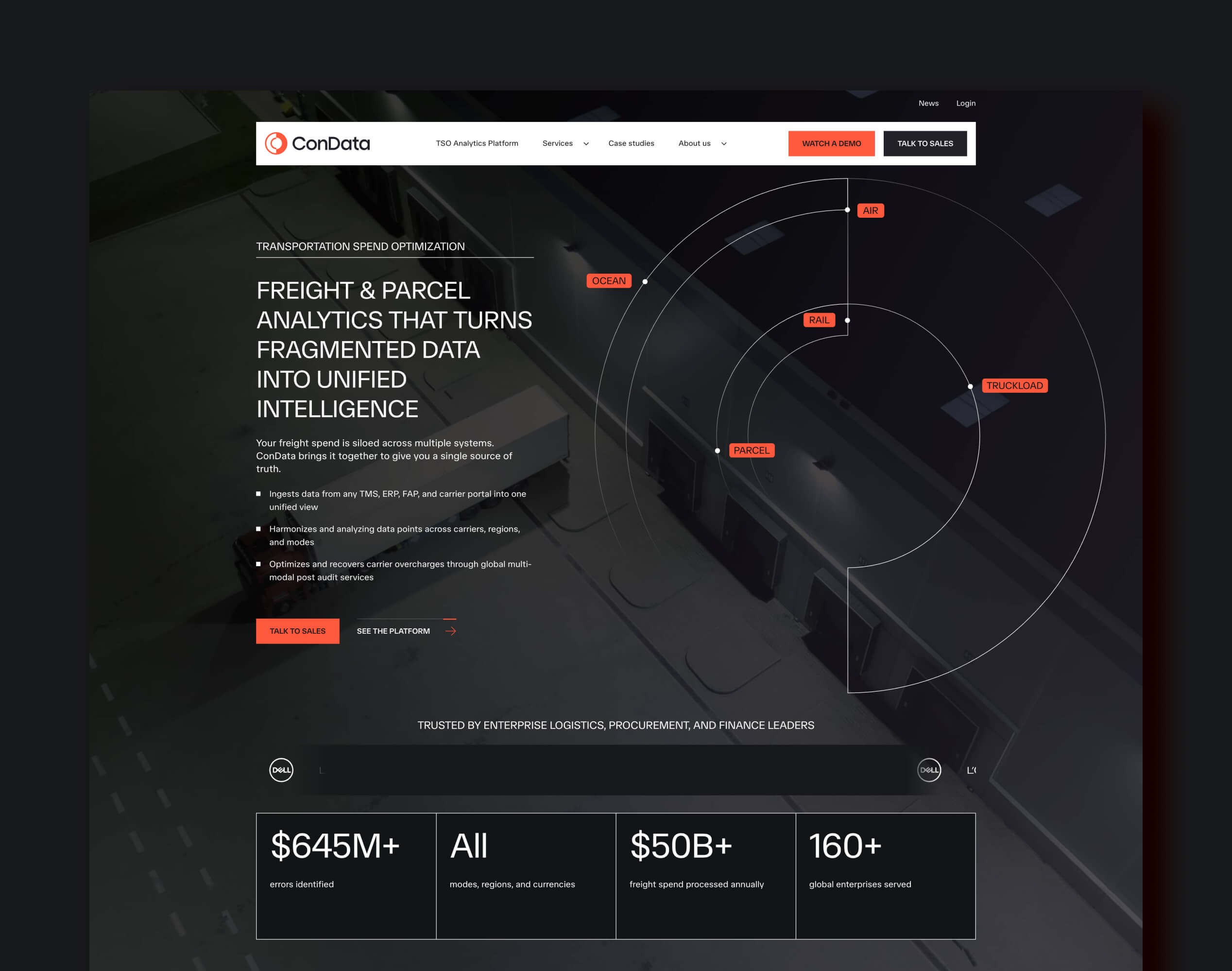
ConData Global has been auditing freight invoices since 1956, and the brief was to take that 70-year heritage into a genuinely modern chapter without losing what made the brand trustworthy in the first place. That's a harder balance than it sounds: a freight audit firm's entire pitch rests on being trusted with financial detail, so the rebrand couldn't afford to feel like a company reinventing itself away from what made it credible.
The new logo uses interlocking initials that nod to data and technology while still telling ConData's story in a single mark. The colour palette stays deliberately restrained: a dark, sophisticated base that lets content breathe, with orange used selectively to connect the new identity back to the brand's history, so the visual system reads as evolution rather than a clean break.
The site itself was built on HubSpot Content Hub alongside a HubSpot CRM implementation that leverages AI customer sentiment integration, positioned to convert the kind of serious, high-intent buyers a 70-year-old freight audit business is now attracting. For a company whose entire value proposition is spotting problems in someone else's data, that CRM layer matters as much as the front end.

Designed and developed by Blend
Firstpoint Logistic's old WordPress site was the kind of barrier that's easy to underestimate: not broken, just slow and awkward enough to quietly cap growth. That's often the harder problem to justify fixing, since nothing is technically failing, the business is just working around a website instead of being helped by one.
Blend migrated the site to HubSpot Content Hub, starting with a full audit of the existing WordPress modules to strip out bloat and consolidate anything doing the same job twice, then redesigned key pages to reflect Firstpoint's position as a serious logistics partner without losing clarity in a genuinely complex service list. The new designs strike a balance between modern aesthetics and practical functionality, with each page structured around clear conversion paths and prominent calls-to-action that guide visitors through the journey rather than leaving them to find their own way.
The result runs on a modular, drag-and-drop foundation, so Firstpoint's own team can build new pages without waiting on a developer, and every page was rebuilt from the codebase up with performance as a first-class requirement rather than an afterthought. That combination, editorial independence plus a genuinely fast site, is usually the bit that pays off long after launch day.
Designed and developed by Blend
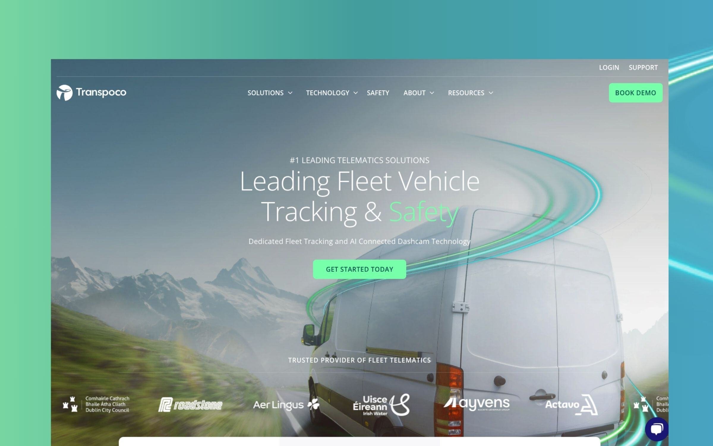
Transpoco, a transport technology leader in Ireland, is a good example of a business whose website and brand had quietly fallen behind its own ambitions. The company was already succeeding in its home market, but neither the brand nor the site reflected the sophistication of the fleet management technology it was actually selling, and that gap becomes a real problem the moment a business tries to compete internationally rather than regionally.
The rebrand centres on a single vision, free-flowing, pollution-free transport, expressed through a brand mark inspired by long-exposure photography of traffic at night, where streams of light capture constant forward momentum. That same motion concept carries through into a free-form gradient system built from professional blues, natural greens and urban greys, giving Transpoco a flexible way to express the brand beyond flat colour blocks while keeping their heritage blue for recognition.
The website itself was built on HubSpot CMS, with the motion-led light trail concept woven through the site for visual continuity and stock photography elevated through careful treatment so it reads as custom brand imagery rather than generic stock. A rebrand built to hold its own against international competitors, not just domestic ones, is what Blend's B2B branding services produced here, carrying the new identity through into the website itself rather than treating brand and site as separate projects.
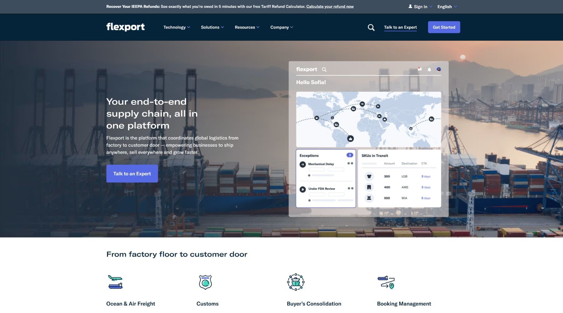
Flexport built its reputation on making a genuinely opaque industry (global freight forwarding) feel legible, and the website carries that promise through from the first screen. The brand system, developed with design studio Firstborn, won The Drum's B2B Award for Best Website, which is a fairly unusual accolade for a company whose core product is moving cargo.
That recognition shows in the restraint: clean typography, confident use of white space, and product visuals that lean on real dashboard UI rather than abstract shipping imagery. It's a good reminder that in a sector full of stock photos of cranes and containers, showing your actual product is usually the braver and more effective choice.
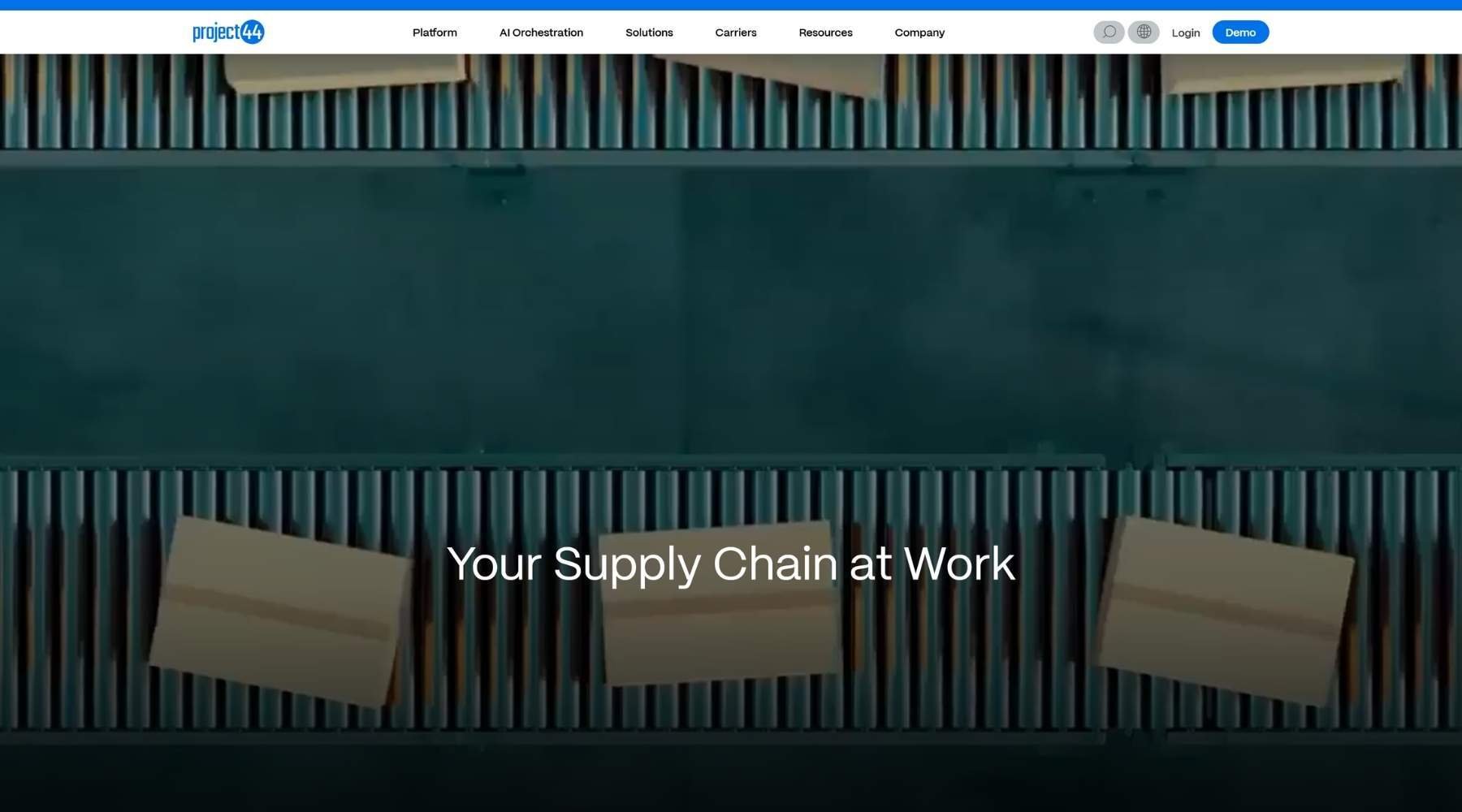
project44 sells supply chain visibility, so the website has to demonstrate visibility rather than just claim it. The homepage leads with a dynamic, data-driven view of live shipment movement rather than a static hero image.
A short product demo sits right on the homepage too, so a visitor can watch the platform actually working before they've had to fill in a single form. That gives visitors an immediate, tangible sense of what "real-time visibility" actually looks like before a single feature gets explained in copy, and for a genuinely technical, data-heavy product, that's the right instinct: show the interface doing the thing, don't just describe it.
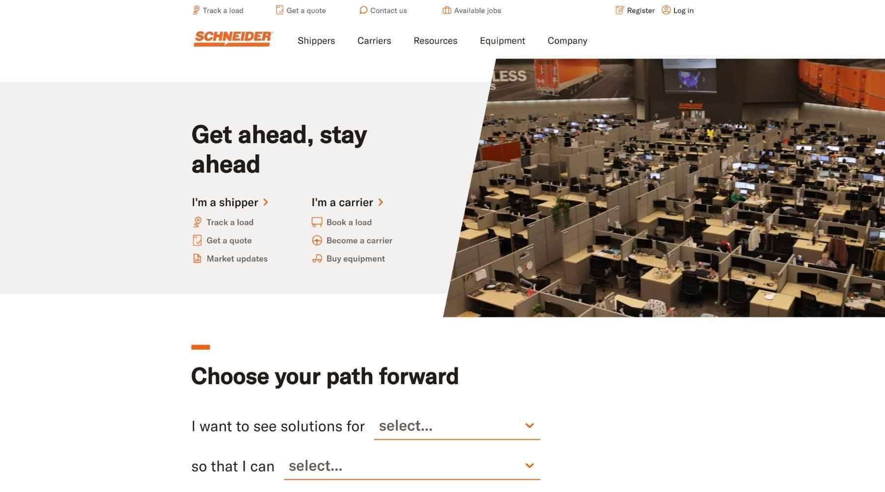
Schneider solves a problem most logistics websites fumble: serving two completely different audiences, shippers and carriers, from the same homepage. Rather than making visitors dig through a generic menu, the site segments immediately into shipper and carrier pathways, each with its own priorities front and centre, so nobody has to guess which half of the site is actually meant for them.
Their FreightPower platform gets its own visual walkthrough on the homepage too, using screenshots and feature callouts rather than a wall of copy, which matters when the audience is a time-poor supply chain manager who wants to see it, not read about it.
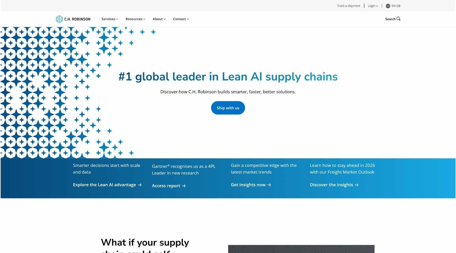
As a Fortune 200 multimodal provider with truckload, ocean, air and everything in between under one roof, C.H. Robinson has a genuinely hard information architecture problem. With that many service lines under one brand, the easy failure mode is a navigation that tries to list everything and ends up explaining nothing clearly.
The hero handles this with restraint rather than density: a geometric pattern of stars and diamonds fades from solid blue into white behind the headline, giving the page visual texture without competing with the message, while a single rounded CTA, "Ship with us", sits alone rather than crowded by secondary buttons. The site handles the harder segmentation problem with a mega dropdown navigation that routes shippers and carriers to the right content without making either group wade through the other's options, which is the single most important job a logistics website's navigation has to do.
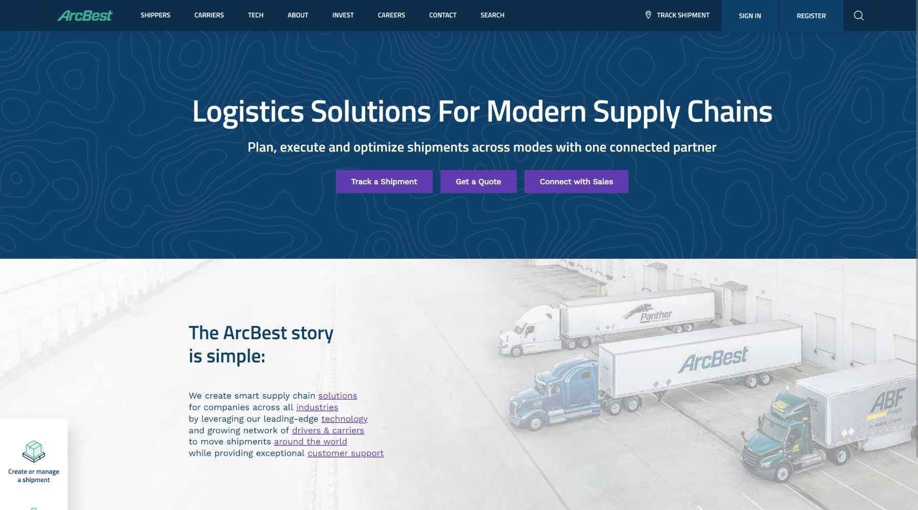
ArcBest opens with a dark navy hero carrying a subtle topographic line pattern in the background, giving it texture without competing with the headline. Rather than one primary call-to-action, three purple buttons sit side by side with equal visual weight: "Track a Shipment", "Get a Quote" and "Connect with Sales", covering a new prospect, an existing customer and a sales enquiry in a single row.
A thin, pinned sidebar sits fixed to the left edge of the page as you scroll, offering "Create or manage a shipment", "Get started with ArcBest" and "Discuss my supply chain", so a returning customer never has to hunt back up to the header to find these tools. Further down, the "Get started with ArcBest" section splits into four simple icon cards, "Ship with us", "Drive for us", "Invest in us" and "Work for us", each just a line icon and a two-word link, which is a clean way of routing four completely different audiences (shippers, drivers, investors, jobseekers) without cluttering the main navigation with all of them.
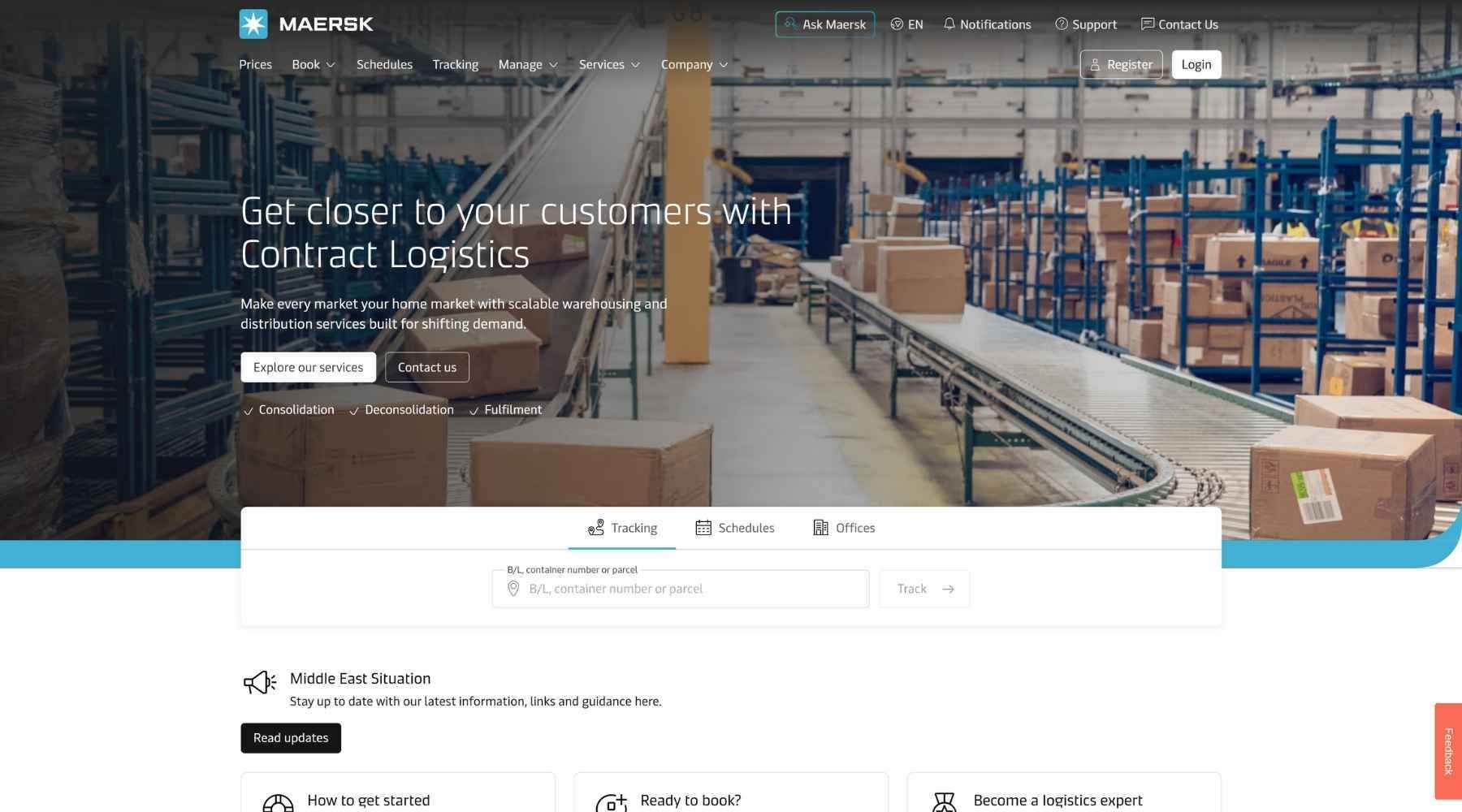
Maersk's site carries the weight of being one of the most recognisable names in global shipping, and it resists the temptation to lean on that reputation instead of usability. A brand that size could easily coast on name recognition alone, but the homepage still does the work of a working tool rather than a billboard.
Real-time container tracking sits prominently on the homepage rather than several clicks deep, and a lighter, softer blue is used deliberately to draw the eye straight to tracking inputs, CTAs and key figures. It's a quieter way of directing attention than most logistics sites attempt.
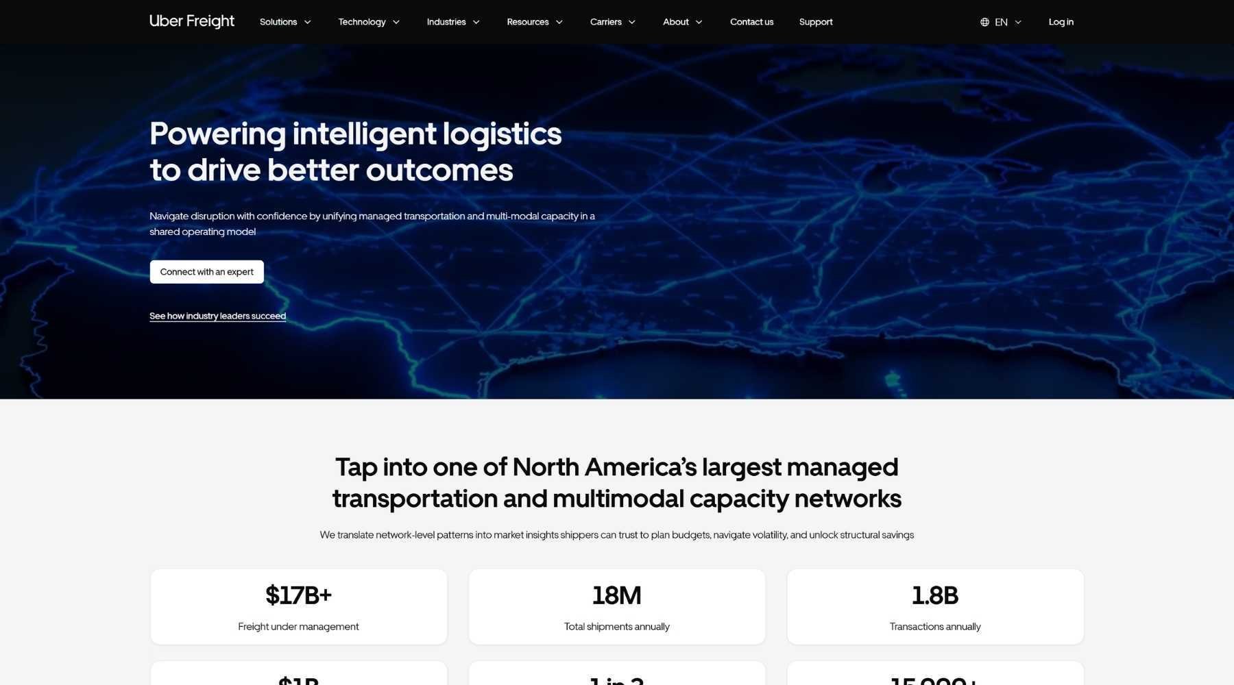
Uber Freight translates the consumer-grade simplicity of its parent brand into a B2B freight matching platform, and it's a useful example of what happens when a company refuses to let "enterprise" become an excuse for a clunky interface. The homepage opens with an animation of the globe that zooms in to trace a single shipment's path, a more visual way of making the "global network" claim most freight sites just state in a headline.
Instant quote requests and load-matching are presented with the same clarity you'd expect from booking a ride, which is a deliberate bet that logistics buyers want less friction, not more gravitas.
Looking across the ten examples above, a handful of patterns separate the logistics and transportation websites that actually generate pipeline from the ones that just list services.
Logistics companies almost never sell to one type of buyer. Schneider splits shippers from carriers before a single word of value proposition loads; C.H. Robinson does the same job through a mega menu built around role rather than product line. This isn't a nice-to-have, it's the difference between a shipper finding a quote form in one click and giving up on page two.
HubSpot's smart content rules turn this kind of segmentation into an editorial decision rather than a development one, serving different homepage modules, CTAs and navigation paths based on a visitor's known attributes or behaviour, so shippers and carriers can share a domain without sharing an experience.
The websites that stood out in this list (Flexport, project44, Kriete Truck Centers) all made the same choice: show the actual product or the actual data doing its job, rather than another stock photo of a container ship. Kriete's HubSpot rebuild pulls live inventory straight from their dealer management system onto every vehicle page, which is the kind of detail that quietly builds more trust than any amount of hero copy.
HubDB and custom objects are what make this possible without a developer touching every page by hand. Once a data source is connected, HubSpot renders and updates pages automatically, so the site stays accurate the moment the underlying data changes rather than whenever someone remembers to update it.
ArcBest puts tracking, rate quotes and document retrieval front and centre on the homepage rather than a level down in a generic "resources" menu. It's a small decision, but it tells a returning customer, who is the one actually generating repeat revenue, that the site was built for people who already trust the business, not just people evaluating it for the first time.
This is a content decision more than a design one, and HubSpot's menu tools and smart CTAs mean it stays adjustable long after launch: which tools sit in primary navigation, and which content a returning visitor sees first, can all be changed without a development ticket.
Firstpoint's old WordPress site and Kriete's previous separate platform were both quietly capping growth in the same way: neither could keep up with how fast inventory, rates and content actually change in this industry. Blend's HubSpot migration work exists precisely for that problem, rebuilding sites on a modular, drag-and-drop foundation so content teams can publish and update pages themselves instead of queuing behind a developer.
Logistics is an unusually demanding sector for a website platform. Inventory changes hourly, rates shift by lane, and the buyer journey runs from an anonymous shipper doing research through to a signed contract months later. HubSpot Content Hub earns its place in this list because it's built to handle that, without asking a logistics company to become a software company to manage it.
Freight, customs and account data all carry real sensitivity, and enterprise buyers in this sector notice when a platform can't demonstrate proper safeguards. Blend is ISO 27001 certified, which matters here specifically because it means the agency building and maintaining these sites operates under the same standard of data handling the sites themselves need to meet. HubSpot's own infrastructure, security certifications and hosting take the rest of that burden off an internal team that would otherwise be patching servers instead of improving conversion rates.
A logistics website's content problem usually isn't volume, it's volatility: prices, routes, inventory and service areas that all move independently of each other. HubSpot's modular templates and native drag-and-drop editor let a content team rebuild or expand pages themselves rather than wait on a developer. Firstpoint's team now works on exactly this foundation, publishing new pages without a development ticket, which is ultimately the difference between a website that scales with the business and one that quietly becomes a bottleneck for it.
Every example on this list looks good in a screenshot. The harder question is who's behind the build once it's live, because a logistics website's problems (inventory sync breaking, a new service line needing pages, a CRM integration that quietly stops working) tend to show up months after launch, not on demo day.
Blend's 50+ in-house specialists work on these builds directly, with no freelancers or offshore resource in the mix, so the team that designed your site is the same one who picks up the phone when something needs fixing. If your current logistics website can't keep up with how fast your business actually moves, book a consultation and we'll tell you honestly what's holding it back.
Speak with our team to discover how we can help you build a HubSpot website that demonstrates your logistics expertise and turns visitors into qualified pipeline.