Good website navigation is an essential feature of your website. It helps users easily find what they’re looking for and directs them towards your most important pages. The ultimate goal of your website navigation is to streamline the user journey, increase the time visitors spend browsing your website, and improve the chances of them taking action.
How can you achieve this? Let's start with the basics:
What is website navigation?
Website navigation is the user interface that helps visitors navigate your website. This is the copy, link text, buttons, and menus that sit at the top of the page.
Ideally, your navigation menu should be consistent throughout your entire website.
Why is website navigation important?
Website navigation helps your website users move from one web page to another. It also helps your visitors understand how each page relates to each other. For example, services or product pages versus your blog or resources pages.
When your navigation is clear and consistent, it improves the user experience (UX) and the likelihood of user conversion. This is because you’re more likely to drive traffic to the correct pages – so your visitors go exactly where you want them to go.
The benefits of a sitemap
A sitemap is a visual structure of your website navigation. It gives you a clear view of page hierarchy and importance. If you create a sitemap, you can use it to inform your decision-making when putting together your website navigation. Learn more about sitemaps.
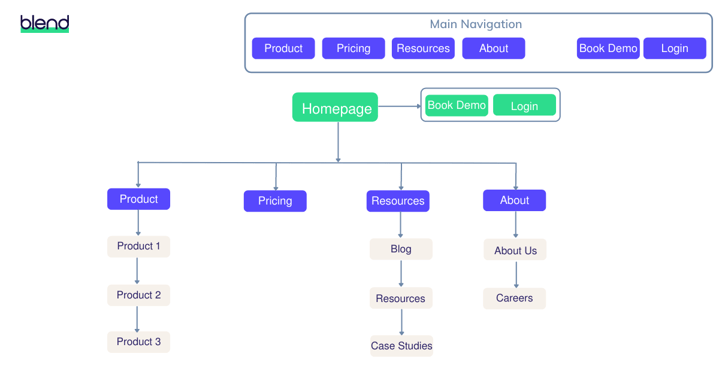
Example: A simple sitemap for a B2B website.
Blend recommends
To get started with creating a site map, use analytics or heatmaps to understand which pages your users visit often, where they’re clicking, where they convert, or where they exit your website. Hotjar and Microsoft Clarity are popular tools to do this.You can also use a content management platform (CMS), such as HubSpot, to set up smart navigation and trackable CTAs. This lets you monitor how users behave on your website.

Types of website navigation
Great website navigation is an important component of B2B website design. How you structure your website navigation will depend on your target audience and what your offering is. Here are a few examples:
Horizontal navigation
This is the most common type of website navigation. The menu lists your most important pages, side-by-side, and is positioned as a website header. This is best for websites that only have a few main pages. Otherwise, you'll have to cram multiple pages into a small, horizontal space – leading to a cluttered look.
.png?width=1200&name=Blog%20post%20The%20Room%20Nav%20(1).png)
Example: The Room's horizontal navigation features two service pages aimed at its two core audiences; brands and influencers, an about us page, and two call to action (CTA) buttons.
Dropdown navigation
If you’ve got a lot of pages that you’d like to include in your website navigation, a dropdown navigation menu is the best choice. It lists your website pages under a broader heading. The user can hover, expand the navigation, and find the page that’s most relevant to them.
.png?width=1200&name=Blog%20post%20Breathe%20Nav%20(2).png)
Example: Breathe's dropdown navigation segments their products into categories, with clear titles and explainers, to help visitors navigate their portfolio.
Hamburger navigation
You’re probably familiar with the distinctive three line icon of a hamburger menu. It’s a mobile-friendly form of navigation that consolidates your navigation options into an icon. The user can click the icon to view their navigation options, which reduces clutter on small screens, compared to desktop.
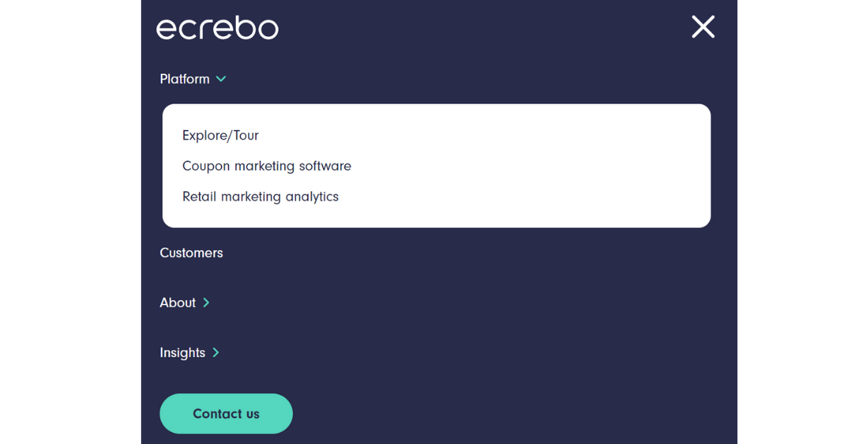
Example: When Ecrebo's website is collapsed, the navigation becomes a hamburger menu that is easy to use on a small screen.
Vertical sidebar navigation
Rather than at top of the page, vertical sidebar navigation sits at the side of your web page. Links are stacked on top of each other, so there’s more room to include a greater number of options.
.png?width=1200&name=Blog%20post%20UK%20Agency%20Awards%20(1).png)
Example: Featuring a vertical sidebar, the UK Agency Awards website displays twelve top-level options within their navigation.
Footer navigation
Navigation should also be a feature of your website footer. This might include links to less popular, but still noteworthy, website pages, like your privacy policy.
.png?width=1200&name=Blog%20post%20Blend%20footer%20%20(1).png)
Example: Our very own footer navigation features our core services, social channels, privacy policy, T&Cs, and a simple form that makes it easy for prospects to reach out across our website.
Website navigation best practice
1. Keep it simple
A complex navigation bar can easily confuse the user journey of your website. If you include too many navigation options, your website visitors will find it difficult to understand where to go. Additionally, an overly unique or complex design can be detrimental to good navigation. It also creates a lot of visual clutter.
Blend recommends At it's most basic, your navigation menu should include:
- Service/product pages (dropdown optional)
- Case studies
- Resources
- Pricing
- Contact us
2. Consider user intent
User intent, or search intent, is the goal that your website visitor wants to achieve. Think about your ideal customer and what they might be trying to do. It's likely they'd want to view your product or service pages to learn more about your business.
This is why it's beneficial to include links to these pages on your main navigation. And why a link to, say, your privacy policy isn't. It's not essential to list out every single one of your website pages, as you should only direct users to the most relevant ones.
3. Optimise for search engines (SEO)
Ideally, your navigation should include commercial keywords where it's logical. For example, if you provide a service that has an industry name or term.
If you have branded service or product names, don't be afraid to use these in your navigation instead. This is because it's more important to establish brand identity than align with SEO for your website navigation.
"Don't sacrifice your branded product or service names to be a robot for search engines. Include commercial keywords only where it's logical."
Sacha Gauthier, Senior Strategist, Blend
4. Include calls to action (CTAs)
Contact us, book a demo, or free trial CTAs are beneficial to include in your navigation bar. But be decisive about which CTA you want to include. If your main objective is to talk directly with a potential customer, then 'contact us' would be the strongest option.
Generic CTAs like 'get started' are weaker, because they're not as specific or instructive. The user might not necessarily understand the action, and are less likely to follow it.
.png?width=1200&name=Blog%20post%20Biocair%20Nav%20CTAs%20(1).png)
Example: Biocair's navigation features two CTAs that clearly tell visitors what to do next. The 'Get a quote' button invites prospects to get in touch with their sales team, while the 'Track my shipment' button guides customers to where they can find updates about their delivery.
5. Add navigation to the footer
Provide navigation options at the bottom of your website pages in your footer section. This can include your main navigation options and any other pages that might be relevant.
For example, links to your social media pages, privacy policy, and an additional CTA or contact us form. However, just like your main navigation, it's important to keep footer navigation simple.
6. Evaluate if you need on-site search
If you have on-site search available on your website, analyse how people are using it. This can provide you with more information about how you could improve your website navigation. For example, are users often visiting a website page that's hidden away? You can make it easier to find using your navigation bar.
When your website is hard to navigate, visitors use search as a fallback. But if you've streamlined your navigation, they rely on search functionality less. Remember, creating a strong user journey through navigation is better than through search.
%20(1).png?width=1200&name=Blog%20post%20AMZ%20search%20tab%20(2)%20(1).png)
Example: Amazon Filters' website features a search bar to help visitors find specific products within its large portfolio of filtration solutions.
Good website navigation makes for great website design
Your approach to designing your website navigation underpins the overall success of your website. Providing a streamlined user journey is an essential aspect of effective B2B website design, so don't overlook its importance. When users clearly understand where to go, they're more likely to find what they're looking for, and are more likely to convert.