Websites that support demand generation need to work harder than traditional lead gen sites. They must create awareness and build trust with the 95% of your market that isn't ready to buy, whilst also capturing and converting the 5% actively seeking solutions. The best demand generation websites achieve this by combining strategic content distribution, intuitive user experiences, and conversion paths that respect where buyers actually are in their journey.
Demand generation website examples
Before we dive in, let's be transparent: several of these websites were designed by us at Blend. We're showcasing them because we have genuine performance data showing what works in demand generation, not to trick you into working with us.
The websites we've designed are clearly marked, but every example here, whether ours or not, has been chosen because it demonstrates exceptional demand generation web design that genuinely creates and captures demand.
1. Viedoc

Website by Blend
Viedoc's clinical trial software website demonstrates how clean, modern design can support demand generation without overwhelming visitors. The minimalist approach with subtle gradients and generous white space creates a fresh feel that stands out in the often-cluttered clinical technology sector. This breathing room isn't just aesthetic; it helps key messages and conversion points stand out clearly, guiding visitors naturally through their evaluation process.
The comprehensive mega menu helps users navigate quickly to relevant content, whether they're early-stage researchers exploring options or ready-to-buy prospects evaluating specific features. High-quality product imagery throughout enables self-education, showing the actual platform interface in context and helping prospects visualise implementation without requiring a demo first. The light and dark mode option demonstrates consideration for how technical users actually work, the kind of user-centric thinking that builds trust with demanding audiences.
2. Cognism
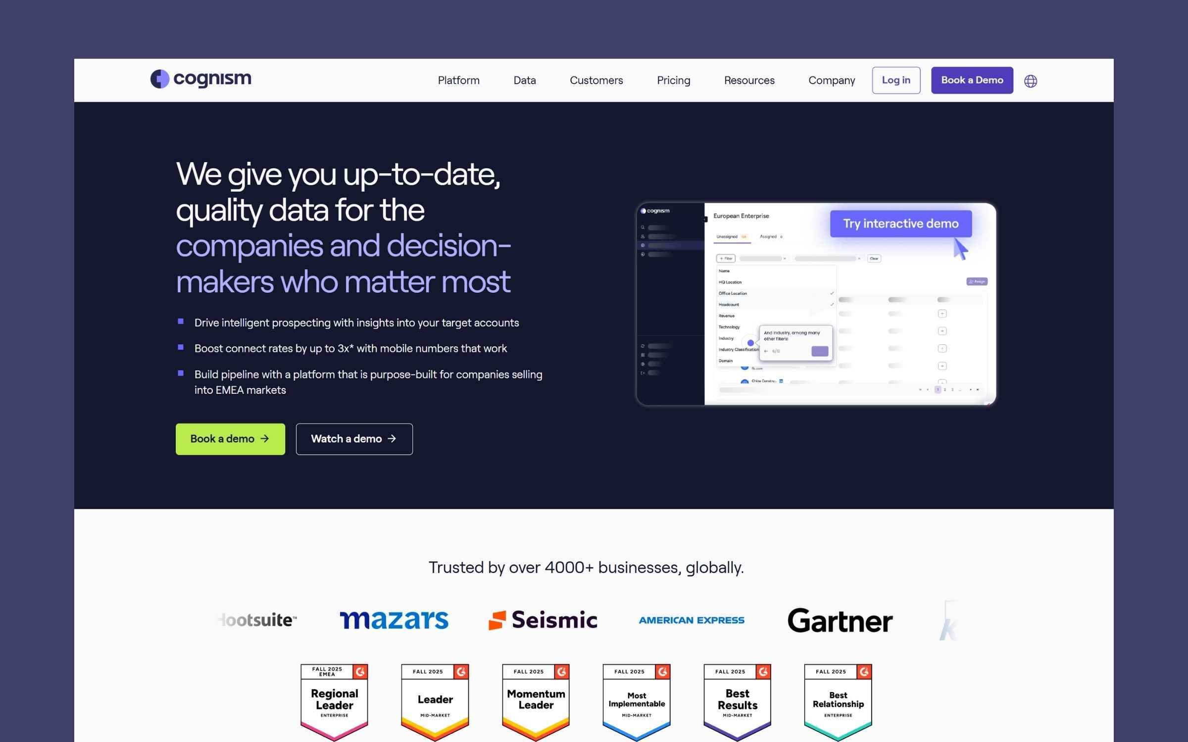
Cognism's website showcases how strategic design choices can effectively support demand generation at every stage of the buyer journey. The dark hero section creates immediate visual impact, with white text standing out sharply against the navy background. The value proposition "We give you up-to-date, quality data for the companies and decision-makers who matter most" cuts straight to the point, followed by three benefit statements addressing specific buyer pain points without fluff.
Product imagery on the right shows the actual platform interface with an overlaid "Try interactive demo" button, enabling self-guided exploration. This lets prospects dig into the product on their terms, reducing friction whilst building familiarity before any sales conversation happens.
Below the fold, the "Trusted by over 4000+ businesses, globally" statement backed by recognisable logos creates immediate credibility. The persona-based presentation, Sales Teams, Revenue Teams, Marketing Teams, combines lifestyle photography with product screenshots, making it easy for different buyers to self-identify and navigate to relevant information without wading through irrelevant content.
3. Datel

Website by Blend
Datel's website showcases how strategic use of colour can guide visitors through conversion paths without feeling pushy. Their signature red is deployed deliberately throughout the site, creating visual focal points that draw attention to key messages and CTAs whilst maintaining a professional, modern aesthetic that suits their Sage ERP positioning.
The site balances detailed product information with clean layouts and thoughtful spacing, ensuring that even complex ERP concepts remain accessible. Bespoke animated illustrations add visual interest whilst reinforcing key messages, demonstrating how professional services websites can be both informative and engaging without sacrificing clarity. This careful balance supports demand generation by making technical content approachable for different stakeholders in the buying process, from technical evaluators to business decision-makers.
4. Labguru

Website by Blend
Labguru's website demonstrates how vibrant design can support demand generation in traditionally conservative sectors. The bold colour palette and animated elements create immediate differentiation in the laboratory management space, helping the brand stand out when prospects are evaluating multiple solutions. This visual distinctiveness aids brand recall, crucial when buyers are conducting extended research across numerous vendors.
Product visuals throughout the site enable self-guided product education, allowing prospects to explore features and workflows at their own pace before deciding to engage with sales. Strategic use of video demonstrations shows the platform in action, building familiarity and confidence without requiring immediate commitment to sales conversations.
The bespoke illustrations create a cohesive visual language that simplifies complex laboratory management concepts. This makes the site accessible to different stakeholders in the buying process, from lab managers focused on workflows to executives evaluating ROI, supporting the multi-stakeholder nature of B2B purchasing decisions.
5. Robin Radar

Website by Blend
Robin Radar's dark-themed website creates immediate visual impact that supports demand generation through strong brand differentiation. The dark aesthetic communicates technical sophistication whilst making their radar detection systems feel cutting-edge, important positioning when you're trying to create awareness in a specialised sector.
The homepage combines a clear value proposition with custom imagery that demonstrates detection capabilities visually. This dual approach, telling and showing simultaneously, helps prospects quickly self-qualify, essential for efficient demand capture. Solution pages are structured around specific use cases rather than technical specifications, making it easy for different buyer personas to navigate to relevant information based on their particular challenge, whether that's airport safety or wind farm protection.
Large images and bold typography ensure key messages cut through, whilst consistent brand elements create recognition across the site. This cohesive approach matters for demand generation, when prospects are researching across multiple sessions and devices, strong visual consistency helps them remember and return to your site over competitors.
6. CHI Overhead Doors
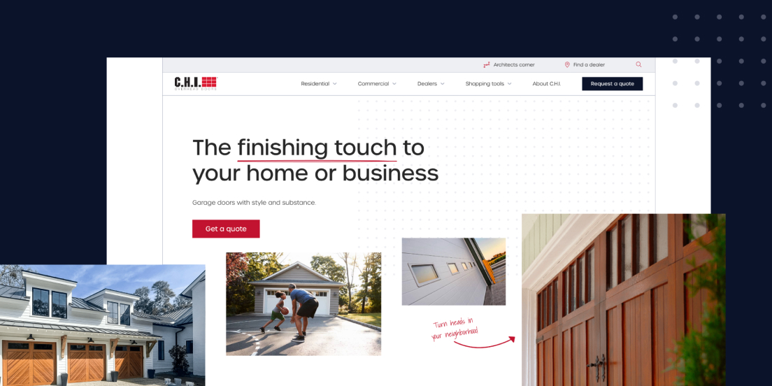
Website by Blend
CHI Overhead Doors' website demonstrates how premium positioning supports demand generation by immediately establishing quality expectations. The tagline "garage doors with style and substance" paired with high-end hero imagery communicates value before prospects read detailed specifications. This visual-first approach matters for creating demand; buyers need to desire your products before they'll invest time researching technical details.
Smart audience segmentation splits navigation clearly between home and business customers, allowing different buyer types to self-direct to relevant content immediately. This reduces friction in the evaluation process, prospects aren't wading through irrelevant information to find what matters to them. For demand generation, this efficiency matters enormously. The easier you make research, the more likely prospects are to progress through their buying journey with you rather than abandoning for a competitor's site.
7. Transpoco

Website by Blend
Transpoco's transport tech website demonstrates how creative design can support demand generation by making complex technology immediately understandable. The site extends their logo into light trails that visually communicate tracking and movement capabilities before prospects read a single word.
The vibrant colour scheme and generous spacing create a modern aesthetic that differentiates Transpoco from competitors in the transport technology sector. When prospects are evaluating multiple fleet management solutions, this distinctive visual identity helps the brand remain memorable across research sessions. The site manages to feel both energetic and professional, a balance that signals innovation without undermining the reliability that fleet managers need from tracking solutions.
Despite its distinctive aesthetic, the site remains intuitive to navigate with thoughtfully organised information. This balance is crucial for demand generation. Creative design captures attention and aids brand recall during extended research periods, but only if it doesn't compromise the usability that allows prospects to actually evaluate your solution. Transpoco proves that memorable branding and conversion-focused functionality can coexist.
8. Cybexer
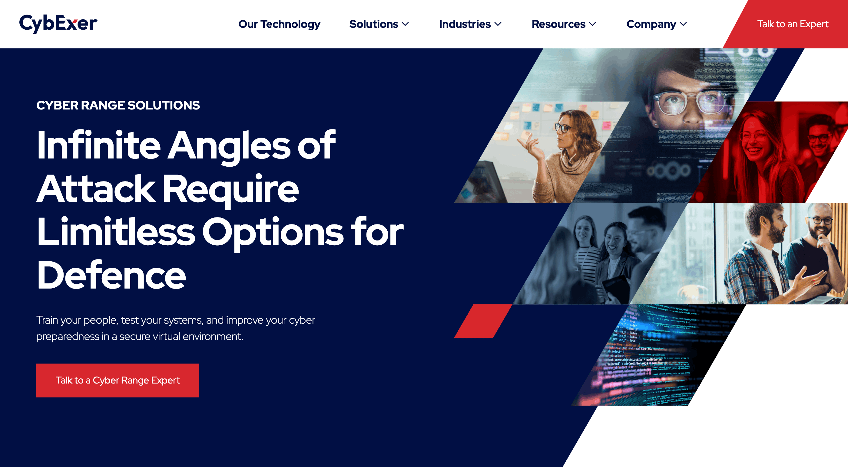
Website by Blend
Cybexer's website uses bold red and angular design to stand out in a sector dominated by conservative blue-and-grey palettes. This visual confidence signals innovation, helping create demand by positioning Cybexer as a modern alternative to traditional cybersecurity training providers. When prospects are researching solutions, distinctive branding like this aids recall, crucial when buying cycles stretch across weeks of evaluation.
The geometric shapes don't just look striking; they create visual pathways that guide visitors through content in a logical sequence. This purposeful design supports demand capture by reducing cognitive load, making it easier for prospects to absorb information and progress through their evaluation. Strong contrast between navy backgrounds and white text ensures readability, whilst strategic red accents draw attention to conversion points without feeling aggressive.
Direct messaging cuts through the jargon that plagues cybersecurity marketing, making complex training concepts accessible to both technical and business stakeholders. This clarity matters enormously for demand generation. When your content works for multiple buyer personas, you reduce the back-and-forth typically required to build consensus in B2B purchases.
9. DrDoctor
.jpg?width=2400&height=1535&name=DrDoctor-Homepage-1%20(1).jpg)
Website by Blend
DrDoctor's website breaks away from the predictable blue palette that dominates healthcare technology, using green and purple to create immediate visual differentiation. The calming green reinforces healthcare associations whilst the purple accents add a contemporary edge that signals innovation. This visual distinctiveness helps the brand stand out when prospects are researching multiple solutions, important for creating awareness in a sector where many providers look remarkably similar.
The organic brush stroke elements appear throughout the site in varied ways, creating visual interest without compromising the clinical credibility that healthcare buyers expect. These brand assets maintain cohesion whilst preventing repetitive design patterns that can make extensive product sites feel monotonous. When prospects are conducting thorough research across multiple pages and sessions, this variation helps maintain engagement.
Layered backgrounds and strategic gradients create visual separation between different content types, helping various stakeholders navigate to relevant information quickly. Healthcare technology purchases typically involve multiple decision-makers with different priorities. Clear visual organisation reduces the effort required to find relevant content, removing friction from the evaluation process that already involves considerable complexity.
10. Ahrefs
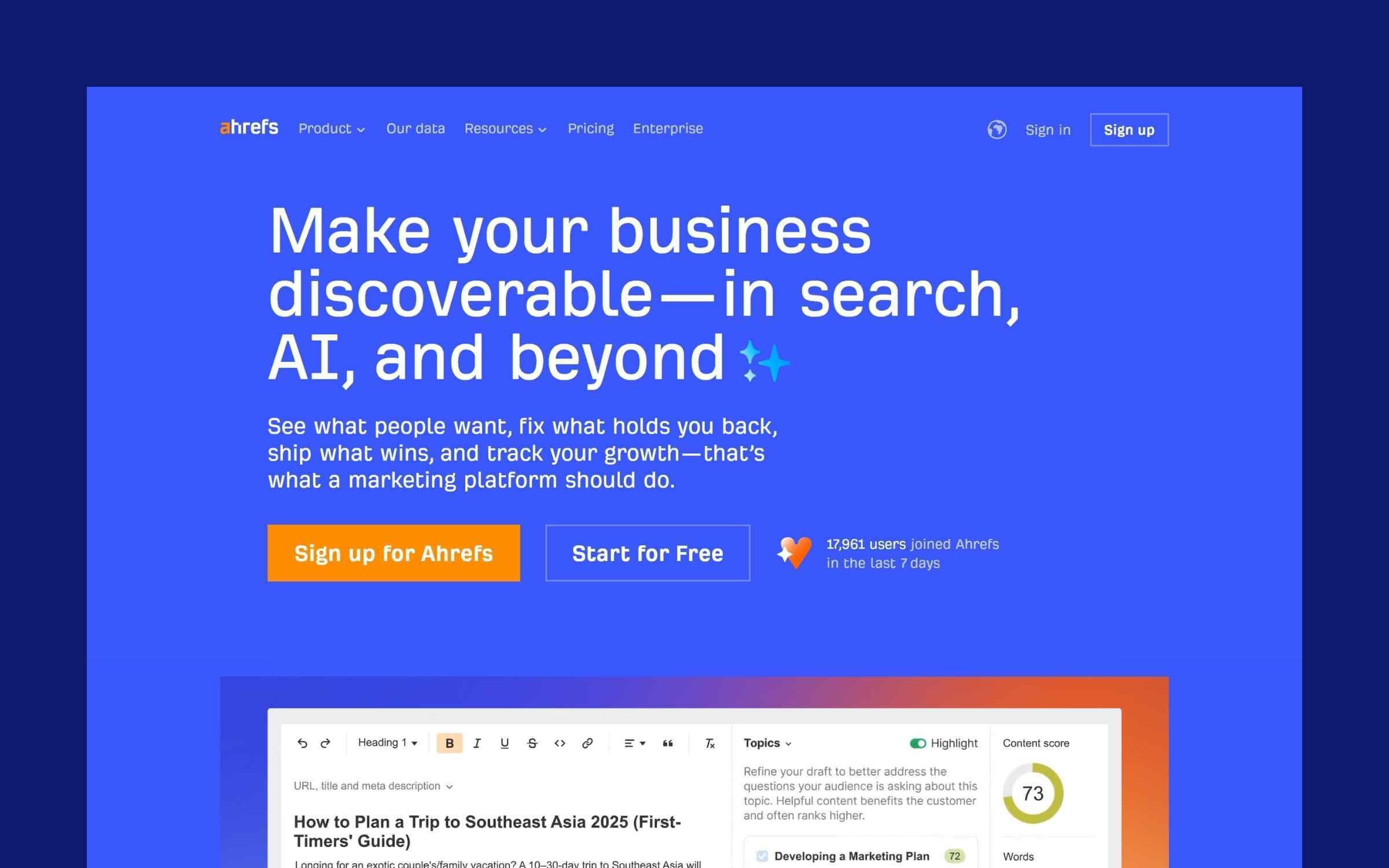
Ahrefs' website demonstrates how to serve both demand creation and demand capture for a complex SEO toolset with multiple use cases and buyer personas. The homepage provides multiple entry points, recognising that visitors arrive with different levels of awareness, from beginners discovering SEO to experienced practitioners evaluating tools. This flexible approach respects where prospects are in their journey rather than forcing everyone through identical funnels.
Extensive freely accessible content establishes Ahrefs as an authority long before prospects consider purchasing. Blog posts, free tools, and comprehensive guides provide genuine value without gates or form fills, embodying the modern demand generation philosophy of building trust through helpfulness. This approach creates brand affinity during the research phase, ensuring Ahrefs remains top-of-mind when prospects eventually reach purchasing decisions.
The navigation handles enormous amounts of content without becoming overwhelming, using clear categorisation and visual hierarchy to maintain usability. Product tours and feature showcases enable self-guided exploration, respecting the preference modern B2B buyers have for independent research before engaging with sales. When prospects can thoroughly evaluate your solution on their own terms, they arrive at conversion points more informed and genuinely qualified.
What makes an effective demand generation website?
Looking across these demand generation websites, several recurring themes emerge that separate exceptional examples from merely adequate ones.
Strategic content distribution
The best demand generation websites don't just host content, they strategically distribute it to support both demand creation and demand capture. This means having comprehensive blog content and resources for early-stage buyers whilst also providing detailed product information and clear conversion paths for those ready to engage.
Effective content distribution also means making it easy for prospects to find what they need without overwhelming them with options. Clear navigation, logical information architecture, and strategic internal linking all play crucial roles.
Clear value propositions
When someone visits your demand generation website, they should quickly understand what you offer, who it helps, and why it matters. The best sites nail their messaging by being specific about problems solved and outcomes delivered, rather than hiding behind jargon or clever wordplay.
Successful demand generation websites speak directly to buyer pain points at different stages of awareness. They help prospects understand problems they might not have fully articulated whilst also serving those actively seeking solutions.
Multiple conversion paths
Demand generation recognises that buyers move through non-linear journeys and engage at different stages of readiness. Effective websites provide multiple conversion paths that respect this reality rather than forcing everyone through identical funnels.
This might mean offering content downloads alongside demo requests, providing calculator tools or assessments, enabling newsletter subscriptions, or creating multiple points of micro-engagement that build relationships before asking for sales conversations.
Self-service product education
Modern B2B buyers prefer to research independently before engaging with sales. The best demand generation websites recognise this by providing comprehensive product information, visual demonstrations, and use case examples that enable self-guided education.
This doesn't mean hiding behind gated content or forcing form fills; it means genuinely helping prospects understand your solution so they arrive at conversion points more informed and qualified.
Strategic social proof
Trust is fundamental to demand generation, particularly when you're asking prospects to engage before they're ready to buy. Effective websites deploy social proof strategically throughout, using client logos, case studies, testimonials, and third-party validation to build credibility.
The best examples don't just dump logos on a page; they contextualise social proof, showing how similar companies have succeeded and providing evidence that speaks to specific concerns or use cases.
Technical performance and UX
Page speed, mobile responsiveness, and intuitive navigation aren't just nice-to-haves for demand generation websites; they're fundamental requirements. Prospects researching solutions won't tolerate slow-loading pages or confusing interfaces, regardless of how good your content might be.
The websites featured here all prioritise technical performance, recognising that UX issues create friction that undermines demand generation efforts at every stage of the buyer journey.
Which platform is best for demand generation websites?
Your marketing budget isn't meant for managing complex server infrastructure or wrestling with technical limitations. It's better invested in creating effective, buyer-centric experiences that support your demand generation goals.
HubSpot Content Hub is the ideal platform for demand generation websites. It handles all technical complexities whilst providing powerful tools for content creation, distribution, and optimisation. The integrated approach means your website works seamlessly with email marketing, CRM, and analytics, creating the connected ecosystem that demand generation requires.
For demand generation specifically, HubSpot's capabilities around content management, lead tracking, and attribution modelling provide the infrastructure you need to measure what's working and continually optimise your approach.
Creating a demand generation website that works
The most effective demand generation websites combine strategic content, clear messaging, and frictionless user experiences. They focus on helping buyers through their journey rather than just pushing for immediate conversions, recognising that trust and authority built over time create better quality pipeline.
Whether you're building a new demand generation website or optimising an existing one, remember that your website should feel like a helpful resource rather than a sales pitch. Give prospects the information they need to self-educate, make it easy to engage when they're ready, and focus on building long-term relationships rather than just capturing contact details.


