

Ready to redesign your HubSpot website into one that builds trust and converts?
Speak with our team to discover how we can help you redesign your website and turn visitors into qualified pipeline.
Most website redesign briefs start with what a site should look like. The better ones start with what's actually wrong with the current one, buried keyword strategy, a brand that's outgrown its own visual identity, marketing and sales data that live in two different systems and never talk to each other.
The examples below all started that way. Some are complete rebrands. Some are platform migrations. All of them replaced a site that was actively working against the business with one that isn't.
A quick note before the examples: all of these were designed and built by us. That's not a coincidence, it's because a genuine redesign, one that fixes an actual business problem rather than just refreshing the paint, is the kind of project we get asked to do most often. Every example here is included because it demonstrates a specific redesign decision worth stealing, not because we built it.
This list was last updated July 2026.
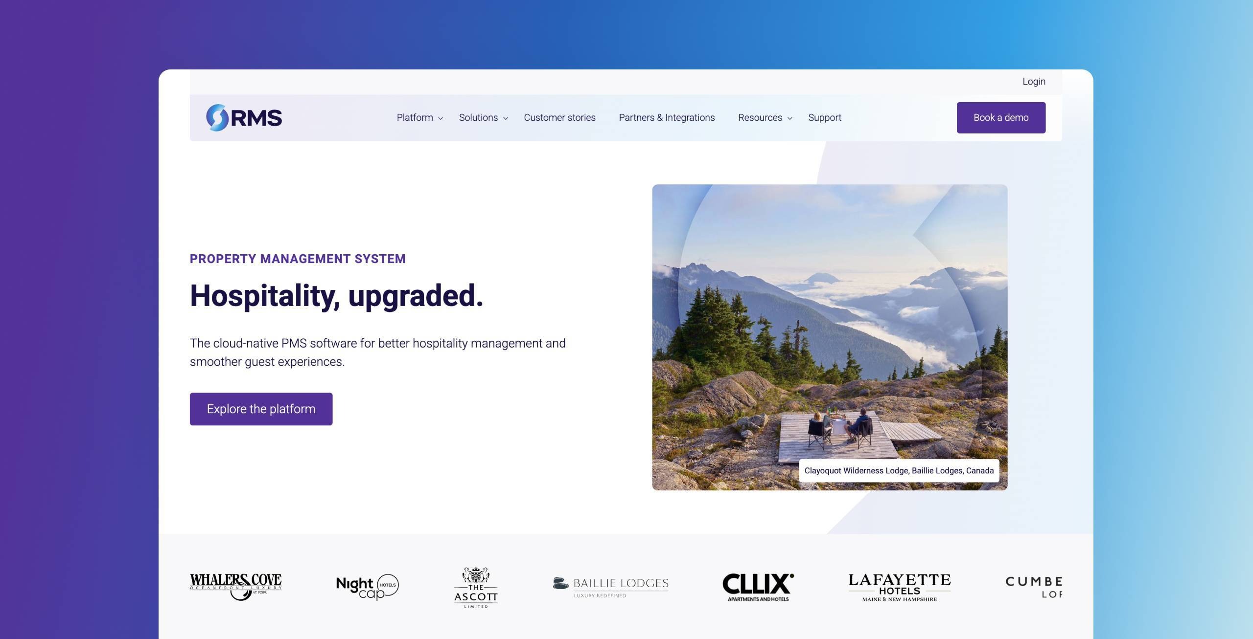
RMS is a 40-year-old property management platform used by hotels, resorts and holiday parks globally. Two disconnected HubSpot portals, one for North America, one for the rest of the world, had drifted into different systems over time, and neither the brand nor the website reflected the business RMS had actually become.
The rebrand's creative idea is "day and night around the world," picked because it could hold a business operating across every time zone without feeling impersonal. The brand mark takes its shape from the Earth turning on its axis, and the wider system (colour, type, photography) was built to flex across markets rather than needing a fresh version every time RMS enters a new one. A messaging workshop then settled on three traits for how the company should sound: reliable, approachable, quietly confident, replacing what had previously been left to whichever writer was working on a given piece of content.
Blend's work with RMS Cloud put the HubSpot portal consolidation first, ahead of any brand or website work going live, on the basis that a redesign's impact can't be measured if the CRM data underneath it is still split across two systems. That same clean-up is what now lets RMS run Breeze AI across the business with data it can actually trust.
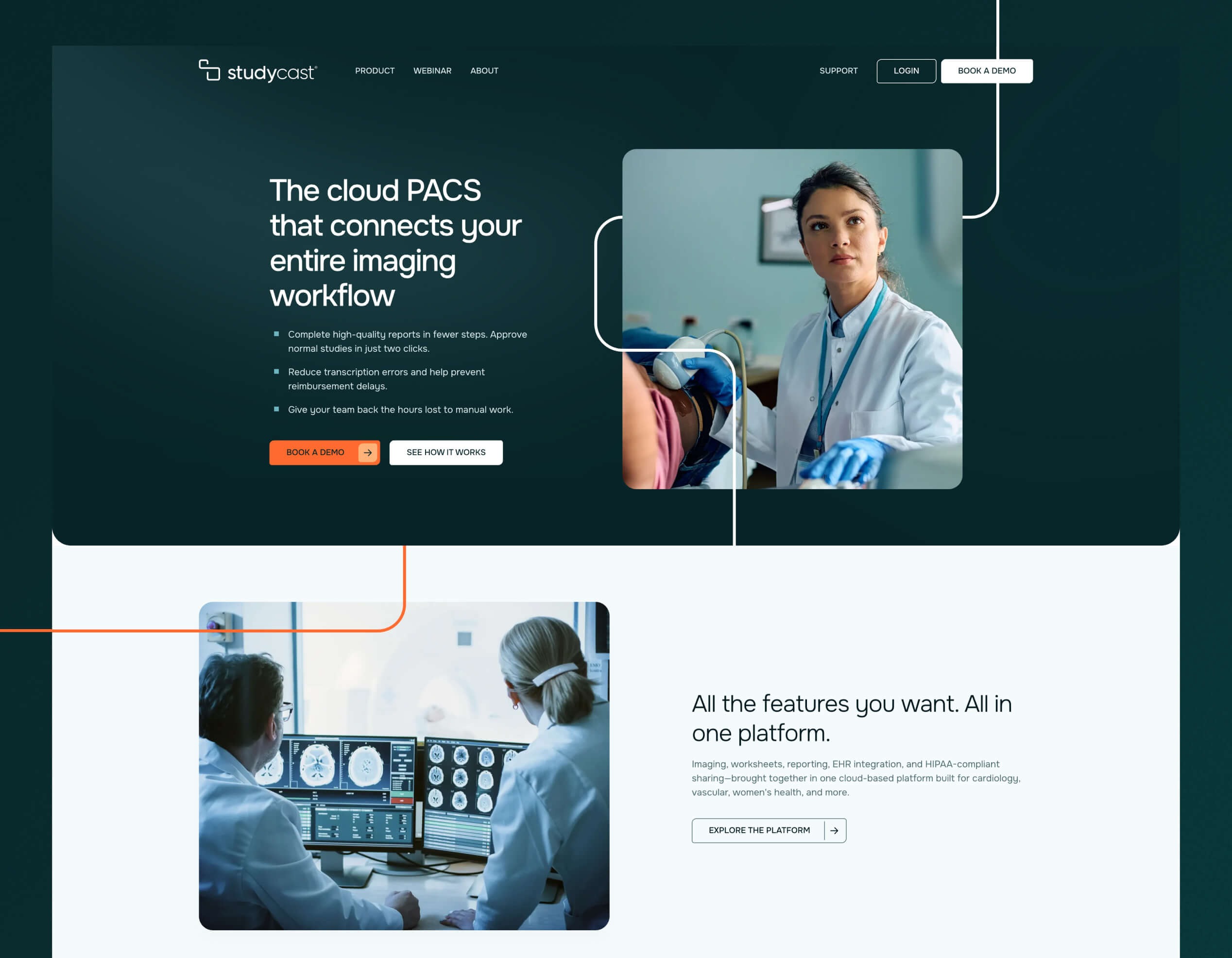
Studycast is a cloud-based medical imaging platform that had outgrown its own brand: it operated under three separate names, which left prospects unsure who they were actually dealing with.
The new mark pairs a plain wordmark with a symbol drawn as one unbroken line, echoing the way a single scan moves through the platform without interruption. It comes in several colour versions so it holds up cleanly on both light and dark backgrounds, not just a single fixed treatment. Colour was the harder call: nearly every competitor in medical imaging defaults to blue or green, and healthcare buyers tend to distrust anything that looks too bold or too new, so the palette had to stand apart without tipping into looking unproven. A gradient system sits alongside it, giving the brand somewhere to go beyond flat colour on everything from a slide deck to a printed handout.
A brand that finally matched the sophistication of the platform, rather than three fragmented identities competing for attention, is what Blend's B2B branding work delivered, unifying everything under one name before a line of website copy got written.
.jpg?width=2400&height=1535&name=DrDoctor-Homepage-1%20(2).jpg)
DrDoctor is the UK's leading patient engagement platform, trusted by over 70 NHS organisations. Their previous site buried a genuine "one platform" story inside granular product listings and needed to speak convincingly to four different audiences: NHS decision-makers, patients, industry peers and recruits.
The redesign builds on AI-generated imagery DrDoctor had already commissioned for their rebrand, showing clinicians and patients in ordinary moments of collaboration rather than the sterile white-coat photography most healthcare sites still lean on. Their brush-stroke motif reappears constantly but never quite the same way twice, sometimes a texture behind a heading, sometimes just a small interactive flourish, which keeps it feeling designed rather than templated.
Where the old site buried a unified platform story inside fragmented pages, the redesign Blend delivered rebuilt the architecture around one platform narrative with distinct pathways for each audience, built on HubSpot Content Hub with reusable, drag-and-drop sections DrDoctor's team can manage directly.
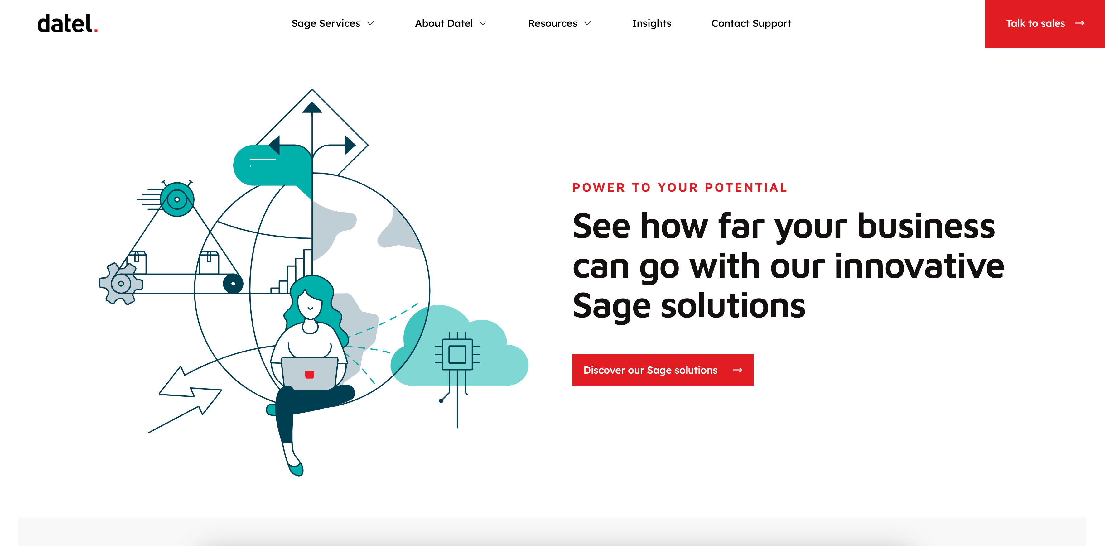
Datel is the UK's leading Sage partner with over 40 years of heritage. Adding Sage Intacct to their portfolio in 2021 meant attracting an entirely new type of buyer, without a brand or website built for them.
The site leaves generous space around its content and leans on custom illustration rather than stock imagery to carry personality, which matters when the subject matter, cloud ERP for finance teams, could easily read as dry. Datel's red square shows up almost everywhere without ever feeling like a rule being followed: sometimes it's a bullet, sometimes the shape behind a button, sometimes just a mark inside an illustration, so the eye starts associating it with the brand rather than noticing it as a repeated template element.
Blend's work with Datel was built specifically to help a 40-year-old business establish credibility in a market segment it was entering from zero, taking a dual-site approach, a main prospect site plus a separate VIP microsite for existing customers, rather than simply refreshing one site for two very different audiences.
Paired with a twelve-month demand generation strategy, the results: a 35% increase in revenue between 2021 and 2024, and an 800% marketing ROI on closed-won revenue.
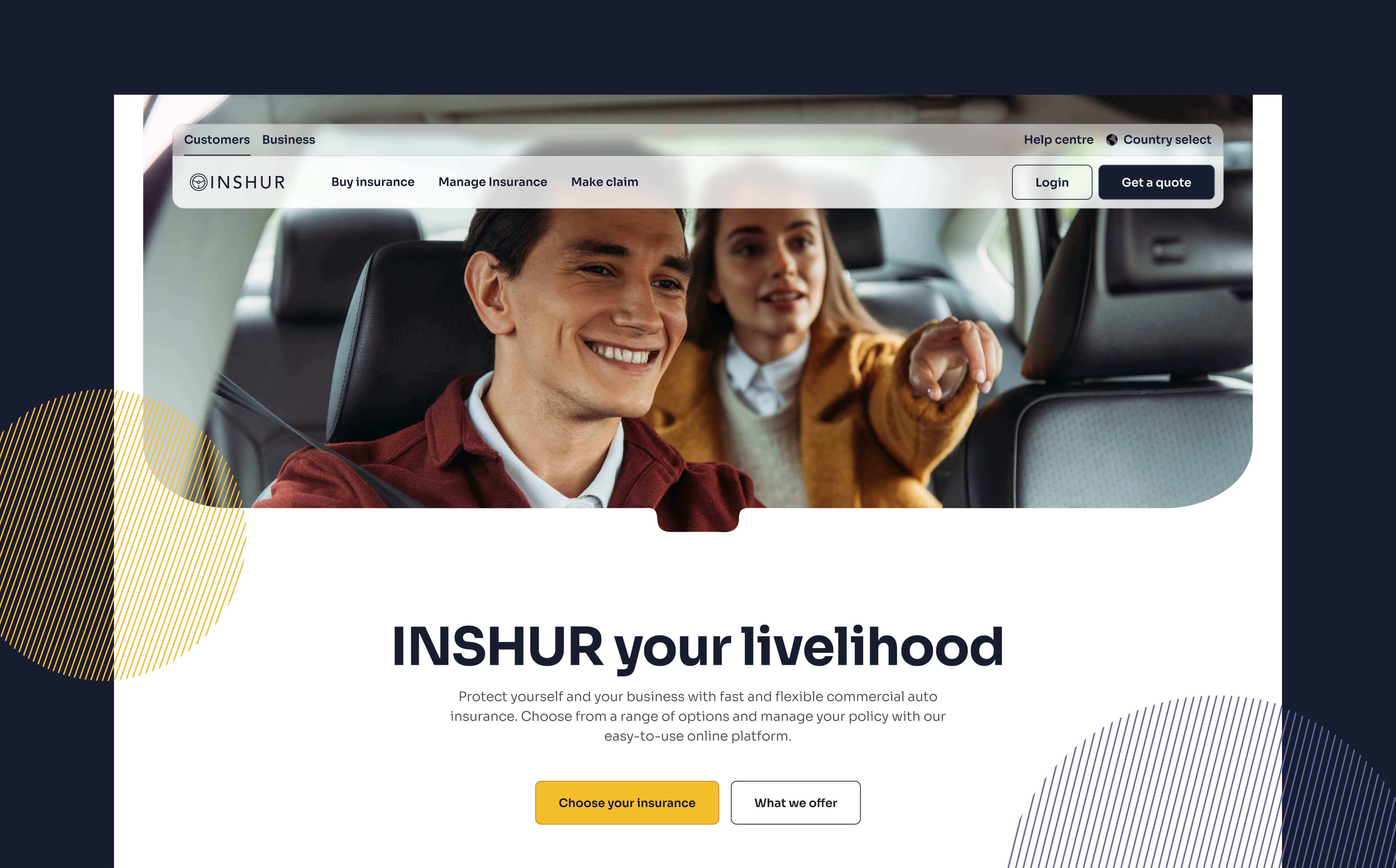
INSHUR provides embedded commercial auto insurance for on-demand drivers, taxi, rideshare, private hire and delivery, a genuinely industry-specific product that a generic insurance site design wouldn't reflect.
Blend's website design work for INSHUR shapes photography using the outline of a car's rear-view mirror, a small piece of visual shorthand that ties the whole site back to driving without a caption ever having to spell it out, and it's used across the site's imagery rather than saved for one hero shot.
The navigation sits behind a soft, frosted-glass effect that holds its own even when the business-facing pages switch over to a dark background, which is a harder thing to pull off than it sounds: most sites either commit to one theme throughout or the switch between them looks broken. Sticking to one idea everywhere, rather than layering on several smaller ones, is what makes the whole thing read as intentional.
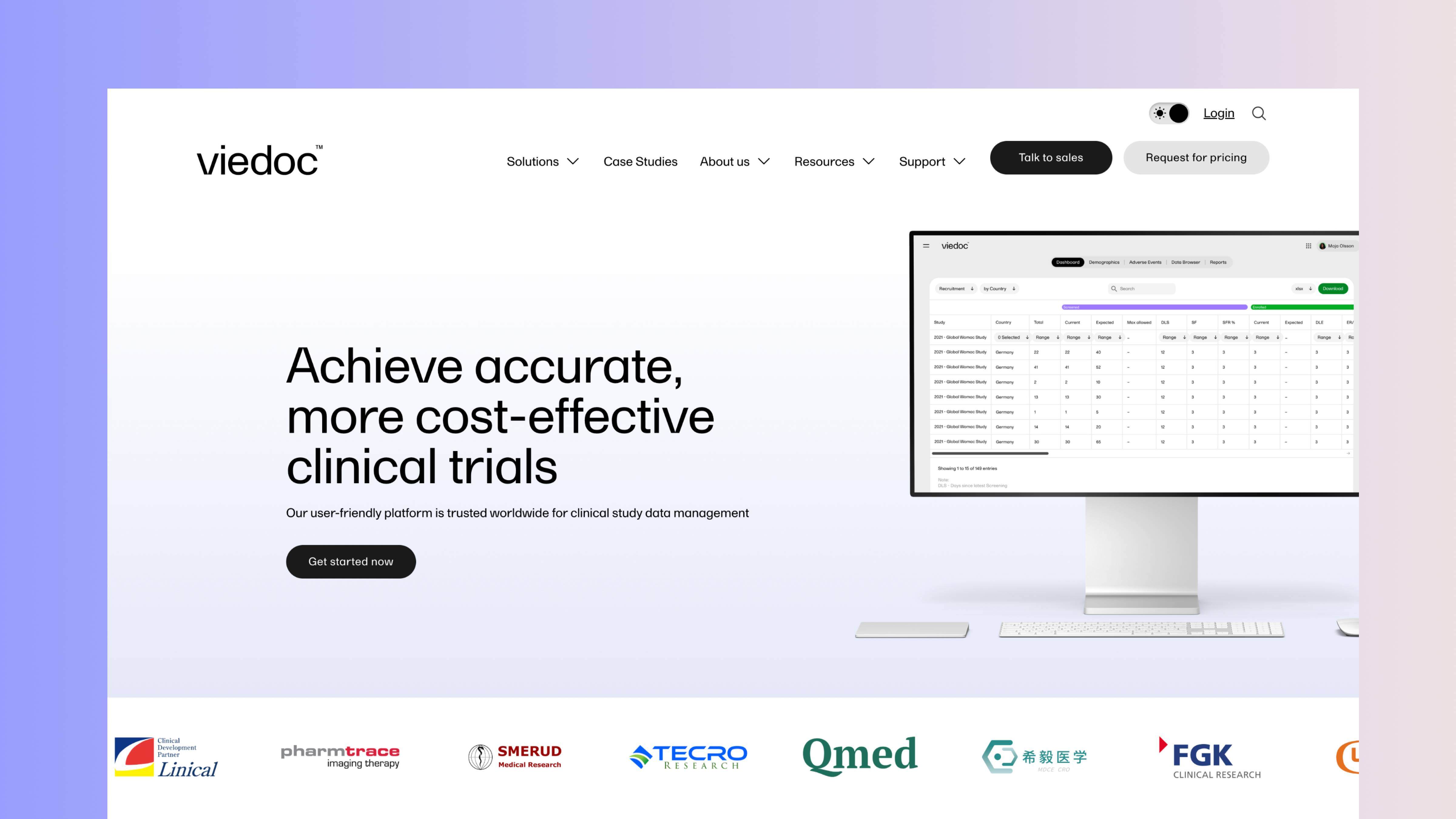
Viedoc's clinical trial technology platform had a strong marketing team generating real traffic, and a website that wasted most of it thanks to rigid legacy CMS tooling and unclear conversion paths.
Product screenshots sit inside soft, rounded frames rather than the stark black device mockups most software sites reach for by default, a small change that makes a clinical trial platform feel considerably less intimidating. Colour stays almost entirely out of the way, black and white doing the heavy lifting with the occasional wash of purple, so nothing competes with the software itself for attention.
Behind the scenes, a HubDB-powered library keeps a growing set of resources and case studies manageable without turning into a maintenance job, and the whole thing still loads fast enough to clear Core Web Vitals despite carrying genuinely heavy visuals and full tracking, a combination that usually forces a trade-off on complex SaaS sites.
A site that finally converted the traffic Viedoc was already generating is what Blend's redesign of their HubSpot website achieved, taking new-user-to-MQL conversion from 0.7% to 1.4% in the first quarter, with demo requests up 14% over the same period.
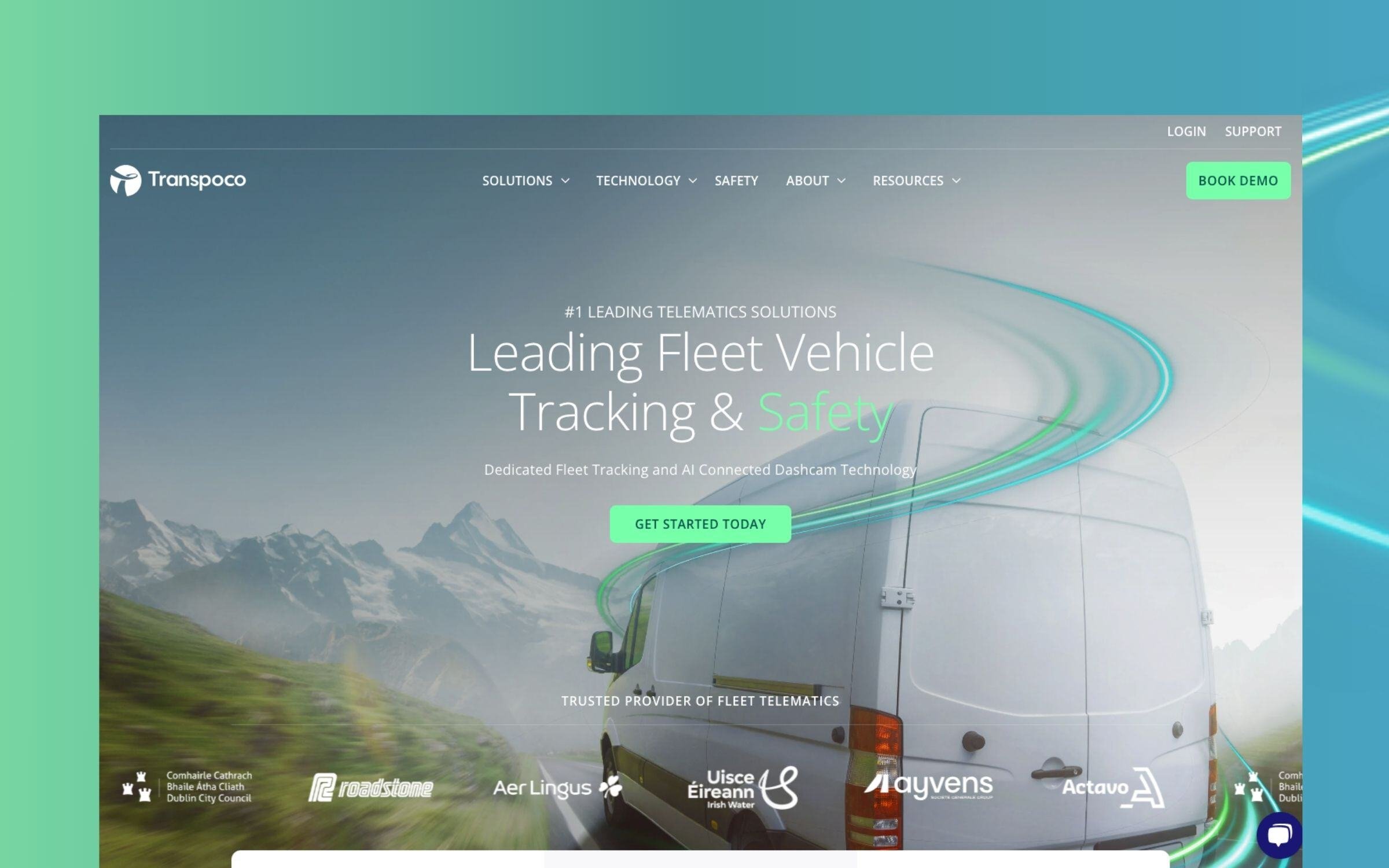
Transpoco, an Irish transport technology company, had a strong product and a solid home-market reputation, but a brand and site that undersold their ambition to compete globally.
The brand mark comes from a long-exposure photo of traffic at night, with light trails standing in for motion. It exists in two forms: a fuller version for anything large, and a simplified monogram for anywhere it needs to shrink right down. The colour palette pulls directly from Transpoco's own world rather than a generic swatch book: blue for the technology, green for the roads their vehicles cover, grey for the infrastructure around them. A free-flowing gradient system sits alongside that core palette, and a documented contrast matrix spells out exactly which colour pairings clear AAA accessibility standards and which don't.
Where Transpoco's previous brand and site undersold a genuinely ambitious vision, Blend's branding work gave them a motion-inspired identity capable of reading as a serious global technology company rather than a regional player, with the light-trail motif carried through into the website itself.
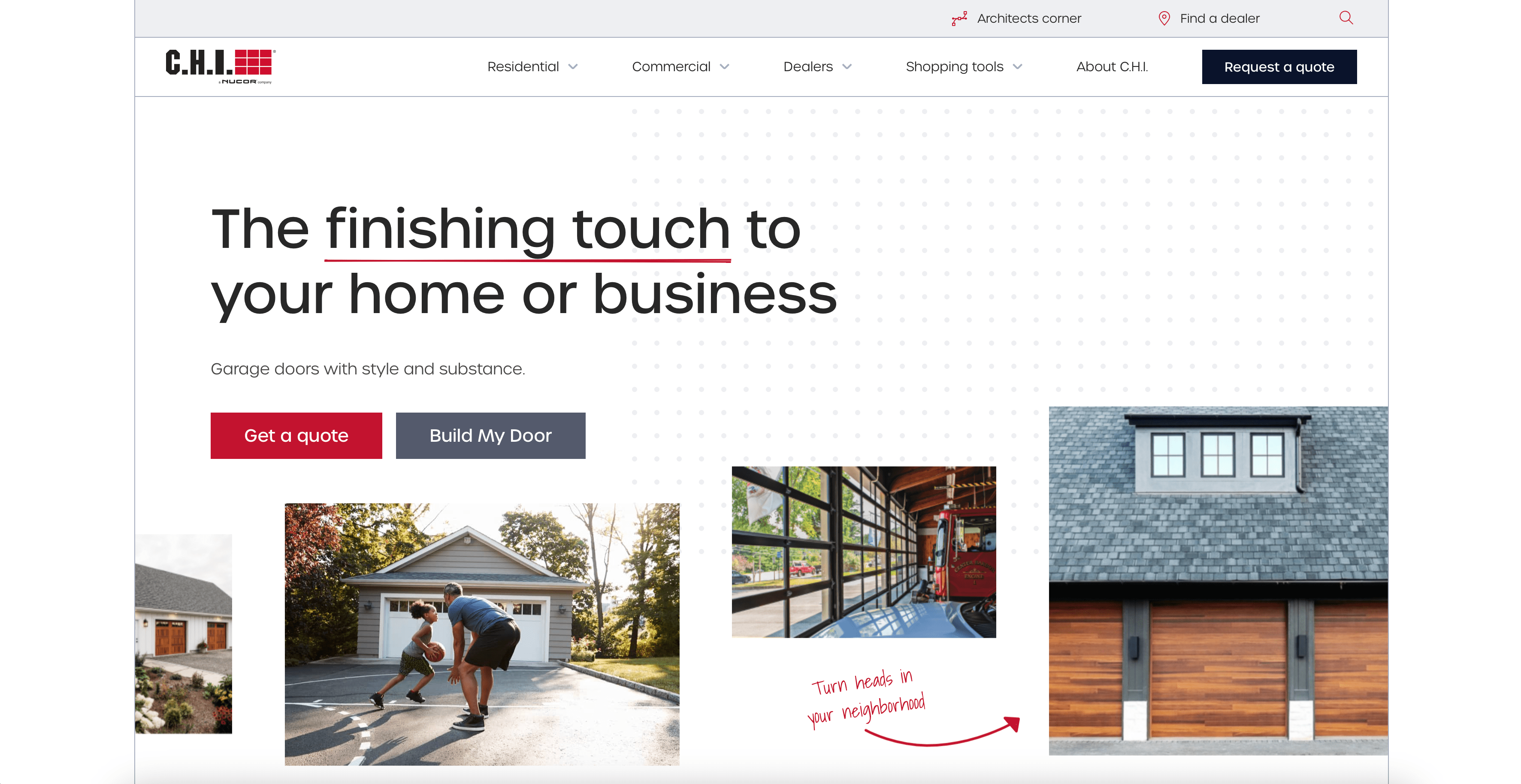
C.H.I. Overhead Doors have made high-end garage doors since 1981, but their old site wasn't communicating premium value or converting visitors into quote and sample requests.
The rebrand keeps C.H.I.'s signature red at the centre but builds an entire system around it: a wider colour range, fresh iconography and lifestyle photography, all still anchored to the colour customers already associate with the business. Hand-drawn touches and simple arrows scattered through the pages soften what could otherwise feel like a purely industrial site, without losing the sense of a company that's been doing this since 1981. Underneath all of it sits a sitemap built from actual keyword research rather than guesswork, so the redesign is as easy to find as it is to look at.
Blend's redesign of C.H.I.'s website added a full product configurator, so a buyer can spec out their own door and land on a quote without ever having to pick up the phone first, driving a 35% improvement in quote page conversion and over 140,000 additional sessions. Sample requests jumped by more than 1,397%, a result that only happens when a redesign fixes the request flow itself rather than just its appearance.
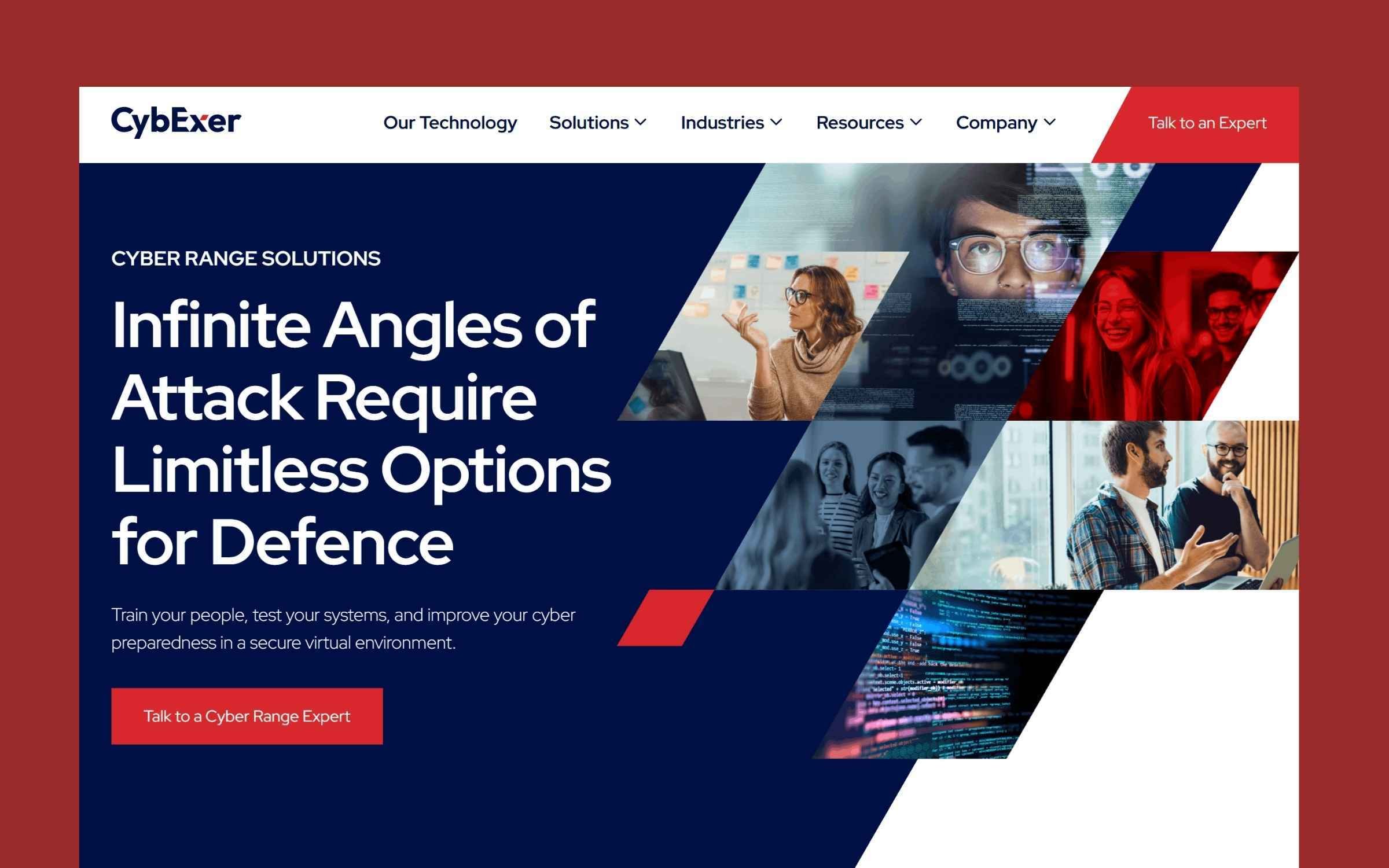
CybExer, a NATO-awarded cybersecurity company, needed their brand and website to support an expansion into the private sector, but their existing identity leaned so heavily on one colour that it had nowhere left to go for emphasis.
Rather than replace a shape customers already recognised, the rhomboid from CybExer's old mark got folded directly into the wordmark itself, sitting inside the 'X' at a smaller scale where it now reads as a deliberate detail rather than the whole identity. A tilted capital 'E' solves a genuinely practical problem: without it, the name reads as one word rather than 'cyber' plus 'exercise', and the tilt breaks that habit at a glance.
Red used to carry the whole brand on its own, which meant it had nothing left to signal when something actually needed attention. Scaling it back to an accent against a dark navy, a nod to the company's roots in military and defence work, gives it a job again: drawing the eye to calls to action specifically, rather than competing with everything else on the page.
A layout that can flex between a rich, layered treatment and something much plainer, without ever looking inconsistent, is what Blend's brand and website work for CybExer delivered by tying the entire grid system to that same logo angle from day one, so structure and identity share one geometry instead of running as two separate systems.
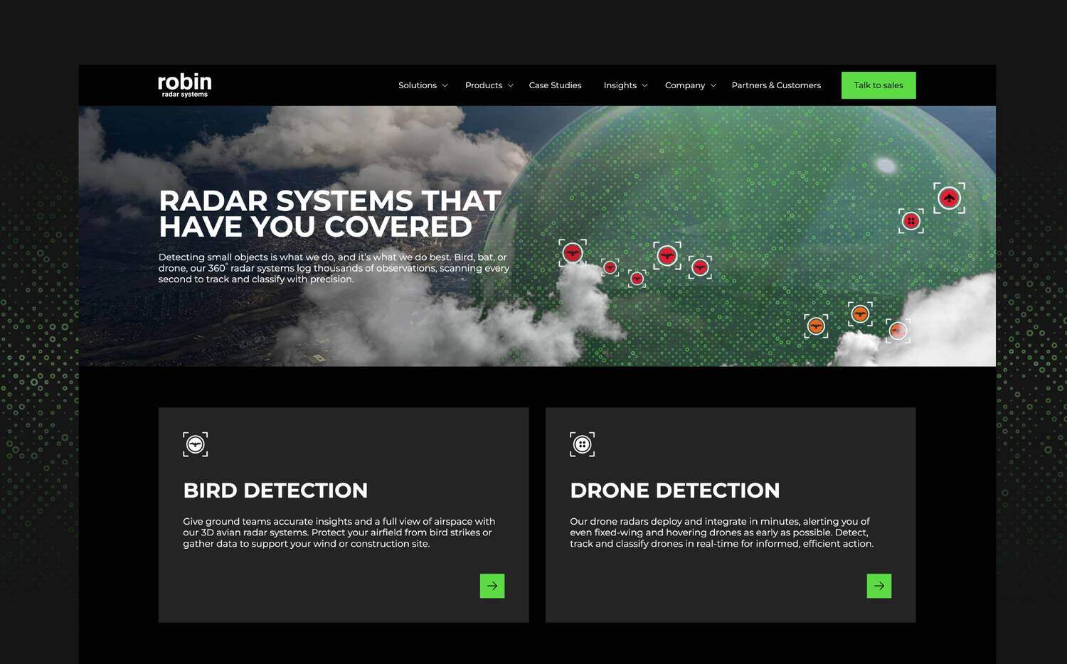
Robin Radar Systems builds advanced radar systems for aviation, wildlife monitoring and security. Their old WordPress site was product-centric, describing hardware rather than the buyer problems it solved.
Where Robin Radar's old WordPress site kept marketing and content tooling split apart, Blend's HubSpot migration consolidated everything onto one platform, helping drive a 236% increase in sessions from organic, social and direct traffic. A full content audit identified gaps and high-performers, feeding an ongoing programme of pillar content and sector-specific navigation improvements, rather than treating radar buyers as one homogeneous audience.
A single line of button copy did real work too: swapping a vaguer call to action for a plain "Talk to sales" lifted enquiry form conversion by 10% on its own. Over three years, that combination of migration, messaging and CRO took high-intent MQLs up 48%.
Look across these ten and a handful of decisions show up again and again, regardless of industry or budget.
Every example that reported a real performance uplift, RMS, Viedoc, C.H.I., started with research into what was actually working on the old site before deciding what to change. RMS's audit went as far as identifying which legacy URLs were still earning traffic, so they could be preserved and redirected rather than lost in the rebuild, and Viedoc's keyword strategy was built into the sitemap redesign itself rather than bolted on once the new pages were already live. It's the same starting point behind Blend's demand generation work: audit what's already ranking before touching a single page, rather than treating SEO as an afterthought once the new site is live. Redesigning first and hoping SEO sorts itself out afterwards is how businesses lose the organic visibility they'd already earned, and it's rarely visible in the pitch deck, only in the traffic graph six months after launch.
DrDoctor's old site organised itself around product lines. The redesign organised itself around four distinct audiences instead. RMS did the same thing at a different scale, restructuring around buyer journeys rather than the internal structure of the business, and Datel went further still, splitting into two separate sites entirely because prospects and existing customers were never going to want the same journey. That's the pattern worth copying: structure the site around the questions a buyer is actually asking, not the departments that produced the content answering them.
Transpoco's brand mark had to work at billboard scale and favicon scale without falling apart. RMS needed a system flexible enough to adapt across regions and verticals without starting from scratch each time a new market opened up. INSHUR proved the same discipline on a smaller scale: one visual idea, the mirror motif, applied consistently rather than diluted across five competing ones. A redesign that only looks good on the homepage isn't a system, it's a mockup with a website attached.
DrDoctor's team can build and edit pages through reusable, drag-and-drop sections without waiting on a developer, and Studycast's HubSpot Content Hub build gives their team the same independence when a new specialty page needs adding. Blend's HubSpot website process is built around getting to that point deliberately, with research and analytics review happening before a single wireframe gets drawn rather than jumping straight into design.
Most of the decisions above aren't platform-specific, any competent redesign audits content and structures around buyers. What HubSpot changes is how much of that thinking survives contact with reality after launch.
A CMS that sits natively on top of the CRM means RMS could only measure their redesign's impact once their CRM data was clean, since website and CRM run on the same platform rather than needing a separate integration to talk to each other. Viedoc's HubDB-powered resource library works on the same logic: dynamic content lives inside the CMS itself rather than in a bolted-on system someone has to maintain separately.
It also changes who can touch the site once it's live. DrDoctor and Studycast's teams manage their own pages because HubSpot's editing tools are built for marketers, not developers, the difference between a redesign that stays current and one that calcifies the moment the agency walks away.
Every example above launched to a good reaction. That's not the hard part, most redesigns get a warm response in the first month, when the old site's flaws are still fresh in everyone's memory and anything new feels like relief.
The actual test is what the site looks like once that initial goodwill wears off: whether the design system still holds up when a new product line gets added, whether the team can build a landing page without waiting on a developer, and whether the traffic converting today is still converting in eighteen months once the novelty is gone. Blend's HubSpot website design and development process is built specifically around that second question, with a flexible, self-manageable build and ongoing support in place from launch, so the redesign is still working long after the launch announcement stops getting likes. If you're weighing up whether your current site is worth fixing or worth rebuilding, book a consultation and we'll give you a direct read on which one it actually needs.
Speak with our team to discover how we can help you redesign your website and turn visitors into qualified pipeline.