

Life science and biotech websites face unique challenges. They need to communicate complex scientific information while still being accessible and engaging. They must build trust and credibility in an industry where accuracy and reliability are paramount. And they need to guide highly educated, specialist buyers through a considered purchasing journey.
In this blog, we explore some outstanding life science and biotech website designs that successfully balance these demands. From lab management software to clinical trial platforms, these websites demonstrate how effective design can elevate scientific brands and create meaningful connections with their audiences.
What makes these life science website examples stand out?
You'll notice that some of the websites in this list were designed by us. This isn't to trick you into working with us, it's because our approach to life science and biotech website design is built to attract and convert buyers. We combine strategic UX and SEO practices with memorable design, not compromising one for the other.
When we create a website for a life science company, we're not just thinking about aesthetics. We're strategically mapping user journeys to guide visitors through research and evaluation phases toward meaningful conversion points. We're implementing SEO best practices that help the company reach their ideal audience. And we're wrapping it all in distinctive visual design that strengthens brand recognition and trust.
This list was last updated July 2026.
1. Labguru
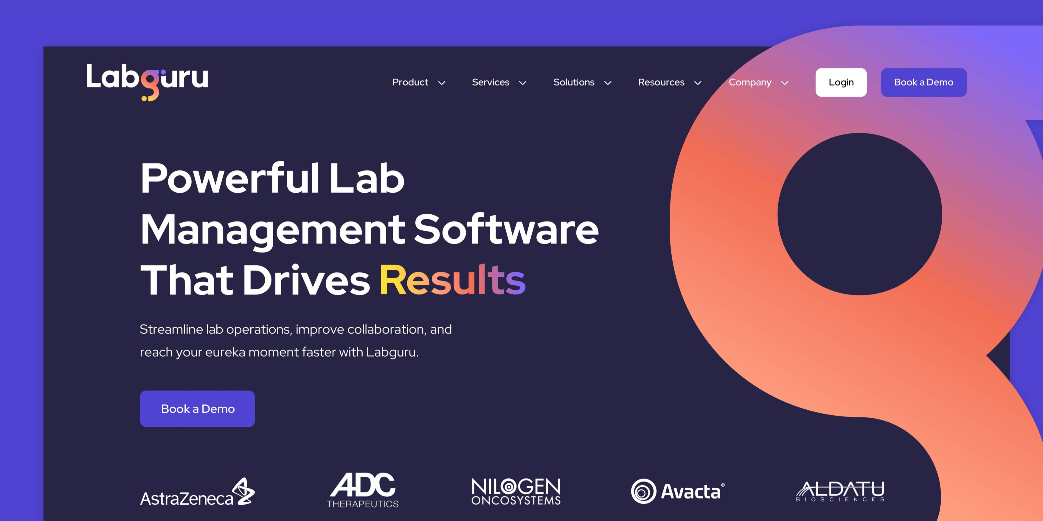
Labguru's SaaS website design immediately captures attention with its striking brand presence and crystal-clear value proposition. The hero section features rotating text that cleverly extends their core message, while a subtle animated gradient flows through their logo, adding a premium touch without being distracting.
As you navigate through the site, there's excellent use of animation to showcase the software's capabilities. UI stills are strategically placed to highlight product features and benefits, while custom iconography supports headings and extends into hero sections, creating a bespoke, crafted feel throughout the entire website experience.
Navigation is intuitive, guiding users effortlessly to key content while making it easy to convert and book a demo. Throughout the site, they've incorporated social proof masterfully, showcasing some of the biggest names in life science – an immediate trust builder for visitors.
2. Viedoc
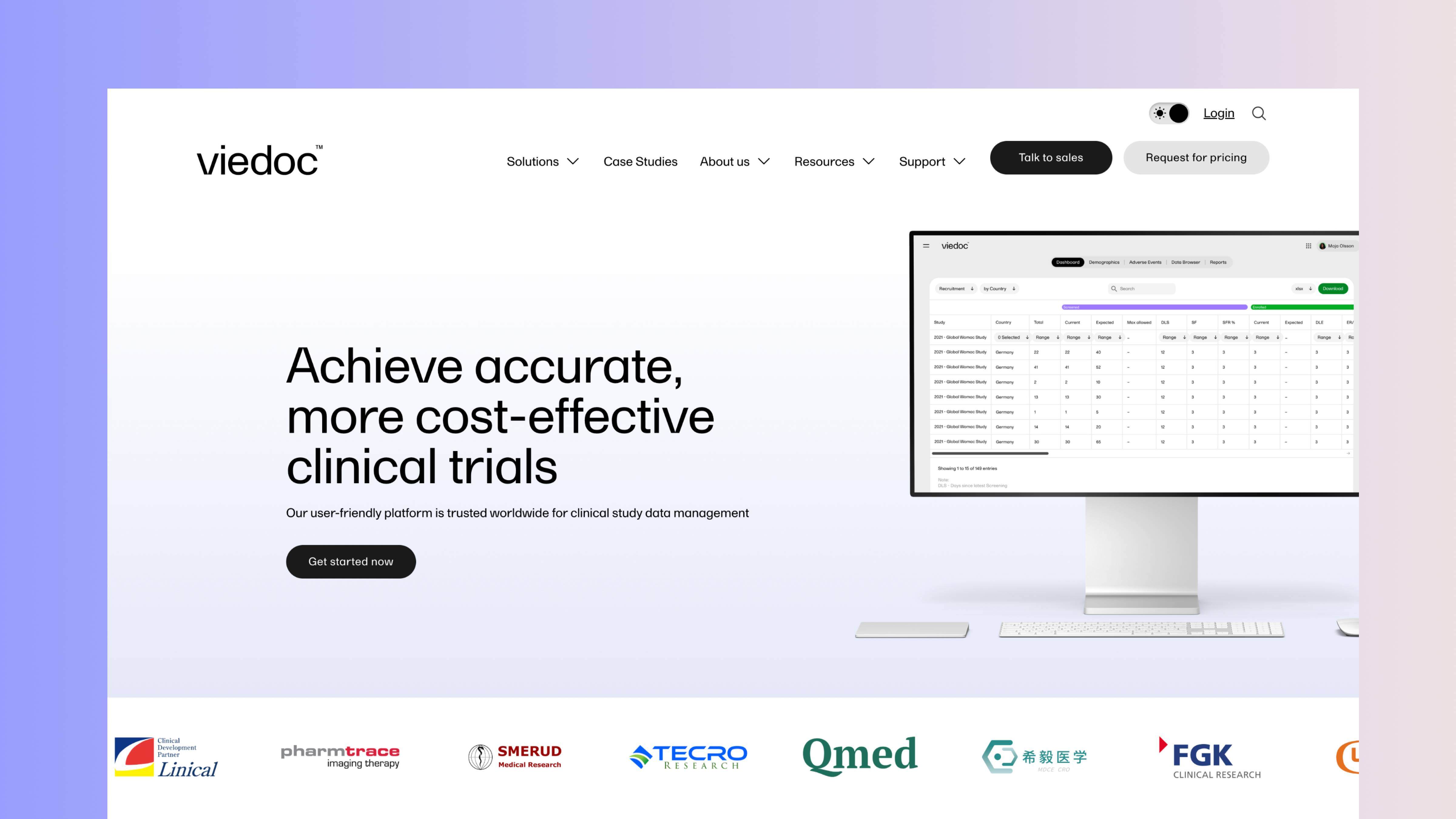
Viedoc's clinical trial software website embraces clean website design principles that perfectly mirror their promise of simple clinical trial technology. The homepage immediately presents a refreshing gradient paired with a clear message, while showing the actual software interface right away, instantly backing up their value proposition with visual evidence.
The site uses light gradients and generous white space, creating a sense of openness that makes complex information more digestible. Their approach to displaying software UI screenshots is particularly clever, instead of harsh black device frames, they've opted for fresh, modern containers that feel light and inviting.
User experience is carefully considered, with the inclusion of light/dark mode functionality and a beautifully simple navigation system. Social proof appears throughout the site in various forms, from custom logos to G2 ratings and case studies – essential elements in an industry that relies heavily on credible data and testimonials.
3. Studycast
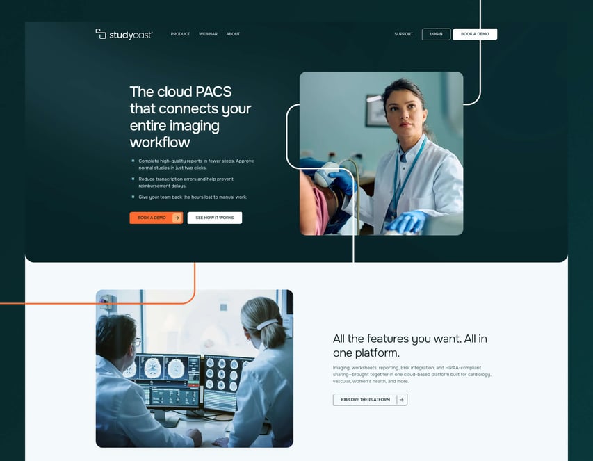
Studycast had a naming problem before it had a design problem. The company traded under three names (Core Sound Imaging as the parent, Studycast as the product, CoreArchive as a secondary offering), which meant prospects were never quite sure who they were dealing with.
Colour is used deliberately across the site: a distinct palette paired with a gradient system gives Studycast's website a way to look different without looking unproven, which matters when the buyer is a healthcare professional trained to be wary of anything that looks trendy for its own sake. The gradients also add depth to what would otherwise be flat page sections, giving the site a sense of movement as visitors scroll rather than relying on static blocks of colour.
The site itself is restructured around how healthcare buyers actually evaluate platforms, with clear pathways by specialty (cardiology, vascular, women's health) rather than by internal company structure. Blend's rebrand and website work for Studycast was purpose-built to unify three fragmented product names under one credible identity for healthcare buyers evaluating imaging platforms.
4. Phoenix Bio

Phoenix Bio demonstrates that simplicity, when executed properly, can make a powerful impact. Their website features a refined colour palette that blends harmoniously throughout the site, creating a cohesive visual identity without overwhelming visitors.
Subtle animations immerse users in the experience without distracting from the core content, while their content layout focuses on readability and making complex scientific information easy to digest. In an industry known for complicated concepts and terminology, this accessibility is invaluable.
The website proves that you don't need flashy elements or complicated design features to create an effective digital presence. Sometimes, doing the simple things exceptionally well, typography, spacing, hierarchy and clarity, creates the most powerful user experience. Ask a lesser agency for a biotech redesign and you often get flashy hero animations layered over thin content, but Blend's work on Phoenix Bio delivers the opposite: restraint that lets typography and hierarchy do the work instead.
5. Cambrian Bio

Cambrian Bio's website exudes a high-end brand feel that immediately positions them in the premium space. Their iconic 'C' logo is cleverly utilised throughout the site in unique ways that elevate their overall image, while full-page colour washes create unique atmospheres for different sections.
The changing full-length gradients add to the premium feel, creating subtle variation that keeps the visual experience engaging as visitors navigate through the site. Every design element works in harmony to reinforce the high-end positioning.
For biotech companies operating at the cutting edge of their field, this kind of refined digital presence helps establish credibility with investors, partners, and potential clients alike. The site communicates scientific expertise while projecting the sophisticated image of a category leader.
6. Biocair

An immersive background video greets visitors on Biocair's homepage, with a clear value proposition overlay that immediately communicates their core offering. Despite being the largest website on our list, information is thoughtfully spaced and presented clearly, with excellent information architecture that displays important content in a prioritised order.
Brand consistency is maintained through their iconic green colour, which is carried across the entire website alongside a supporting grid graphic. This creates a connected brand feel throughout different sections and page types.
What's particularly impressive is how they've managed to keep navigation refined despite the site's complexity. By creating a clear hierarchy, they enable existing customers to find specific resources like their e-commerce store, while new buyers can easily request a quote. Two very different journeys served without friction, existing customers finding support resources and new buyers requesting a quote, is what Blend's HubSpot website design and development work achieves without the navigation ever feeling like two separate sites bolted together.
7. Entor Tech

Entor Tech takes a different approach with their one-page website that creates an immersive, narrative experience. The dark theme immediately draws visitors in, while key messages remain large and bold to maintain excellent readability – a critical consideration when using darker backgrounds.
Animation is used purposefully to present text in an engaging way, rather than simply for decoration. This intentional approach ensures that motion enhances the content rather than distracting from it.
The single-page format creates a guided journey that leads visitors through their narrative in a controlled, sequential manner. For certain types of scientific companies with a focused offering, this approach can be more effective than traditional multi-page structures.
8. BioLoomics

BioLoomics showcases a fresh, clean website design that cleverly integrates their logo lines throughout the site to create a cohesive brand image. Large, high-quality imagery is used extensively to support messaging and showcase their technology, helping explain complex concepts more intuitively than text alone.
Despite its relatively compact size, the website never feels cramped or oversimplified. Navigation presents key pages clearly, with a distinctive hover effect that adds interest while remaining intuitive.
The overall design demonstrates that effective life science websites don't necessarily need to be complex or expansive, clarity, focus, and quality can create a more impactful impression than sheer volume of content.
What makes a good life science and biotech website?
After looking at these excellent examples, several key elements emerge that contribute to effective life science and biotech website design.
Clear message and value proposition
The nature of these industries can lead brands toward aspirational, mission-driven taglines that end up dominating homepage messaging. While these make for nice reading, they often fail to clearly communicate what the company actually does and who they help. This leaves potential buyers confused when they land on the site.
The best websites in this sector balance visionary statements with crystal-clear explanations of their offerings and target audiences. They answer the fundamental questions visitors have: "What do you do?" and "Is this relevant to me?" before attempting to inspire.
Real imagery
Scientific buyers want evidence that products and technologies are real and used by professionals like themselves. Effective websites show products being used in authentic scenarios, combined with imagery of ideal customer profiles that helps visitors see themselves in the picture.
Stock photography has its place, but nothing builds credibility like showing your actual solutions in real-world environments. This visual proof helps bridge the gap between technical specifications and practical application.
Creative brand application
The design and visual appeal of your website play a crucial role in creating an engaging and memorable experience. Top life science and biotech websites are creatively designed, integrating unique branded elements throughout to maintain a consistent and personalised look.
From custom iconography to thoughtful colour applications, distinctive imagery treatments to bespoke animations – these elements work together to create a cohesive brand experience that differentiates from competitors and leaves a lasting impression.
Social proof
There's perhaps no other industry where website social proof is more important than life science and biotech. These fields rely on passing and trusting different systems with groundbreaking data that needs to be studied and verified. You need to show that your solution is trustworthy in a variety of ways.
The most effective websites in this space incorporate multiple forms of social proof: client logos, testimonials, case studies, published research, regulatory approvals, partnerships with respected institutions, and more. This evidence creates a foundation of trust that's essential for converting highly discerning scientific buyers.
Which platform is best for life science and biotech websites?
Your marketing budget isn't meant for managing complex server infrastructure and software patches. It's better spent creating effective, buyer-centric user experiences that grow your pipeline. That's why we believe HubSpot Content Hub is the best platform for life science and biotech websites.
HubSpot takes care of the technical stuff. It provides a powerful development and editing environment that enables you to create, optimise, and evolve a market-leading website without IT and security headaches.
With technical concerns handled by the platform, your team can focus on what matters most – creating compelling content and experiences that connect with your scientific audience and drive meaningful business results.