

Professional services websites face a unique challenge: how do you showcase expertise, build trust, and convert visitors when your "product" is knowledge and experience? The best professional services websites solve this by combining clear messaging, thoughtful design, and strategic user experience.
Professional services website examples
Before we dive in, let's be completely transparent: some of these websites were designed by us at Blend. We're not showcasing them to trick you into working with us, we're including them because we have genuine performance data showing what works and what doesn't.
The websites we've designed are clearly marked, but every example here, whether ours or not, has been chosen because it demonstrates exceptional professional services web design that genuinely converts visitors into clients.
This list was last updated July 2026.
1. Datel

Datel demonstrates how to bring modernity to financial professional services. Their homepage immediately establishes a contemporary feel through thoughtful white space, modern typography, and bespoke animated illustrations that reflect their services.
What makes this design particularly effective is its clean approach to traditionally complex subject matter. The website combines a refined colour palette with strategic touches of their signature red, creating visual interest without overwhelming visitors. Their navigation uses modern functionality with a clean, intuitive mega menu that simplifies complex service offerings.
Perhaps most notably, Datel's blog showcases modern content presentation at its finest. By prioritising readability and reducing clutter, they've created a content experience that feels fresh and engaging, proving that even detailed financial content can be presented in a contemporary way that actually helps visitors understand complex topics.
That focus on clarity translated into results too: a 35% increase in revenue between 2021 and 2024 followed Blend's rebrand and website rebuild for Datel as they launched into a new market segment.
2. BCAS
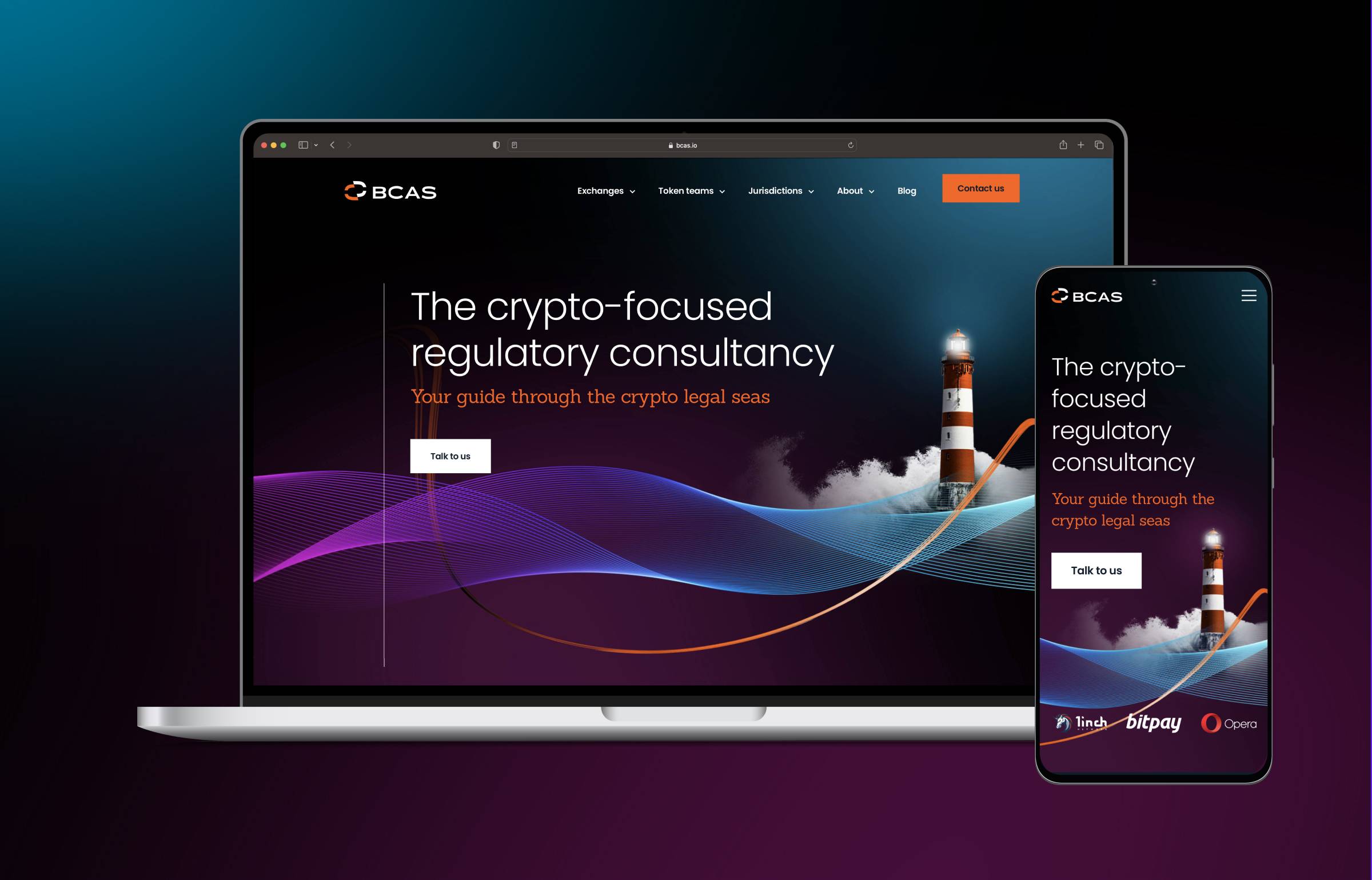
BCAS' website stands out with its distinctive design and stylish photography that perfectly complements their brand. The moment you land on the homepage, you're greeted with clear positioning and eye-catching visuals that seamlessly match their brand messaging and continue to impress throughout the entire site.
The interactive globe module showcases BCAS' best crypto-friendly locations, fitting beautifully within the overall design aesthetic. The website offers an intuitive and engaging user experience, effortlessly guiding visitors to important information whilst maintaining visual appeal. They've also implemented well-defined conversion paths, ensuring the site is optimised to generate a strong pipeline of qualified enquiries.
3. Leep Group
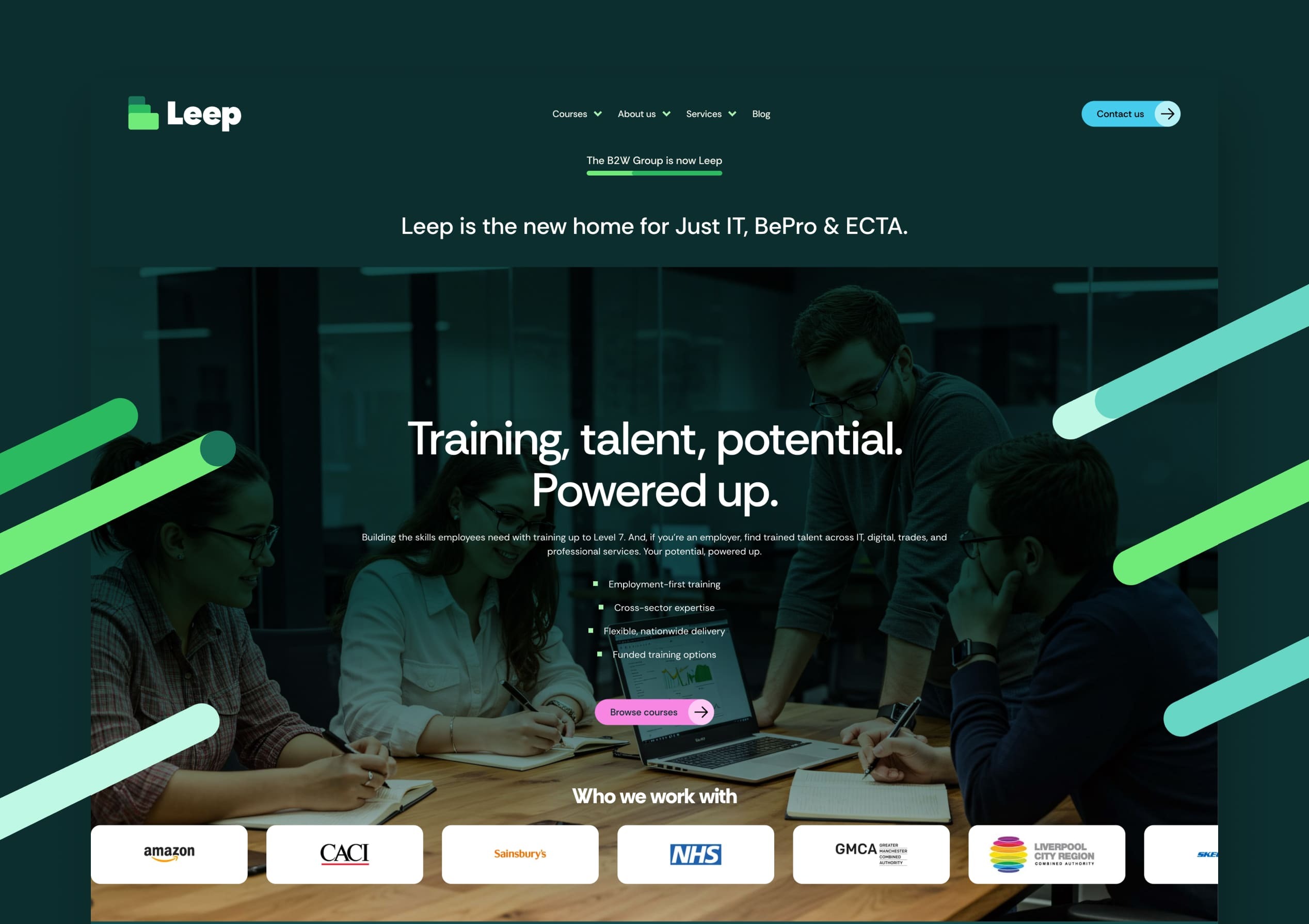
Leep Group shows how strong visual design can bring order to a genuinely complex offering, in this case funded training pathways spanning digital, IT, HR, trades, and renewable energy, aimed at two very different audiences: employers and learners.
The site's diagonal graphic elements and bold colour palette are used deliberately throughout, creating visual energy in the hero sections and section breaks without ever muddying the underlying content hierarchy. Custom iconography sits alongside a consistent typographic scale to differentiate the eight sector areas at a glance, while people-focused photography of real learners and employer partners replaces the generic corporate imagery this sector tends to default to.
Blend's website rebuild for Leep Group developed a comprehensive digital design system, standardising iconography, typography, and colour application across the site so a brand built through several acquisitions finally reads as one.
4. Kings Court Trust
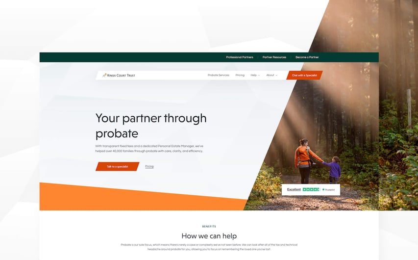
Kings Court Trust shows how visual design alone can shift the entire tone of a professional services site, turning something that could easily feel clinical into something that feels authoritative and genuinely compassionate, which matters when the site is guiding grieving families through complex decisions.
The visual identity uses warm oranges against neutral greys and soft tones throughout, a deliberate palette choice that keeps the site feeling human and approachable rather than corporate. Structured comparison tables and clear pricing breakdowns replace what used to be scattered, confusing information about service tiers, giving the layout a visual hierarchy a family can actually work through during a difficult time.
Where many probate sites bolt visual warmth onto an otherwise generic template, Kings Court Trust's redesign runs on a section-based HubSpot component system, giving the internal team full control to keep that same tone consistent as new pages get added.
5. Wavenet

Wavenet's website brings modern design sensibilities to complex technology services, proving that technical doesn't have to mean boring or overly complicated.
Their innovative use of technology panel image masks transforms standard stock photography into distinctive brand elements, while consistent shape patterns throughout the site create a cohesive visual experience that feels uniquely theirs. This approach shows how professional services can stand out without resorting to generic imagery.
The colour palette is distinctly modern and tech-focused, with strategic use of space and signpost colours to guide users through conversion paths. Their navigation's blur effect background demonstrates real attention to detail while enhancing usability, a perfect example of modern design serving practical purposes rather than just looking flashy.
6. Biostrata
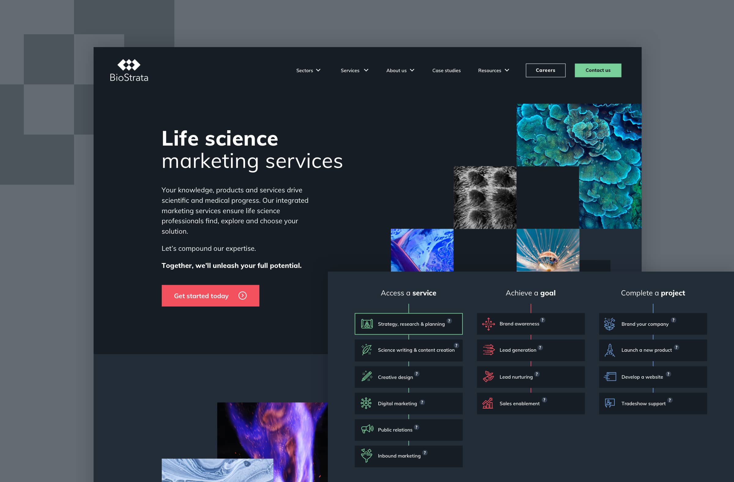
Biostrata's website displays its unique value proposition and promotes its life science marketing services with remarkable clarity and confidence. The visually striking design reflects the expertise, experience, and passion of the agency whilst maintaining the scientific credibility their sector demands.
Subtle animations, abstract imagery, and a distinctive tree diagram format enhance the scientific aspect of their brand and establish their unique identity in a crowded marketplace. These elements work together to communicate complex concepts in an accessible way.
The improved navigation and strategically placed CTAs provide an intuitive customer journey that guides visitors naturally towards conversion. The website not only demonstrates Biostrata's marketing expertise but perfectly reflects their deep understanding of their life science audience.
Blend's B2B branding services are purpose-built for translating a scientific niche identity into a distinctive visual system, which is exactly the abstract, tree-diagram language Biostrata's site relies on.
7. Thalēs
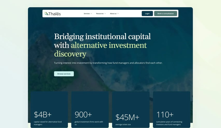
Thalēs shows how a consultancy with a genuinely dual audience can avoid the trap of speaking to neither of them properly. Thalēs helps fund managers connect with institutional investors while also offering capital advisory, technology, and talent solutions, and the site needed to serve both sides with equal confidence.
The design uses a clean, spacious layout with a light green background that gives the whole site a fresh, modern feel without tipping into generic territory. Lifestyle imagery runs throughout, keeping a high-touch, people-focused service feeling approachable rather than abstract.
Blend's website rebuild for Thalēs restructured the site around two distinct audiences, fund managers and institutional investors, with clear pathways into services like the Agora platform.
8. Foundation IT
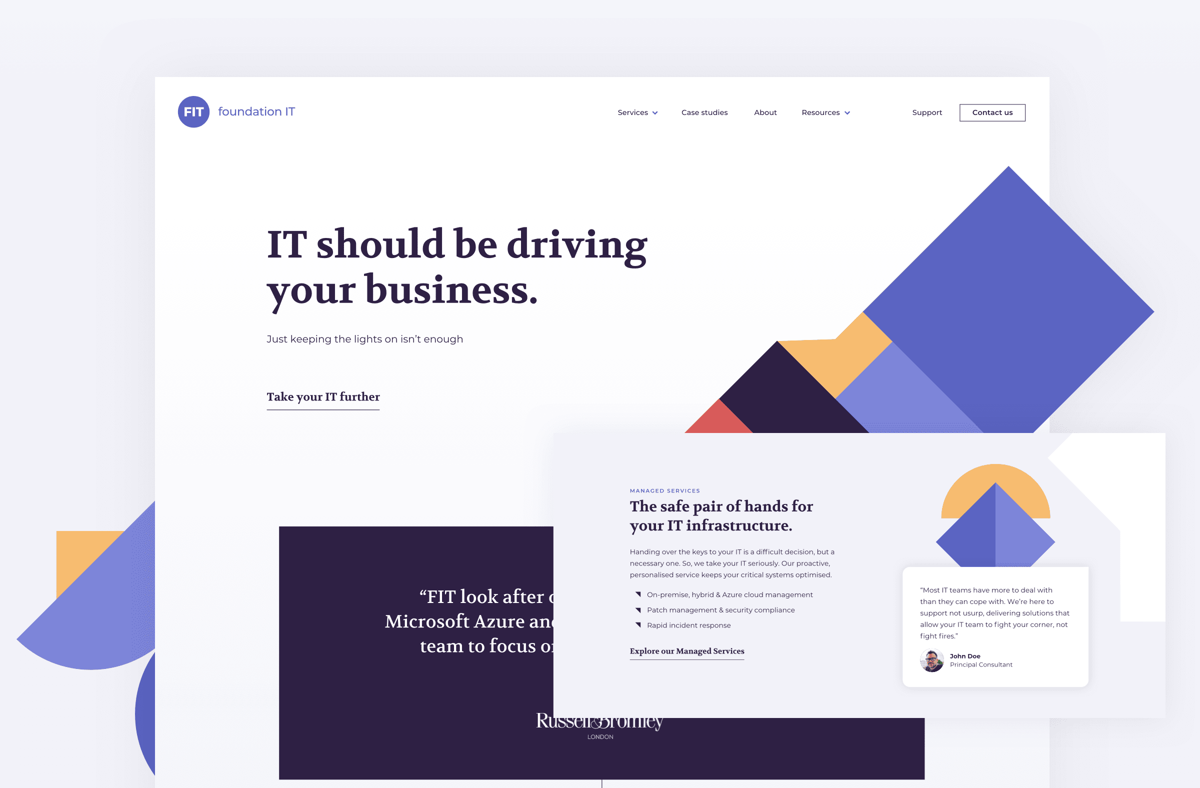
Foundation IT's website stands out from the typical corporate technology crowd with its bold colours, abstract visual style, and crystal-clear brand messaging. Rather than falling into the trap of corporate blue and generic stock imagery, Foundation IT's site is as distinctive as their approach to IT services.
The website truly represents their people, processes, and unique value proposition. Strategic animation on the homepage, combined with short, punchy copy, helps differentiate their brand in what's often a congested and commoditised marketplace where many providers sound remarkably similar.
9. Experts for Expats

Experts for Expats demonstrates how to handle complex service offerings with a clear value proposition and professional yet interesting visual approach. Their colour palette incorporates gradients effectively, while varied font weights and sizes create proper content hierarchy throughout the site.
The use of colour blocks to separate content sections makes complex information digestible, whilst their simple navigation manages to handle numerous services without overwhelming visitors. A particularly clever touch is how we implemented a toggle for their request form, the button changes the form dynamically, showing attention to user experience details.
Despite offering extensive information for partners and clients, everything has been carefully curated with thoughtful content hierarchy and user experience design that makes even complex information easy to consume.
10. Berkshire Hathaway

(Not really a design inspiration, but there's a valuable lesson here)
Obviously, this isn't genuinely a design inspiration in the traditional sense, but Warren Buffett's holding company website offers an interesting perspective on what truly matters in web design. The site strips out virtually all modern UX principles, design elements, sophisticated typography, and content hierarchy.
Yet here's the fascinating part: a holding company managing billions in assets operates with this incredibly basic (and let's face it, awful) website, proving that you don't necessarily need the flashiest design, just the information your buyers actually care about.
Of course, this is an extreme example, and most businesses couldn't get away with this approach. Notably, none of the individual Berkshire Hathaway portfolio companies have websites like this, only the holding company does. But it serves as a useful reminder that substance should always trump style, even if both together create the ideal combination.
What do the best professional services websites have in common?
Looking through these professional services websites, several recurring themes emerge that separate the exceptional from the merely adequate.
Clear, concise messaging
When someone visits your professional services website, they should quickly understand whether you can solve their specific problem. The best sites nail their messaging by clearly stating what they offer and who benefits from it. They avoid clever wordplay that confuses rather than clarifies, instead focusing on outcomes and value.
Successful professional services websites speak directly to their audience's pain points and demonstrate understanding of their challenges. They use language that resonates with their target market rather than trying to impress with jargon or complexity.
Blend's copywriting within our branding services is built to translate a specific value proposition into plain language, rather than defaulting to jargon that sounds impressive but says nothing.
Genuine differentiation
Differentiation matters enormously in professional services, where many providers can seem remarkably similar on the surface. What truly counts is that your differentiation is genuine and meaningfully distinguishes you from your main competitors. This is what will genuinely captivate your visitors and give them a compelling reason to choose you.
The most effective differentiation often extends beyond just your core service offering. It might stem from your unique approach to client relationships, your company culture, your specific industry experience, or how you deliver results. The key is ensuring your differentiation is both authentic and valuable to your target audience.
Humans integrated into the visual language
Professional services are fundamentally about people helping people solve problems. The best websites recognise this by integrating real humans into their visual storytelling rather than relying solely on abstract concepts or generic stock photography.
Whether through authentic photography of team members, case studies featuring real clients, or video content that showcases personality and expertise, successful professional services websites remember that trust is built between people, not between brands and prospects.
Kings Court Trust's homepage leans on lifestyle imagery of real families rather than stock photography, reinforcing the warmth the colour palette is already doing on its own.
Intuitive navigation
B2B decision-makers are incredibly time-poor, giving you mere seconds to engage them effectively. Your goal should be understanding their needs and offering the most relevant navigation options. By guiding visitors along their expected journey and limiting choices to what truly matters, you demonstrate understanding and confidence in your offerings.
When using dropdown or mega menus, keep them clean and manageable to avoid overwhelming visitors. The navigation should feel like a helpful guide rather than a complex maze that requires effort to understand.
Creative brand application
The design and visual appeal of your website play a crucial role in creating an engaging and memorable experience that sets you apart from competitors. The most successful professional services websites are creatively designed, integrating unique branded elements throughout to maintain a consistent and personalised look.
This approach enhances brand identity and leaves a lasting impression that helps you stand out in competitive markets. Creative brand application doesn't mean flashy or over-designed, it means thoughtful, consistent, and distinctively yours.
Comprehensive social proof
Professional services purchases often involve significant investment and risk, making social proof absolutely crucial for building confidence. The best websites offer multiple forms of evidence to back up their claims and reassure visitors.
This might include client logos, detailed case studies, testimonials from recognisable companies, industry awards, or certifications. The key is providing various types of proof that speak to different aspects of your credibility and track record of success.
Which platform is best for professional services websites?
Your marketing budget isn't meant for managing complex server infrastructure and software patches. It's better invested in creating effective, client-centric user experiences that generate qualified enquiries and demonstrate your expertise.
That's why HubSpot CMS is the ideal platform for professional services websites. HubSpot handles all the technical complexities, providing a powerful development and editing environment that enables you to create, optimise, and evolve a market-leading website without IT headaches or security concerns.
For professional services firms, HubSpot's integrated approach means your website works seamlessly with your CRM, email marketing, and lead nurturing – creating a cohesive experience that guides prospects through your sales process effectively.
Creating a professional services website that works
The most effective professional services websites combine clear messaging, strategic design, and genuine understanding of their audience's needs. They focus on building trust, demonstrating expertise, and making it easy for prospects to take the next step.
Whether you're redesigning an existing site or building from scratch, remember that your website should feel like an extension of your best client consultation, helpful, insightful, and focused on solving real problems rather than just showcasing what you do.