

Looking to build a distinctive website on HubSpot?
Speak with our team to discuss how we can help you bring your brand to life.
HubSpot website design is more flexible and creative than most people assume. The platform has evolved significantly since its early days as a marketing tool, and what's possible today is a long way from the templated, generic sites the misconception is based on.
The belief that all HubSpot websites look the same is understandable. There are real reasons it exists. But it's rooted in how the platform has historically been used by some businesses, not what it's actually capable of.
In this blog, we explain where the myth comes from, what actually determines how a HubSpot website looks, and show you five very different websites that were all built on the platform.
HubSpot didn't start as a serious web development platform. It started as a marketing tool, and HubSpot CMS came later, bolted on to support campaigns and landing pages rather than built from the ground up as a development-first platform. For a long time, that showed. Developer capabilities were limited, the flexibility wasn't there, and a perception formed: HubSpot is fine for marketing, but not for serious websites.
That perception has never caught up with reality. HubSpot Content Hub now gives developers serverless functions, HubDB, custom data structures, and advanced module development capabilities. Yet outside of those who work closely with the platform, that reality remains largely unrecognised.
The second reason the myth persists is the template and theme marketplace. HubSpot's marketplace is full of off-the-shelf themes, many of them free, and smaller businesses and startups use them regularly. They're quick to set up, low cost, and fit for purpose at a basic level.
But when dozens of companies build on the same theme, the layouts, section patterns, and overall feel start to blur together. Swap in a logo and change the brand colours, and the underlying structure remains identical to the site in the next browser tab. This isn't a platform problem. It's a procurement pattern, and it's one you'd find on WordPress, Squarespace, or any other CMS with a free theme library.
The best way to prove a point is to show it. These five websites were all built on HubSpot by Blend. Beyond the platform, the similarities end there. You can see more examples of HubSpot website here.
.jpg?width=2400&height=1535&name=DrDoctor-Homepage-1%20(1).jpg)
DrDoctor is a healthcare patient experience platform working with the NHS. Their website looks exactly like what it is: a bold, distinctive brand applied with real creative ambition.
AI-generated oil painting backgrounds run throughout the site, giving it a visual identity that none of their competitors share. Product UI is presented in bespoke branded frames rather than plain screenshots dropped onto a generic layout. The mega menu is large and deliberately so. DrDoctor has a complex product range and multiple audience types to serve, so the navigation is built around that strategic reality. Every element has been designed to reflect the brand, not just to fill space.

C.H.I. Overhead Doors manufacture premium garage doors in the US, and their website reflects the quality of what they make. Where DrDoctor leads with texture and illustration, C.H.I. leads with lifestyle photography, with high-end imagery of their doors in real-world settings.
The detail that makes it stand out is the hand-drawn typography and illustrative arrows woven through the design, a deliberate nod to the craftsmanship behind the product. The navigation is structured entirely around how their buyers actually shop, guiding them through the range in a way that supports the purchasing decision rather than just listing products. An entirely different design language to DrDoctor, built for an entirely different brand and buyer.

Inshur provide commercial auto insurance globally. Their website is cleaner and more stripped back than the previous two, but it's a long way from generic.
The hero section is a good example. Rather than a standard background image, the design uses a vehicle silhouette as a cut-out, pulling elements of the product world directly into the layout. Custom iconography and branded circular section shapes come straight from their brand guidelines. The design focus throughout is readability and user experience, because that's what Inshur's audience needs. Every creative decision serves that purpose.

UES are a commercial facilities management company. Their website is typographically led, using high-impact photography and a considered visual hierarchy that rewards attention.
The brand's signature red is used sparingly but deliberately, pulling out key messages and CTAs in a way that creates clear visual hierarchy without dominating the page. Trailing structural lines run through the layout, giving it a distinctive feel that's specific to UES. Like every website in this list, the navigation was built from a strategic starting point: how should buyers consume information on this site, and how does the design serve that journey?
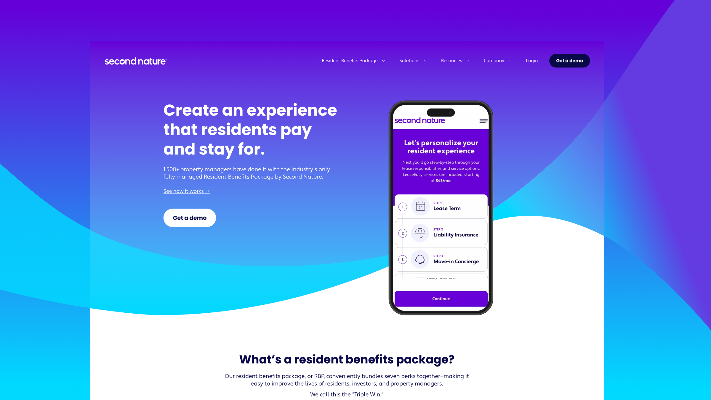
Second Nature uses bold, swooping curved sections, vibrant colours, vector-style illustrations, and a homepage hero video to create a website that feels genuinely alive. The brand is joyful and playful, and every design decision reflects that, from the way sections flow into each other to the custom iconography that runs throughout.
It's a site where creative ambition has been matched by technical execution. The layouts push beyond what most people associate with HubSpot, and that's precisely the point. When a strong brand meets the right team, the platform enables rather than constrains.
Most criticism of HubSpot's design capabilities comes from people who haven't seen it built properly. If your only reference points are template-based sites, it's reasonable to assume the platform has a ceiling.
The ceiling is much higher than most people think. The real constraint is never the platform. It's the combination of design talent and HubSpot development expertise applied to it.
Building a genuinely distinctive website on HubSpot requires a designer who can express a brand visually without defaulting to familiar patterns, paired with a developer who knows HubSpot's architecture deeply enough to execute that vision in a technically sound, scalable way. When one or both are missing, the website ends up looking like everything else, not because of what HubSpot can do, but because of what wasn't brought to it.
When we look across the websites we've built, the ones that stand out share the same foundations.
The structure of a website should reflect how your buyers actually move through information and make decisions. That means understanding:
Who your audiences are and what they need to know at each stage
How the site should guide them towards a decision
How navigation, page hierarchy, and content sequencing serve that journey
When strategy drives the build, every design and development decision has a clear rationale behind it. The result feels considered rather than assembled.
A strong brand, applied well, produces something distinct. That means going beyond swapping in colours and a logo. It means making deliberate decisions about imagery, typography, layout, and motion that collectively express what the brand stands for.
The iconography, the flow between sections, the visual language: every element should feel specific to that business and no other. That level of intention is what separates a website that's recognisably a brand from one that's recognisably a template.
HubSpot has capabilities most people never touch:
Custom modules built precisely to the brand's needs
HubDB driving dynamic, structured content
Integrations pulling data from other platforms
Serverless functions handling complex logic
When developers understand the platform in depth, they can build things that look nothing like a template, because they're not using one.
The gap between design and development is where websites lose their distinctiveness. A designer produces something visually ambitious; a developer who doesn't fully know the platform scales it back to what's familiar. Closing that gap, with a designer who understands what HubSpot can do and a developer who can execute the full vision, is what produces consistently strong results.
HubSpot website design has moved well beyond the limitations that gave rise to the "they all look the same" perception. The platform now gives developers the tools to build anything a brand requires, and the examples in this blog demonstrate what's possible when that capability is matched with the right strategy and expertise.
What separates a distinctive HubSpot website from a generic one has nothing to do with the platform itself. It comes down to the people building it, the depth of their HubSpot knowledge, and whether design and development are working from a shared strategic foundation.
Get those things right and the platform becomes an asset, not a constraint. Your website can look exactly like your brand, behave exactly as your buyers need it to, and sit alongside all the CRM, marketing, and sales tools your team already relies on.
Speak with our team to discuss how we can help you bring your brand to life.


15 June 2026

11 May 2026