Your homepage is the most important page on your website. It's where the majority of your visitors land first, and it's often the deciding factor in whether they explore further or leave immediately. For B2B companies, this first impression can directly impact pipeline and revenue.
Yet most B2B homepages fail to capitalise on this opportunity. They're filled with vague messaging, generic imagery, and unclear value propositions that leave visitors confused about what the company actually does or why they should care.
The most effective B2B homepages cut through this noise with clear messaging, strategic design, and genuine understanding of what visitors need to make informed decisions. They don't just look great, they actively guide visitors toward becoming qualified leads.
The best examples of B2B homepage design
A quick note before we dive into the examples...
You'll notice that all the websites featured in this list were designed and developed by us at Blend.
This isn't because we're short on inspiration or trying to show off, but because we know the strategic thinking behind each design decision, we've seen the results they deliver, and we understand exactly why they work so effectively.
As a specialist HubSpot website design agency, our approach to homepage design goes beyond aesthetics. When we create these homepages, we integrate deep audience research, conversion optimisation, and user experience best practices into every design decision. We don't just make them look appealing; we carefully consider how each element guides visitors toward becoming qualified leads. So while these examples showcase effective homepage design, they also demonstrate how strategic thinking can make design choices work harder for your business.
1. C.H.I. Overhead Doors
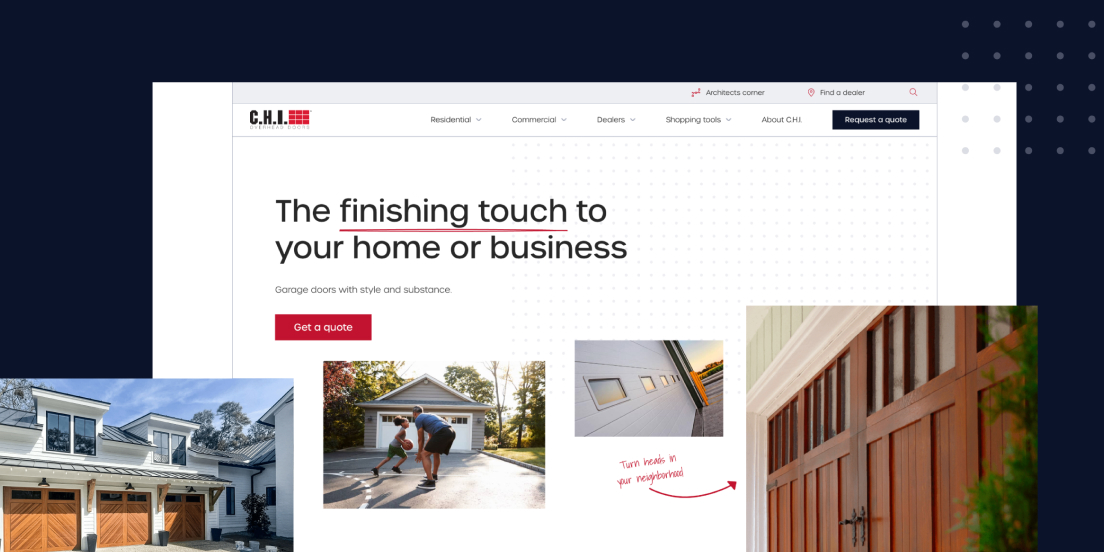
C.H.I Overhead Doors' website demonstrates how a manufacturer can blend creativity, brand identity, and user-friendly design without sacrificing clarity. Their homepage gets straight to the point, highlighting their premium garage doors as the perfect finishing touch for homes and businesses.
The clear tagline "garage doors with style and substance" works in perfect harmony with the hero images to showcase C.H.I's range of designs and functionality. The hand-drawn elements throughout the site add a crafted, premium feel that sets them apart from competitors who rely on generic industrial imagery.
What makes this homepage particularly effective is how smartly it segments content for different audiences. The site clearly splits navigation between home and business customers, making it effortless for visitors to find exactly what they need. Each section provides tailored information that gets users to the right product and information faster, reducing friction in the buyer journey.
The design strikes the perfect balance between showcasing product quality and maintaining professional credibility, essential for an industry where trust and reliability are paramount.
2. Transpoco

Transpoco's transport technology website proves that B2B design can be both vibrant and functional. This homepage is a masterclass in extending brand identity throughout the user experience while maintaining clarity and purpose.
It features an immersive full-width hero image that immediately communicates their industry focus. The value proposition is positioned prominently and kept refreshingly simple, avoiding the trap of over-explaining what should be immediately obvious. Social proof appears early in the hero section, building credibility from the moment visitors arrive.
The subtle fade effects between homepage sections create smooth visual transitions that guide users through the content naturally. This attention to micro-interactions demonstrates how thoughtful design details can significantly enhance user experience without overwhelming the core message.
3. Viedoc

In the complex world of clinical trial technology, Viedoc's website stands out by embracing simplicity rather than fighting it. The minimalistic design perfectly mirrors their promise of straightforward clinical trial technology, proving that less really can be more.
The homepage immediately clarifies what they do through prominent product UI displays, supported by a crystal-clear value proposition that relates directly to the visual evidence. Multiple forms of social proof, crucial in the clinical trials space, where credibility is everything. are woven throughout the design. Easy navigation to different product sets ensures visitors can quickly find the specific solutions they need.
4. INSHUR

INSHUR's website demonstrates how design elements can perfectly align with core business focus. The automotive-themed image masks and shapes create a cohesive visual identity that immediately communicates their auto insurance speciality without requiring explanation.
The homepage architecture showcases sophisticated user journey planning. Distinct B2C and B2B sections are easily accessible through intuitive navigation, with each area visually differentiated through strategic colour application. This approach ensures absolute clarity for different audience segments who have vastly different needs and decision-making processes.
The homepage excels at presenting offerings with supporting information that makes the next step obvious and effortless. Rather than overwhelming visitors with every possible option, the design focuses on clear pathways that guide users toward their specific needs. This creates an excellent user experience that reduces bounce rates and increases conversion potential.
The automotive theme extends throughout the visual elements without becoming gimmicky, creating a memorable brand experience that reinforces their industry expertise and specialisation.
5. Blend

As a B2B website agency, we've included our own website as an example of how to effectively communicate services while maintaining visual impact. The homepage immediately establishes who we are and what we do through clear messaging supported by carefully chosen background imagery.
The immersive scroll-expanding showreels provide immediate credibility by showcasing actual work rather than making empty promises. This approach lets our work speak for itself while demonstrating the quality and variety of projects we handle.
Social proof is strategically deployed throughout the homepage experience, including case studies, portfolio pieces, and client reviews. This multi-layered approach builds trust progressively as visitors engage with the content, rather than front-loading testimonials in a way that might feel overwhelming.
Clear navigation options help visitors explore our services without getting lost in unnecessary complexity. The design balances creative expression with practical functionality, essential for demonstrating that we understand both the art and science of effective web design.
6. Robin Radar Systems

Robin Radar Systems employs a sophisticated dark-themed design that perfectly aligns with their high-tech offering while strengthening their brand identity in the radar technology space.
From the moment visitors arrive, they encounter a clear, concise value proposition that immediately helps first-time visitors understand whether Robin Radar can address their specific detection needs. The adjacent custom imagery visually represents their ability to detect various small objects, reinforcing core capabilities without requiring lengthy explanations.
The homepage effectively uses real-world case studies to build credibility, particularly important in a specialised technical field where proof of concept is crucial for buyer confidence. These case studies aren't buried in a separate section but integrated into the homepage flow where they have maximum impact.
Clear directional cues guide visitors toward exploring their two main product categories, recognising that all potential buyers will fall into one of these segments. This strategic simplification of choice makes decision-making easier while ensuring visitors don't get overwhelmed by technical specifications before understanding basic applicability.
7. Partful
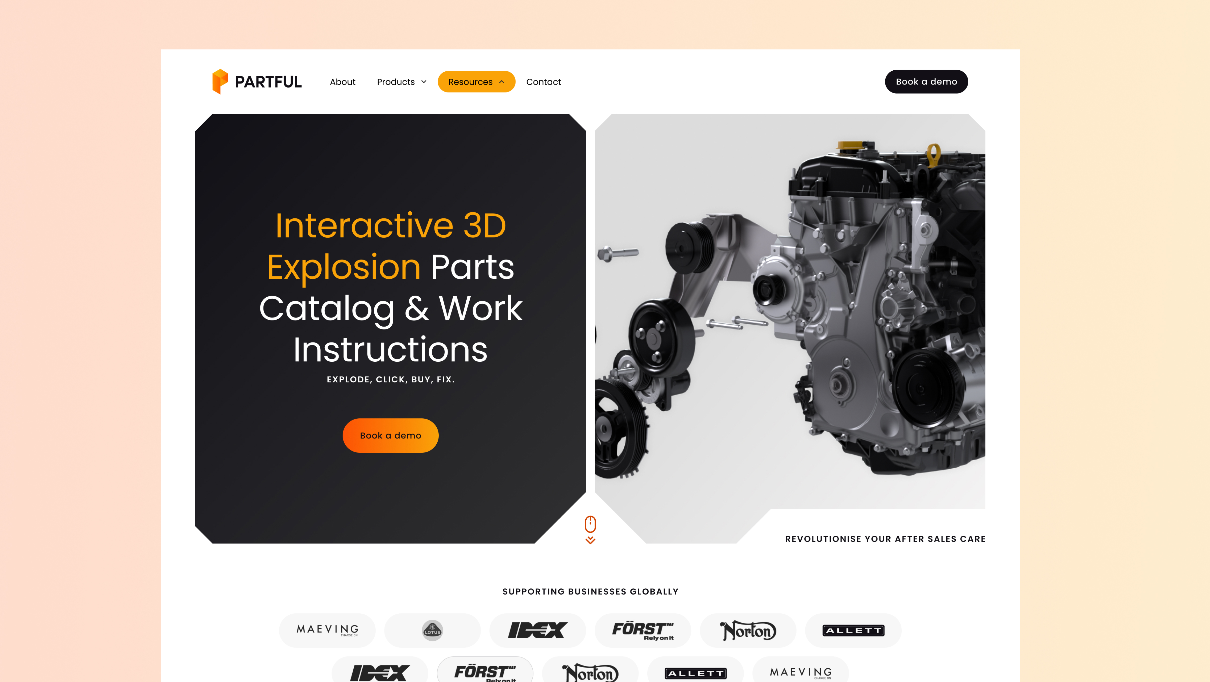 Partful's homepage features a truly distinctive hero design that immediately sets them apart in the competitive manufacturing software space. The angled boxes echo the cut of their logo, while the accompanying animation cleverly showcases the "exploding" nature of their product—a visual metaphor that explains their core concept more effectively than paragraphs of text.
The homepage's standout feature is an interactive before/after slider that tangibly demonstrates the value of their approach compared to traditional methods. This interactive element transforms abstract benefits into concrete, visual comparisons that immediately communicate their unique selling proposition to visitors who might otherwise struggle to understand the technical advantages.
The strategic use of angles derived from their logo frames images in distinctive ways, while their signature orange colour is deployed specifically for CTAs and key messaging, creating visual focal points that naturally guide user attention.
8. Equiem
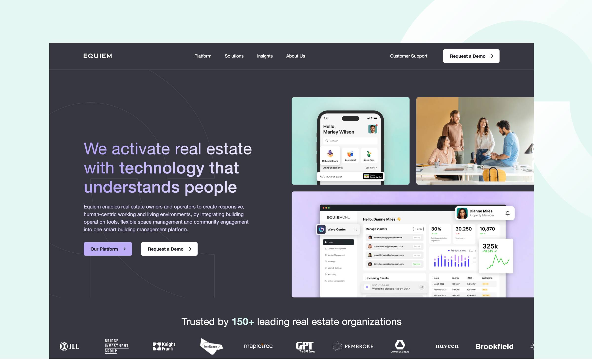 Equiem's homepage sets a new standard for property technology website design through its elegant approach to showcasing complex software solutions. The brand identity shines through sophisticated typography featuring a purple-to-white gradient that adds visual depth without overwhelming the content, a delicate balance that many tech sites fail to achieve.
The homepage excels in presenting product features using contemporary device frames that showcase their user interface with exceptional clarity and professionalism. This approach gives visitors a genuine understanding of the product experience without requiring them to commit to demos or sign-ups first, reducing barriers to initial engagement.
What makes this design particularly effective is its thoughtful balance of product and lifestyle imagery. Technical features are highlighted in clean, modern layouts that feel approachable rather than intimidating, while carefully selected photography maintains a human connection that reminds visitors of the real-world impact of their technology solutions.
The design successfully bridges the gap between technical capability and user experience, making complex property management software feel accessible and valuable to decision-makers who may not have technical backgrounds.
9. Labguru
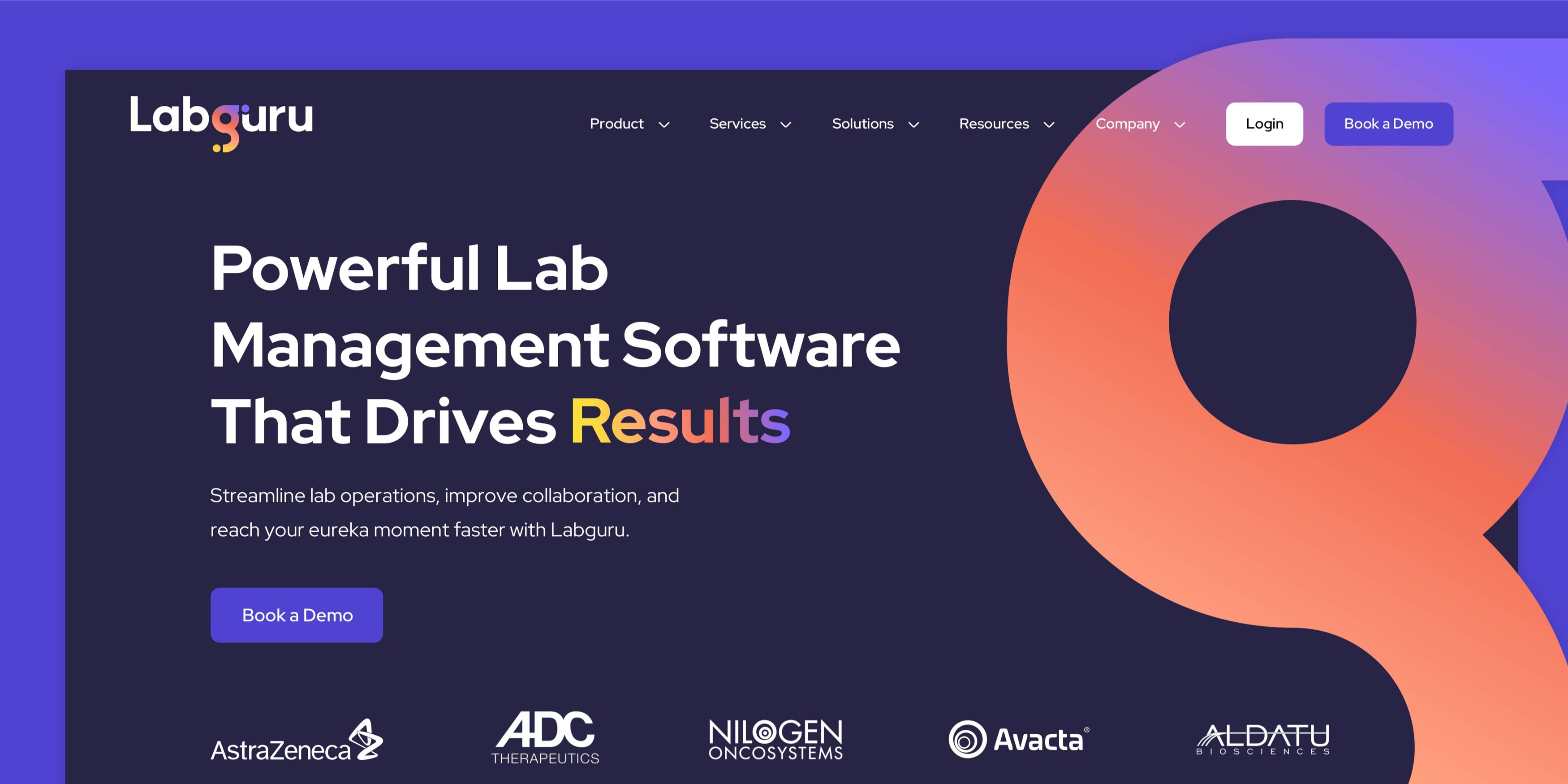
Labguru's homepage immediately captures attention through striking brand presence and crystal-clear value proposition. The hero section features rotating text that cleverly extends their core message without becoming gimmicky, while a subtle animated gradient flows through their logo, adding premium appeal without creating distraction.
As visitors navigate through the page, strategic animation showcases the software's capabilities in context. UI screenshots are positioned to highlight specific product features and benefits, making the software's value immediately apparent rather than abstract.
The homepage incorporates multiple types of social proof, from client logos to detailed testimonials to usage statistics, building credibility through varied evidence rather than relying on a single trust signal. This layered approach to social proof is particularly effective in the scientific software space, where buyers need multiple forms of validation before making purchasing decisions.
10. FT Technologies
 FT Technologies proves that technical products don't require technically complex websites to be effective. The clean design approach begins with an impactful homepage hero video that immediately establishes their industrial expertise and sets expectations for the entire site experience.
The remainder of the homepage presents information with generous white space and clean, title-focused typography that's optimised for scanning rather than deep reading. This approach recognises that B2B buyers often skim content initially before diving deeper into specific areas of interest.
This stripped-back approach demonstrates that effective B2B design often means getting out of the way of the core business objectives rather than trying to impress with unnecessary complexity.
What makes an effective B2B homepage?
Looking across these examples, several key elements consistently appear in homepages that actually convert visitors into qualified leads.
Clear value proposition
Every effective B2B homepage starts with messaging that immediately answers the visitor's fundamental question: "What do you do and can you help me?" The best value propositions are specific enough to qualify the right visitors while being clear enough that anyone can understand them within seconds.
Your value proposition should combine what you do, who you do it for, and why it matters, all in language that your buyers actually use. Avoid industry jargon that might confuse rather than clarify, and resist the temptation to be clever at the expense of being clear.
Supporting imagery that actually supports
Generic stock photos of people in suits shaking hands don't support anything except your visitor's desire to leave immediately. The most effective B2B homepages use imagery that reinforces their message, whether that's actual product screenshots, real customer environments, or custom visuals that illustrate their specific value.
If you offer software, show the interface. If you provide services, show the outcomes. If you manufacture products, show them in use. The goal is to make your offering tangible and believable rather than abstract and forgettable.
Strategic social proof
Social proof works, but not all social proof is created equal. The most effective homepages use varied types of proof, client logos, specific testimonials, case study results, industry awards, or usage statistics - positioned where they have maximum impact on visitor confidence.
Rather than cramming every testimonial into one section, distribute social proof throughout the homepage journey. Place client logos near your value proposition, include specific results near your service descriptions, and use detailed testimonials to support conversion points.
Clear next steps
Every section of your homepage should have a clear next step that moves visitors closer to becoming customers. This doesn't mean every paragraph needs a "Buy Now" button, but it does mean visitors should never wonder what they're supposed to do next.
Create a logical progression from awareness to interest to consideration. Early in the homepage, next steps might involve learning more about specific solutions. Later sections might focus on getting in touch or requesting demos. The key is matching the call-to-action to where visitors are in their decision-making process.
Strategic calls-to-action
Your homepage CTAs should reflect the reality of B2B buying decisions, they're rarely made impulsively, often involve multiple stakeholders, and require significant research. Rather than pushing for immediate purchases, focus on CTAs that move visitors through their natural buying journey.
Primary CTAs should offer high-value, low-commitment next steps like consultations, demos, or detailed information. Secondary CTAs can provide alternative paths for visitors who aren't ready for direct engagement but want to stay connected with your content and expertise.
Creating a homepage that drives growth
These examples demonstrate that effective B2B homepage design isn't about following trends, it's about understanding your audience and creating experiences that convert visitors into customers.
Every website featured in this list was built with strategic thinking at its core. We didn't just make them look good—we designed them to generate qualified leads and deliver measurable business results for our clients.
If your current homepage isn't driving the growth your business needs, it's time to rethink your approach. Creating an effective B2B homepage requires deep audience understanding, strategic design decisions, and technical expertise that goes beyond aesthetics.


