

An effective SaaS website needs to attract, engage, and convert visitors. The user experience, design, copy, performance, and structure of your site all play their part in achieving this. In this blog, we explore some of the best SaaS websites that you can use for inspiration in 2026.
The best SaaS website examples
As a SaaS website design agency, we've looked at and created countless SaaS websites, so we understand what makes them successful.
To inspire your next project, here are 15 SaaS websites that give businesses a market-leading presence.
This list was last updated July 2026.
1. RMS
Designed and developed by Blend
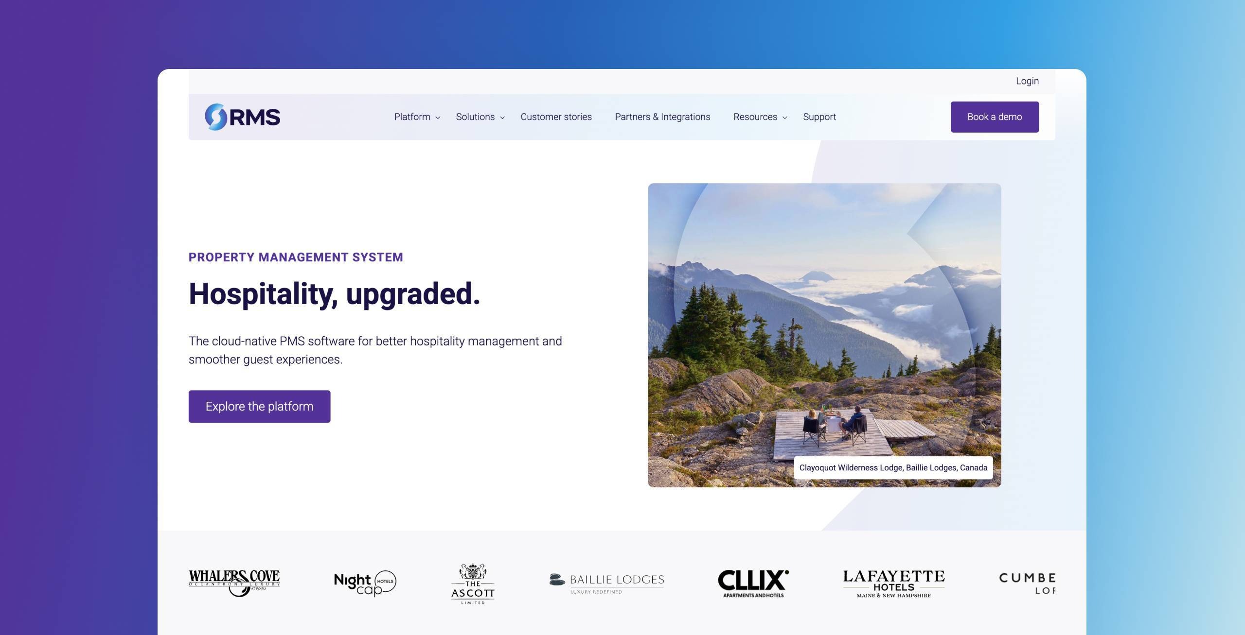
RMS is a global property management platform for hotels, resorts, and holiday parks, expanding fast across three verticals and multiple continents. When Blend rebuilt RMS's brand, website, and HubSpot infrastructure as a single integrated programme, the design system that came out of it was built around a "day and night around the world" concept, reflecting RMS's teams working across time zones, expressed through structured geometry and warm, people-focused photography rather than generic SaaS stock imagery.
The homepage hero balances that bold creative concept with a clear, buyer-first message, and conversion pathways are designed into every page from the outset rather than added as an afterthought. Design, copy, and technology all reinforce each other here because they were delivered as one connected piece of work, not three separate handoffs.
The results back up the approach. Pipeline grew 48% in the twelve months after Blend's rebuild went live, a rare case where you can draw a fairly straight line from design decisions to commercial outcome.
2. Wynter

Wynter lives and breathes their core values of clear, concise messaging to their target audience. The homepage hero section exemplifies this. After reading it, you know exactly what Wynter does and how it benefits you. The looping video supports the core message and shows you precisely how the platform works, enhancing the overall user experience rather than distracting from it.
It's also good to see that the yellow background is used sparingly and effectively. With a bold colour like yellow, there's a danger of overdoing it and compromising readability. However, when presenting more copy on the page, Wynter uses a white background, which helps readability, leaving the yellow background mainly for hero sections and bold statements.
3. Viedoc
Designed and developed by Blend
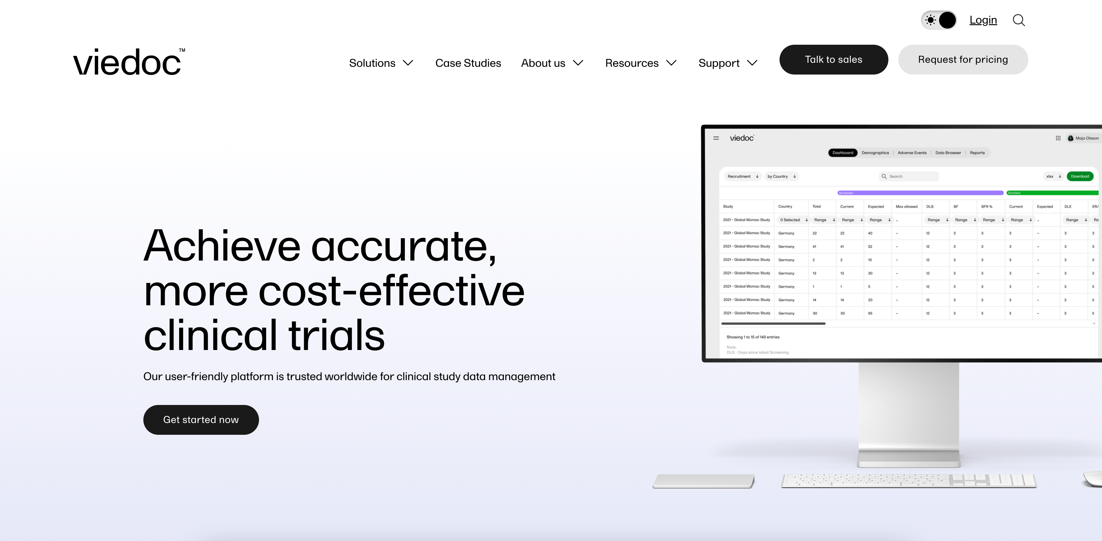
Viedoc's clinical trial technology platform had strong marketing behind it, but a website that wasn't converting the traffic it was generating. Blend's rebuild started with a full UX audit and sitemap redesign, and it shows: the navigation uses a comprehensive mega menu that makes a genuinely complex software platform easy to explore, backed by high-quality product imagery rather than illustration.
The site balances rich visuals with performance, passing Google's Core Web Vitals despite the volume of imagery and tracking running behind the scenes, no small feat for a SaaS platform with this much content. Resource and case study management runs on a HubDB integration, giving Viedoc's team the flexibility to scale content without rebuilding pages from scratch.
The proof is in the conversion numbers: new user to MQL conversion rate doubled in the first quarter post launch, alongside a 14% increase in demo requests.
4. Apollo.io

Apollo's website uses clean typography with clear differentiation upfront. The looping animation usefully demonstrates how Apollo's different features work. The professional animation style allows you to see the platform's look and functionality in a polished way. Product images throughout the website show exactly what you'll see inside Apollo. The tabber section on the homepage is a good example - you can select each feature to preview how it looks within the platform.

The custom hero sections make an impact creatively. Importantly, they also separate out the platform's features, showing how they work individually while tying back into the full integrated platform.

The navigation is a well-executed mega menu. It's clear and easy to use without being overwhelming, using icons and text styles effectively to distinguish sections.
5. Mosai
Designed and developed by Blend
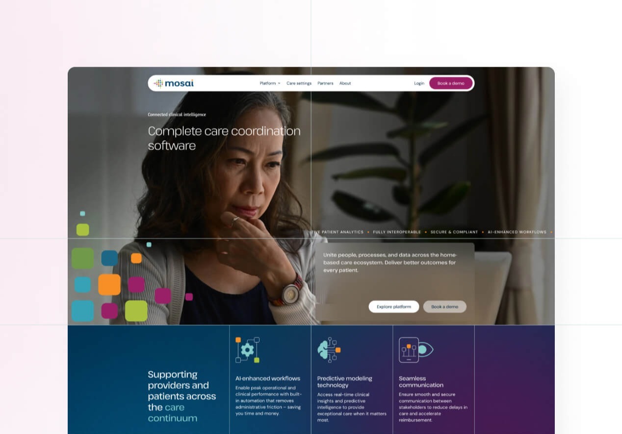
Mosai's website had to do something unusually difficult: launch a brand new identity born from a merger of Forcura and Medalogix, and make it feel established from day one. Blend built a mosaic inspired graphic system that runs throughout the site, reinforcing the idea of disparate pieces forming a coherent whole, and set it against a dark blue foundation punctuated by aqua and electric lime accents drawn from each heritage brand.
Rather than defaulting to sterile clinical stock photography, a bespoke image treatment gives mosai's healthcare imagery a distinctive, ownable feel. The homepage structures a genuinely complex product suite (three product families spanning referrals, clinical management, and networked care) into clear, digestible sections, while EHR integration logos and outcome stats build credibility fast for a buyer audience that needs reassurance before trusting a new platform with patient data.
Built on HubSpot Content Hub with reusable sections, the site also gives mosai's marketing team the flexibility to keep expanding content while the visual system stays consistent, which matters for a young brand still finding its feet in market.
6. Labguru

Designed and developed by Blend
Labguru's website is vibrant and engaging, and it needed to be: the brief called on Blend to translate 50% year-over-year growth into a website capable of doubling it. From the moment visitors land on the site, they're captivated. The homepage greets them with a clear message explaining exactly what their platform does and how it benefits the visitor, and an animated gradient logo adds a premium creative touch without distracting from the message.

Product videos and animations are used frequently throughout the website to support the copy and demonstrate the platform, making it easy for visitors to understand how it works and the value it offers.

Labguru's website also features bespoke illustrations forming a unified design. These not only enhance the visual appeal but also perfectly align with Labguru's brand identity. The illustrations bring creativity and uniqueness.
Various forms of social proof are placed strategically throughout, which is particularly important in industries like life-sciences that place significant importance on evidence.
The website was also built with SEO and Core Web Vitals in mind despite the animation and video load, which is part of why the redesign delivered a 132% increase in demo requests year over year.
7. Ramp

Ramp's website immediately grabs visitors' attention.
One key element that sets it apart is the subtle use of animation. By incorporating animations strategically, Ramp maintains a balance between keeping the core message easy to digest while also providing an engaging and interactive browsing experience.
The website is very clean and well-spaced throughout, putting particular emphasis on the typography, which lets the message and copy take centre stage. When visuals are used, they are intentional and easy to consume, not overwhelming.
8. Rainforest Pay

Rainforest's website is a good example of how to combine lifestyle and product imagery to connect with your target audience while also showcasing the product.
While the overall user experience (UX) follows conventional principles, the design elements elevate the website. The attention to detail and thoughtful placement of visuals, animations, and videos make the UX feel refreshing and unique. These small design choices set Rainforest apart and make their website appealing.

The navigation is a great example of presenting multiple items clearly and concisely, using varied backgrounds, illustrations, and typography to clearly distinguish menu items.
9. Second Nature

Designed and developed by Blend
Second Nature's website is vibrant, fun, and engaging. The homepage has an immersive looping video that gives a quick insight into what the software looks like, and the entire site has a positive design, blending product imagery and relatable stock photos that perfectly capture the essence of their target audience.
Offering a seamless and intuitive user experience, the site Blend built guides visitors to valuable informational content and is optimised for demo requests, supporting Second Nature's next phase of growth.
10. Loom

Loom's website put's particular emphasis on bold typography and strong headline copy, which clearly communicate their value proposition and benefit statements.
When animation is used, it's designed in a way that allows you to consume it on the page without needing to play a video. This means it blends right into the user experience through the website.
The use cases section is particularly useful. This clearly highlights how Loom can be used to solve particular problems and visually communicates how this can be done. Within the use case pages, social proof is aligned to the vertical they're covering, providing evidence to the visitor that Loom is being used by companies just like theirs.
11. PandaDoc

PandaDoc does a great job visualising their product and highlighting its simplistic nature, which is a key benefit they promote.
Throughout the website, clear product animations and visuals combine with the copy to effectively communicate the message.

The demo page provides a particularly great experience. It clearly outlines the steps to book a demo, what to expect after booking, and the benefits of booking a demo. They also cleverly use social proof as added evidence at this crucial conversion point.
12. Breathe HR

Designed and developed by Blend
Breathe's modern, fresh design reflects their core message of putting people first. With an emphasis on user experience, the website seamlessly integrates stylised product imagery with images of people, creating a connection between their offering and audience. The carefully crafted design showcases the importance of human interaction and highlights Breathe's commitment to a user-friendly platform.
Before any of that design work started, Blend rebuilt the site's navigation and architecture from the ground up, replacing unwieldy dropdown menus with a structure built around how buyers actually search. That groundwork is a big part of why traffic grew over 100% and lead generation increased 12x within five months of launch.
13. Figma

Figma understands their audience and what will engage them. Their website has engaging visual functionality that immerses you into their product directly on web pages. It cleverly shows how the tool works collaboratively with different team members.
When diving into individual products, they dial back movement within visuals and focus on the platform's benefits.

The bespoke illustrations representing each of Figma's products in the navigation adds a creative touch that extends throughout the pages.
14. Asana

Asana gets the basics right without overcomplicating their website. The typography, backgrounds, and imagery focus on clarity and easy consumption. With little movement and ample white space, it's easy to consume the presented information without distractions, creating a strong and memorable message.
The comprehensive website covers everything you'd need to know about Asana without talking to sales. While this means the navigation is large, it remains clear and easy to use thanks to distinct typography, iconography, and background choices.
15. Equiem

Designed and developed by Blend
Equiem's website is a great example of doing the fundamentals right, building a website with the core components needed for success. When Blend redesigned and rebuilt Equiem's site on HubSpot CMS, the brief was to reflect a shift in the company's positioning as it scaled to serve over 170,000 users globally.
The design, content, and visuals all work together to convey Equiem's positioning with clarity and impact. Video is used sparingly and placed strategically so that the players blend into the website experience and maintain a suitable size.
A variety of backgrounds distinguish website sections without impacting readability, opting for darker backgrounds with large typography to highlight the core messages they want to address.
The user experience makes it easy for visitors to explore Equiem's offering, while optimised conversion paths capture high-intent demo requests to increase pipeline.
What do the best SaaS websites have in common?
As you looked through the websites in this blog, you likely noticed some recurring themes. Let's explore what qualities the best SaaS websites share and why they're so effective.
Clear, concise messaging
When someone visits your website, they should quickly understand if it's what they're looking for and if your business can address their needs. To nail your messaging, clearly state what you offer and who it helps. Avoid catchy phrases that confuse rather than clarify.
Differentiation
Differentiation matters, and it comes in various forms. What truly counts is that it's genuine and distinguishes you from your main competitors. This is what will captivate your visitors.
Keep in mind that points of differentiation aren't just limited to your product or service. They can also arise from aspects like your customer service, company culture, organisation, or how you cater to specific user needs.
Product-based visuals
The most effective way to present a SaaS product is by displaying it directly. This involves using real screenshots, even if they're enhanced for your website's aesthetic. It's the most straightforward way to show visitors how your product can help them and precisely what it offers.
Intuitive navigation
B2B buyers are time-poor; you have only seconds to engage them. Your goal is to understand their needs and offer them the most relevant options in the navigation. By guiding them along their expected journey and limiting choices to what truly matters, you show that you understand them and are confident in your offerings. When using drop-down or mega menus, keep them clear and manageable to avoid overwhelming visitors.
Creative brand application
The design and visual appeal of your website play a crucial role in creating an engaging and memorable experience. Top SaaS websites are creatively designed, integrating unique branded elements throughout to maintain a consistent and personalised look. This approach enhances the brand's identity and leaves a lasting impression.
A variety of social proof
Offering evidence to back up your claims reassures visitors and encourages them to take action. In SaaS purchases, proof is especially crucial, as it helps buyers feel more confident and justifies their decisions, especially when facing significant costs.
The simplest and most common method to showcase proof is by displaying customer logos, testimonials, or case studies. Whenever possible, leverage these to build trust and credibility.
Which platform is best for SaaS websites?
Your marketing budget isn't meant for managing complex server infrastructure and software patches. It's better spent creating effective, buyer-centric user experiences that grow your pipeline. That's why we believe HubSpot Content Hub is the best platform for SaaS websites.
HubSpot takes care of the technical stuff. It provides a powerful development and editing environment that enables you to create, optimise, and evolve a market-leading website without IT and security headaches.
It's also why we build almost exclusively on it. Blend holds HubSpot's CMS Advanced Implementation Accreditation, a status held by only a small number of partners worldwide, and has built 150+ HubSpot websites for SaaS and B2B companies, several of which feature in HubSpot's own Inspire Gallery.
If you're still weighing up whether Content Hub is right for your business, or you already know it is and need the right team to build on it, book a consultation with Blend and we'll walk through what it'd look like for yours.