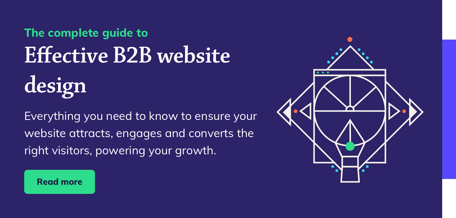
Your website is a crucial part of a B2B buyer’s decision-making process. It helps you attract, engage, delight, and convert the right visitors – so it’s important to get it right. You need a website that's powerful, eye-catching, and well-designed.
The expectations of B2B websites are rapidly changing. Today's users are exposed to so many forms of marketing communications in day-to-day life, that they expect a seamless experience. This includes things like clear user journeys and consistent branding across a website.
We've put together our top B2B website designs that can be used for inspiration in 2026. These websites showcase the latest website design and branding innovations that we think will help B2Bs stand out in the next year and beyond.
The 20 best B2B website designs
We've included a mix of websites in this list that vary by sector and business size, and yes, some of them are ours. We're not going to pretend otherwise.
But there's a reason for that beyond just liking how they look.
With external sites, we can appreciate strong design, smart UX, and clear messaging. With our own, we can go further. We see the data. We know how they convert, what impact they've had on pipeline, and whether they've delivered a return on investment. So when we say these are the best B2B website designs, it's not just an aesthetic judgement. For the Blend sites on this list, it's backed by real business results.
1. RMS Cloud

RMS Cloud's website brings together technology and people in a way that feels genuinely balanced. The design system, rooted in a brand concept of day and night around the world, uses clean geometry and structured layouts alongside warm lifestyle imagery to reflect both their global reach and their human approach.
The visual storytelling is strong throughout, with people-focused photography sitting naturally alongside product messaging. Typography and spacing keep things clear and scannable, while a consistent design language ensures every page feels connected without becoming repetitive.
2. DrDoctor
.jpg?width=2400&height=1535&name=DrDoctor-Homepage-1%20(2).jpg)
DrDoctor's website solves a common healthcare marketing challenge with real creativity. AI-generated imagery replaces the usual sterile stock photography with realistic, empowering scenarios that feel collaborative and human, a smart approach in an industry where patient privacy makes traditional photography difficult.
The brand's distinctive brush stroke elements are woven throughout the site in varied ways, from background textures to section breaks, keeping the design fresh without losing consistency. Layered backgrounds and gradients shift depending on the content, helping users distinguish between patient-focused information and technical product details.
The site architecture is built around a unified platform message, moving away from fragmented product listings to tell a clearer, more confident story. Distinct pathways for decision-makers, patients, and other audiences ensure relevance across multiple segments without cluttering the experience.
3. UES

UES's website is a clean, confident redesign that brings a modern feel to a traditional engineering services business. The previous site was text-heavy and outdated, so the new design takes a lighter approach with improved spacing, stronger visual hierarchy, and high-quality imagery that showcases their work and culture.
The layout keeps things simple and easy to navigate, with clear pathways into their mechanical, electrical, and renewables services. Case studies and social proof are positioned to reinforce credibility without overwhelming the page. The overall effect is a site that feels professional yet approachable, setting UES apart from the larger, more corporate competitors in their space.
4. Thalēs

The Thalēs website uses a clean, spacious layout with a distinctive light green background that gives the whole experience a fresh, modern feel. It's visually distinctive without being over-designed, helping the brand stand apart in a space that often defaults to generic corporate aesthetics.
Lifestyle imagery is used throughout to keep things approachable and engaging, supporting a service offering that's high-touch and people-focused. The site is structured around two core audiences, fund managers and investors, with clear pathways into key services so different users can quickly find what's relevant to them.
The navigation is intuitive and well-considered, with a mega menu that handles the breadth of their offering without feeling cluttered. The result is a site that looks polished, feels current, and aligns with the premium positioning Thalēs brings to their consultancy and advisory work.
5. Inshur

Inshur's website aligns design elements with their core business focus. The automotive-themed image masks and shapes create a cohesive visual identity that perfectly reflects their auto insurance offering.
The website's architecture demonstrates sophisticated user journey planning, with distinct B2C and B2B sections that are easily accessible through the navigation. These areas are visually differentiated through strategic colour application, ensuring clarity for different audience segments.
What sets this website apart is the attention to content presentation. Every element has been carefully considered. From typography and spacing to colour choices and module design, it ensures information remains easily digestible throughout the user journey. The result is a website that not only strengthens Inshur's brand presence but creates an optimised path to conversion.
6. Zapier

Zapier's website is a masterclass in simplifying complex information and guiding buyers on their journey. With a tool as extensive and versatile as Zapier, it would be easy for users to feel overwhelmed or lost.
Their clever website hierarchy, however, expertly guides users to information and use cases specifically relevant to their needs. The site manages to make an enormous product feel accessible and tailored to each individual visitor.
The visuals throughout the website are thoughtfully designed to incorporate product UI screenshots and other elements that demonstrate the platform in action. This approach helps visitors understand not just what Zapier does, but how it works in practice.
Perhaps most impressive is the navigation system. Despite the substantial product offering and numerous options, the mega navigation remains surprisingly intuitive thanks to clear iconography and a well-structured layout. It's a testament to how thoughtful design can make even the most complex products accessible.
7. Monday.com

When you have a broad platform with lots of use cases, it's important to simplify this for your website visitors so that they can understand how your product solves their individual needs.
The monday.com website provides an intuitive user experience that helps users understand their product and how it can help them. The dynamic product selector on the homepage fosters a personalised experience from the start. The use of stylised product imagery helps to convey the platform and support core messaging.
With such a large solution, monday cleverly opted to use a mega menu to give users a clear path through the website. Whilst the mega menu is large, it's easy to navigate thanks to the use of icons, clear typography, and sensible spacing.
For more SaaS website examples specifically check out our blog covering the 15 best SaaS websites.
8. Labguru
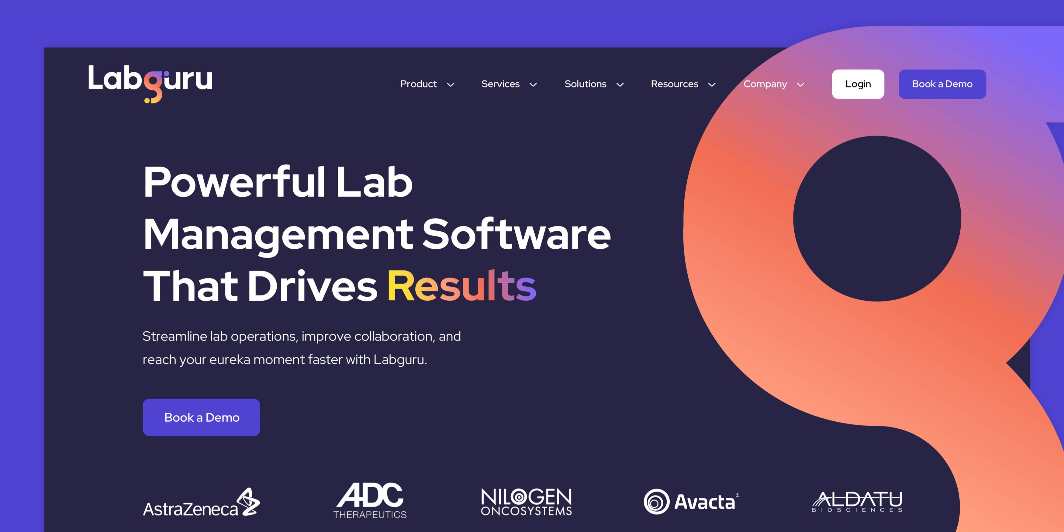
The Labguru website is vibrant and engaging. From the moment visitors land on the site, they are captivated.
As visitors land on the website homepage, they're greeted with rotating text that highlights the numerous benefits of the Labguru platform. This dynamic feature not only grabs attention but also effectively communicates the key selling points of the product.
In addition to the captivating animation and rotating text, Labguru's life science website showcases bespoke illustrations that form a unified design. These illustrations not only enhance the visual appeal of the website but also align perfectly with Labguru's brand identity. The illustrations bring a sense of creativity and uniqueness to the overall design.
9. Kings Court Trust

Kings Court Trust's website balances professionalism with compassion, exactly the tone you'd want from a probate specialist helping families through difficult times. The design uses warm oranges alongside neutral greys and soft tones to create a look that's trustworthy and approachable without becoming clinical.
The real standout is how the site simplifies complex decisions. Structured comparison tables with clear visual hierarchies make it easy to understand different service levels, while transparent pricing removes the ambiguity that often surrounds professional services. It's a smart approach that builds confidence and reduces friction.
Lifestyle imagery keeps things grounded and relatable throughout, while a clean layout and intuitive navigation ensure families can find the right information quickly. The site strikes a difficult balance well: modern and confident, but never impersonal.
10. Transpoco

Transpoco's website immediately conveys a strong, consistent brand image that establishes their market position with confidence. Every page reinforces their identity through thoughtful design elements and consistent visual language.
High-end photography is enhanced with subtle brand marks that weave through the imagery, creating a connected feel throughout the site. This clever integration of visual elements elevates standard imagery into something proprietary and distinctive. The typography is refined and clear, using colour selectively to highlight key words and draw attention to critical messaging.
Overall, the website achieves a high-end, premium feel that positions Transpoco as a sophisticated, trustworthy partner in their industry.
11. C.H.I Overhead Doors
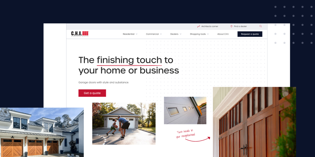
Your website should reflect the value of your products, and that's exactly what C.H.I Overhead Door's website does. With its sleek and modern design, C.H.I's new website exudes a sense of sophistication and luxury that perfectly aligns with their premium brand.
The clean layout and high-end photography showcase the quality and craftsmanship that CHI is known for. To further engage visitors, subtle movement is incorporated throughout the website. This adds a dynamic element that captures attention and creates a more interactive browsing experience.
Colour is also used strategically on CHI's website to distinguish different markets and areas of the website. The use of colour helps users navigate through the website and find the information they need with ease.
Overall, the website showcases their brand and products while enhancing user experience.
12. Overpass
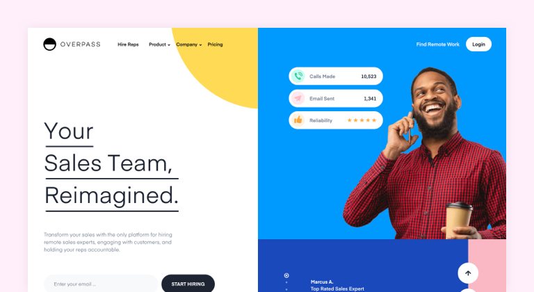
The Overpass website has remained in our rankings for top B2B website designs for the last few years. Its sleek and fun imagery is immediately eye-catching. And the use of heavy colour blocking helps solidify the company's striking brand.
However, Overpass also uses whitespace to draw the user's attention to important copy or imagery, so their use of colours isn't too distracting to the eye. Additionally, strong typography in the heading and animations capture user attention.
Additionally, Overpass integrates shapes into certain sections, such as ones with a product focus, to reinforce its brand identity. In some places, sleek micro animations make the shapes more eye-catching. This is why the website is still a standout choice for us.
13. Advice Guide
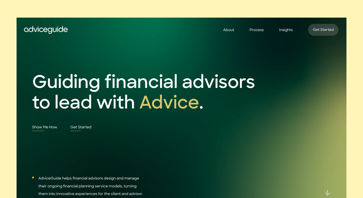
Website design should always prioritise the needs and preferences of your target audience. Advice Guide has hit the mark. As a provider of services for financial advisors, who often face high levels of stress in their jobs, Advice Guide understands the importance of creating a calming and trustworthy online experience.
The deliberate use of green, a naturally soothing colour for the human brain, instantly instils a sense of relief and trust in visitors. This strategic choice of colour not only helps to alleviate the stress that financial advisors may feel but also establishes a sense of credibility and reliability in the services offered by Advice Guide.
The website's design ensures that their process is presented in a clear and easily understandable manner. The information is shown in a logical and intuitive way, making it easy for financial advisors to understand how working with Advice Guide works.
14. Viedoc

In the complex world of clinical trial technology, Viedoc's website stands out with its refreshingly simple approach. The minimalistic design perfectly mirrors their promise of simple clinical trial technology.
The site masterfully employs light gradients and generous white space, creating a sense of openness that makes complex information more digestible. What's particularly clever is the approach to displaying software UI screenshots, instead of harsh black device frames, we opted for fresh, modern containers that feel light and inviting.
The navigation is beautifully simple, proving you don't need elaborate menus to present information effectively. Their restrained colour palette of black and white, accented with subtle purple gradients, puts the emphasis exactly where it should be, on clean, clear typography.
15. Biostrata
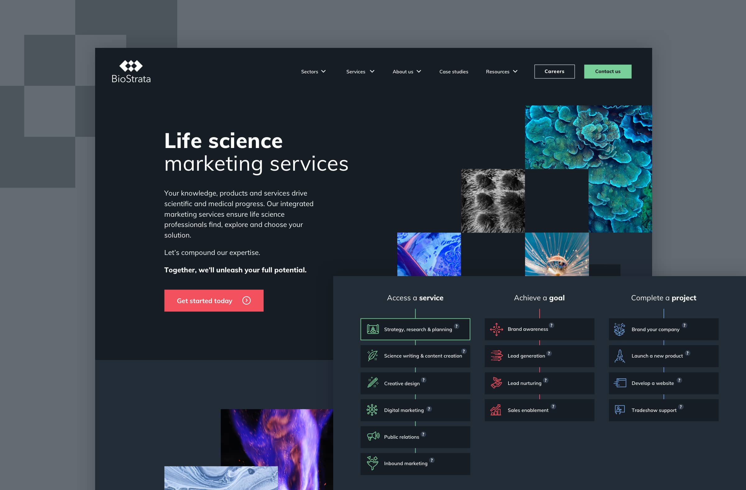
Biostrata's website displays its unique value proposition and promotes its services with clarity and confidence. The visually striking website reflects the expertise, experience, and passion of the agency. Subtle animations, abstract imagery, and a tree diagram format enhance the scientific aspect of their brand and establish their unique identity.
The navigation and clear CTAs provide an intuitive customer journey. The website not only demonstrates Biostrata's marketing prowess, but perfectly reflects their affinity with their target audience.
16. Databox

Databox is an excellent example of a SaaS website that strikes a perfect balance between an exceptional user experience, creativity, and a unique brand identity.
They have a clear message that immediately explains what Databox does and how it helps, leaving no room for confusion. They also provide supporting social proof to back up their claims. The hero image is static, which means it doesn't distract the brain from consuming the message, but it's visual enough to demonstrate the platform's appearance and core functionality. The calls to action are clear and use direct language, so it's easy to understand what happens when you click.
As you navigate through the website, the messaging is clear throughout, and social proof is used strategically. Product screenshots are also used, balancing an authentic platform appearance with an enhanced look and feel for the website.
The pricing is presented in a clear and concise way, allowing you to choose how much information you want to see and displaying it clearly throughout. The sticky pricing bar is useful so you can easily compare packages as you look through the features.
17. Wavenet

Wavenet's website brings modern design to complex technology services. Their innovative use of technology panel image masks transforms standard stock photography into bespoke brand elements, while consistent shape patterns throughout the site create a cohesive visual experience.
The colour palette is distinctly modern and tech-focused, with strategic use of space and signpost colours to guide users through conversion paths. Their navigation's blur effect background demonstrates attention to detail while enhancing usability – a perfect example of modern design serving practical purposes.
18. Robin Radar Systems

Robin Radar Systems use a dark-themed website that aligns perfectly with their high-tech offering and supports their brand image.
As soon as visitors land on the homepage, they see a clear, concise value proposition. This immediate clarity helps first-time visitors quickly understand if Robin Radar has a solution to their specific needs. Next to this statement, a custom image visually represents Robin's ability to detect various small objects, reinforcing their core offering.
Throughout the site, Robin Radar uses a combination of large images, ample space, and bold fonts to deliver key messages effectively. Brand elements are consistently applied to backgrounds and other areas, creating a cohesive look and feel across the entire website.
19. Equiem
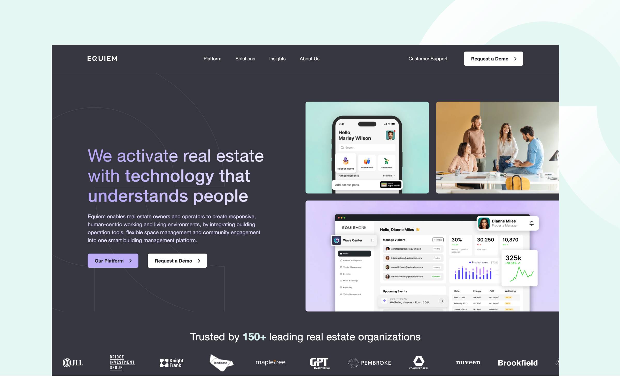
Equiem's website is a great example of doing the fundamentals right - building a website with the core components needed for success.
The design, content, and visuals all work together to convey Equiem's positioning with clarity and impact. Video is used sparingly and placed strategically so that the players blend into the website experience and maintain a suitable size.
A variety of backgrounds distinguish website sections without impacting readability, opting for darker backgrounds with large typography to highlight the core messages they want to address.
The user experience makes it easy for visitors to explore Equiem's offering, while optimised conversion paths capture high-intent demo requests to increase pipeline.
20. Mosai

Mosai's website had to do something particularly difficult: launch a brand-new identity born from a merger and make it feel established from day one. Starting with just a logo and colour palette, the design builds a complete visual system that feels cohesive and intentional throughout.
The mosaic-inspired graphic elements are a standout touch, reinforcing the brand concept of disparate pieces forming a coherent whole. A dark blue foundation is punctuated by aqua and electric lime accents, with colour used strategically to help visitors identify solutions relevant to their specific care setting, whether that's home health, hospice, or another area.
The imagery approach is worth noting too. Rather than defaulting to sterile clinical stock photography, a distinctive image treatment transforms standard photos into something that feels ownable and on-brand. Typography strikes the right balance between authority and approachability across what is a complex information architecture. The result is a site that feels like it belongs to a company that's been around for years, not one that just launched.
What makes the best B2B websites work?
The websites in this list look great, but design alone doesn't make a B2B website effective. The best B2B websites share a set of fundamentals that make them work as business tools, not just brand showcases.
Clear, concise messaging
When someone lands on your site, they should immediately understand what you do and whether you can help them. The best B2B websites lead with clarity over cleverness. They state what they offer, who it's for, and why it matters, without burying the message in jargon or vague taglines.
Defined differentiation
What sets you apart from competitors matters, and it needs to come through on your website. This doesn't always mean product features. It could be your approach, your specialism, your customer experience, or how you solve a specific problem differently. The best sites make this obvious rather than leaving visitors to figure it out.
Intuitive navigation
B2B buyers are time-poor. Your navigation should reflect the journeys your visitors actually take, not your internal org chart. The sites that do this well limit choices to what matters, use clear labels, and make it easy to find relevant information quickly, even when the product or service offering is complex.
Product-led visuals
If you're selling software or a technical product, show it. Real screenshots, product animations, and UI demos give visitors a tangible sense of what they're buying. The best SaaS websites in particular use product imagery to support their messaging rather than relying on abstract graphics or generic stock photography.
Strategic use of social proof
Logos, testimonials, case studies, and data points all build confidence. The most effective B2B websites don't dump social proof in one section, they place it strategically throughout the site at key decision points to reinforce trust when it matters most.
Creative brand application
Design isn't decoration. The best B2B websites use colour, typography, imagery, and motion intentionally to reinforce brand identity and guide user attention. Consistency across every page creates a cohesive experience that builds recognition and trust.
Audience-specific user journeys
Many B2B companies sell to more than one audience, whether that's different industries, roles, or buyer types. The best websites account for this by creating distinct pathways that let each visitor self-select into the most relevant experience. This could be through navigation structure, homepage segmentation, or tailored landing pages. What matters is that different visitors aren't forced down the same generic route.
Conversion path design
A good-looking website that doesn't convert is just a brochure. The best B2B websites are designed with conversion in mind from the start, not bolted on afterwards. That means clear calls to action at the right moments, forms that don't create unnecessary friction, and a logical flow from awareness-level content through to high-intent actions like demo requests or consultations. Every page should have a purpose and a next step.
Content structure and hierarchy
How information is organised on a page matters as much as what it says. The best B2B websites use visual hierarchy, spacing, and layout to guide the eye through content in a deliberate order. Headlines do the heavy lifting, supporting copy adds detail for those who want it, and nothing competes for attention unnecessarily. This is especially important for complex products or services where there's a lot to communicate.
Mobile experience
It's easy to design a beautiful desktop experience and treat mobile as an afterthought, but B2B buyers increasingly browse on mobile, particularly in the early research phase. The best websites aren't just responsive, they're thoughtfully adapted for smaller screens, with navigation that works, content that's readable without zooming, and CTAs that remain accessible.
Scalability and ease of editing
A website is never finished. The best B2B websites are built on systems that allow marketing teams to create new pages, update content, and evolve the site without relying on developers for every change. This usually means a section-based, drag-and-drop editing approach with pre-branded components that maintain consistency no matter who's building the page. If your team can't easily update the site, it will fall behind your business.
Performance and technical foundations
A great-looking site that loads slowly or fails Core Web Vitals undermines everything else. The best B2B websites are built on solid technical foundations, with optimised images, clean code, and a CMS that supports both speed and flexibility as the site evolves.
First impressions count
Your website is usually the first interaction a prospect has with your business, so don't let it disappoint. An effective B2B website plays a crucial role in generating high-quality traffic, converting visitors into qualified sales opportunities, and ultimately growing your business. To achieve this, you need a modern, well-designed, responsive, buyer-centric website built on the right CMS platform.